Designing the admin area of a
SAAS social media platform
Project background
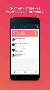
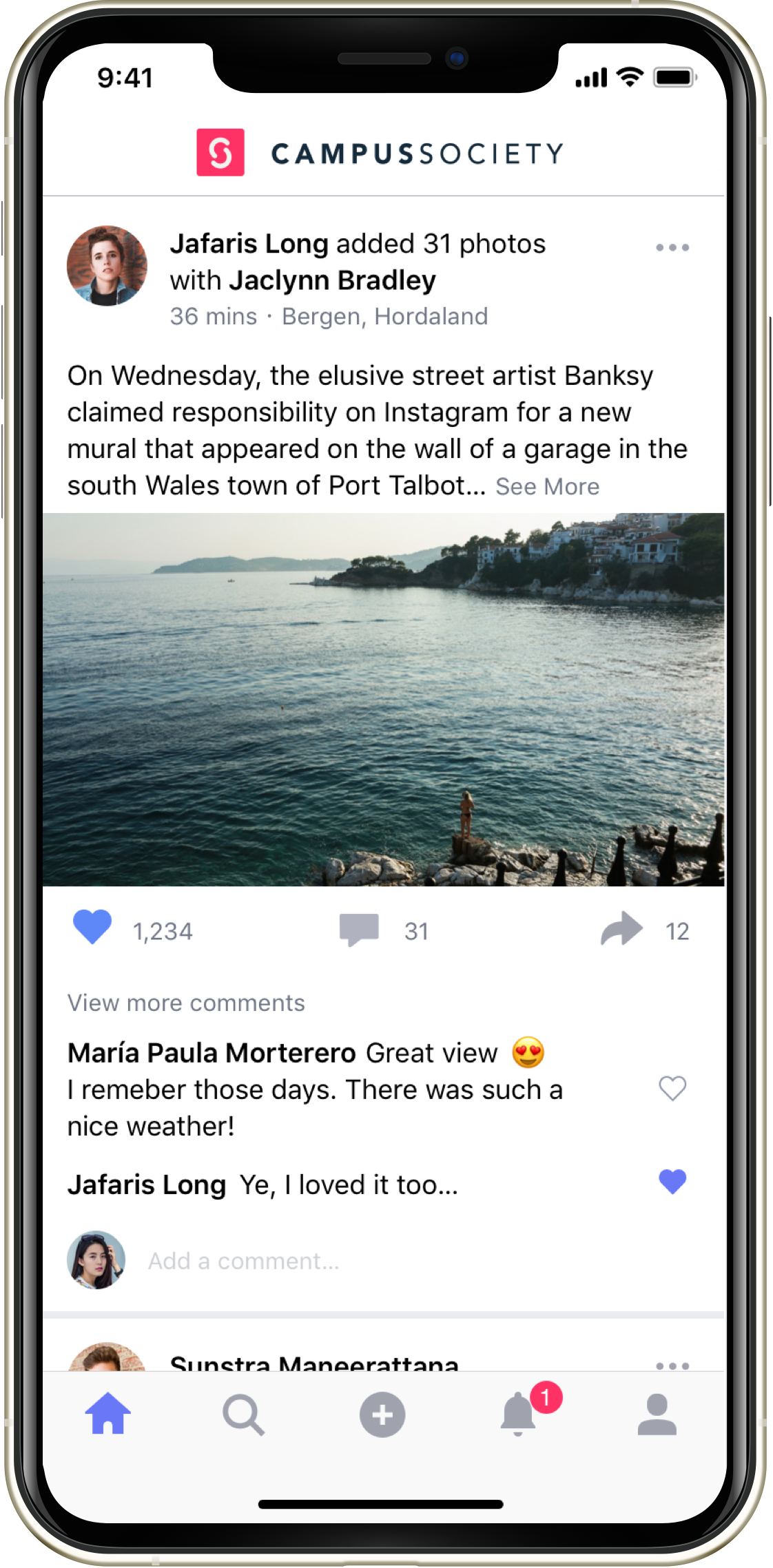
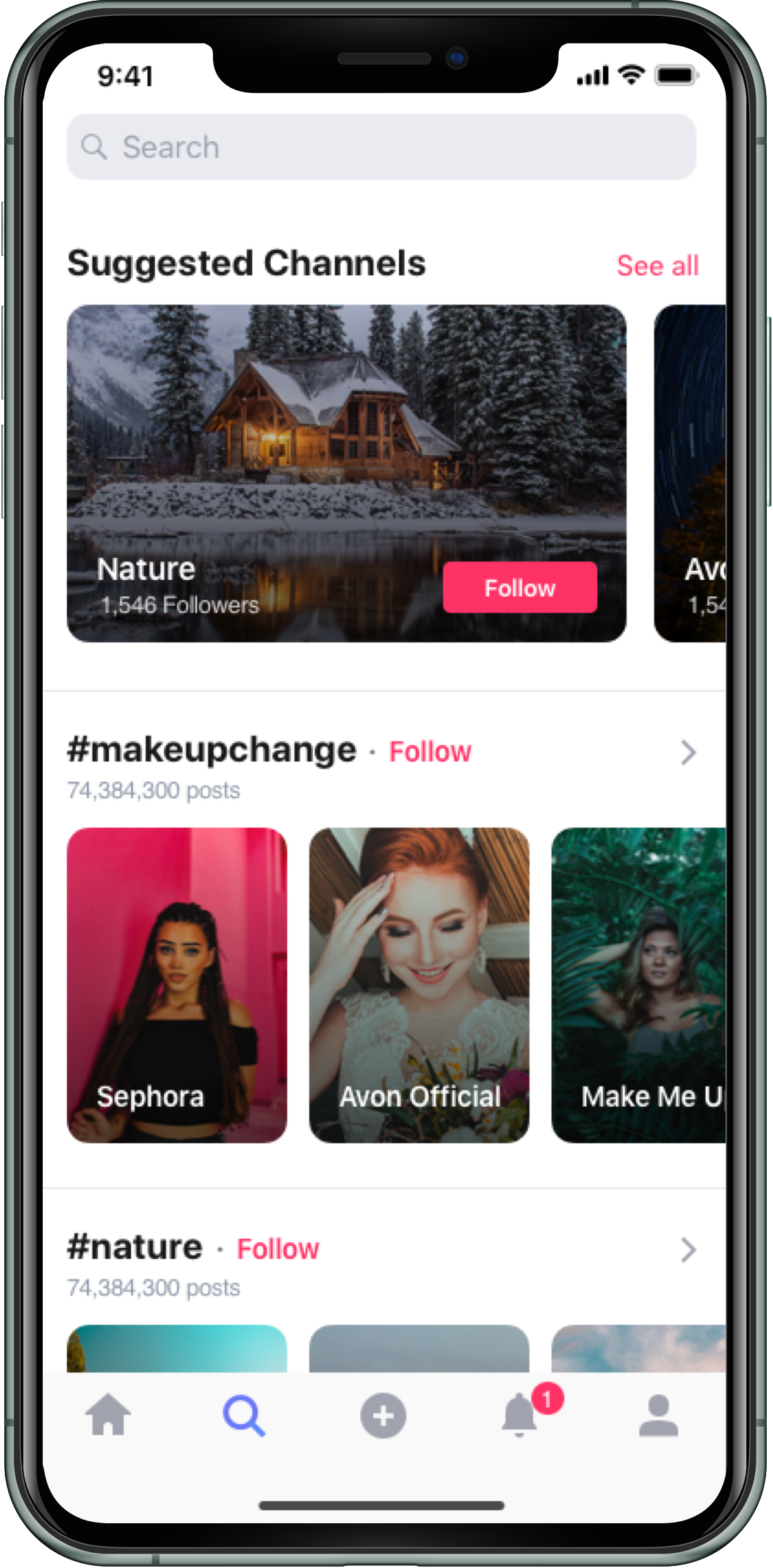
Campus Society - the UK’s fastest growing student app - connects you with other students on your course or at your uni. With Campus you can join communities, access textbooks, win free stuff, and get help with anything you need during your uni journey.
Stakeholders wish to create a new social media software product and distribute this on a white label basis to clients, allowing them to maintain their own social media network. The product is to be designed and built from scratch, using Campus Society as a reference which will then be migrated to this new software upon completion.
The project's aim was to capitalise on the success of the Campus Society product by creating a white-label SaaS that would be delivered to clients FOC with monetisation coming from the option to upgrade to better product versions or through an online library of premium plug-in apps that could be integrated within the platform.
Research suggests that many organisations have become increasingly frustrated with existing social media outlets. They want complete ownership of data and to be able to use that data to target their audience accordingly. This, as well as options to pick and choose site features and moderate the community on their terms should be considered a viable USP and a niche alternative to other existing mainstream outlets. For the MVP, the goal was to deliver an initial product that would allow clients to create and manage their own online digital community at a basic level with aims to expand the product much further over time.
User Interviews
At the first stage of the project, I started to get to know the Campus Society platform by sitting down with the team and finding out how they did their jobs. We assessed the positive and negative points of the processess they were performing and I listened to how they felt these tasks could be improved. With the product having been in existence for a couple of years at this point, they were able to offer a real in-depth appraisal of it's performance and let me know how their working lives could be improved, demonstrating pain points and offering ideas and solutions on how to alleviate them.
With the current software in place, moderating the platform is cumbersome and laborious. We need to be able to moderate every piece of content that comes in swiftly, simply, and in mass volume. At the moment we have to use multiple apps, it's time-consuming and frustrating. We need a one-stop shop where all the processes can be done.

Rob BarkerHead of Moderation
The main thing I need is data and analytics. I need to know as much about the user as possible and be able to target ads and content to them by gender, age, location, etc. I then need to monitor the performance of those ads and assess the audience and reachability levels. As well as this I need to be able to download that data and compare it historically.

Vanessa AtkinsonMarketing VP
We are getting feedback from our users that there is not much participation on the channels. Anyone can create a channel so we have many lying dormant. We need to engage users and supply relevant content that gets people interacting and participating in the community. Content is king and we are only as good as what we put out.

Michelle LeaverCommunity co-ordinator
The platform currently doesn't scale well, we have problems when large numbers of users are online at the same time. The new product must be scalable and we need to learn from the mistakes of Campus Society. The designs must be complete by MVP as we are not blessed with a wealth of time at this moment and really need to hit our target deadlines.

Sai SharmaCTO
Excerpts from interviews I conducted with in-house staff at campus society. I carried out these interviews within my first few weeks of joining the team to get a better understanding of the product as well as to find out what the main frustrations were in the existing product and what was needed in the new build.
Competitor analysis
Having gained a solid understanding of what was required from a users' perspective and identifying the existing problems in place, I proceeded to research existing products on the market that were already solving similar user needs. I looked closely at the strengths and weaknesses of the leading systems on the market and analysed any possible ways to gain a competitive advantage over them in the marketplace.
I researched numerous existing social networks and cms to gain further insight into how they operate as well as the workings of their product model. How they monetised the product, the design, functionality and overall user experience would influential to the way connectt should work.
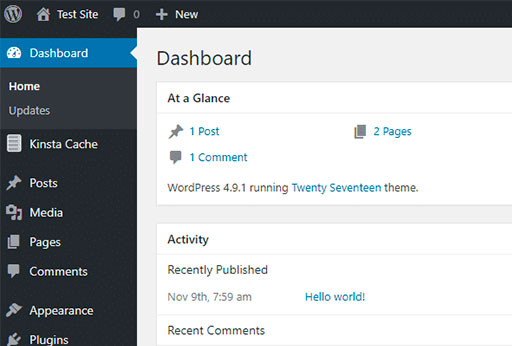
Wordpress
The world’s most widely used CMS powers 35.2% of all websites and was the main focal point for review given it is a very similar product and what we were ultimately hoping to emulate with connectt. It is accessed via URL, has an integrated plugin system allowing for easy in-app purchases. It has numerous features that connectt need immediately and desire for future planned integration.
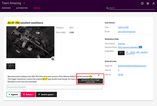
Besedo
Besedo's Implio product offers automated & manual content and comment moderation and is available for various sectors including the community. It has options to review and approve live posts swiftly to ensure quality, as well the option to edit that same content within its interface. Besedo also offers AI options that assist with speed and the need to manually moderate by filtering out unwanted imagery or bad language
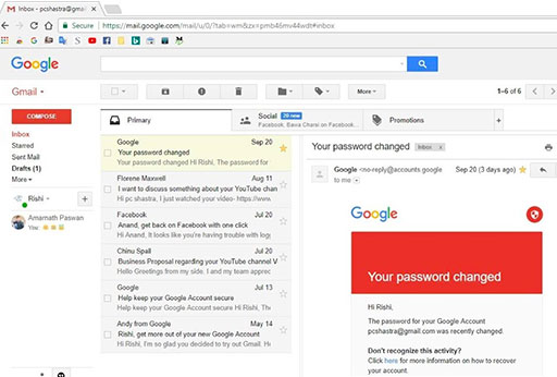
Gmail
Gmail was a great point of influence for listing users both social side and admin. The way emails are listed could be translated to member and administrator lists and a preview pane could be implemented to list information and take actions, meaning no page refreshes. It's UI is sleek and subtle and was also noted for its subtleties. The transitions between information points were duly noted and examined.
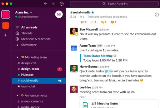
Slack
Although not an actual social media platform I looked into Slack's channels and application methods as a point of comparison. A user can create a channel and invite other users selectively so a review of this mechanism was helpful as a starting point. The other relevant feature was applications, how they were added and the search functionality to find those apps.
This is a snapshot of the research undertaken. I, and in fact we as a team found inspiration in many other tools that would form a basis in sharing relevant ideas. We worked as a team and if someone felt that a certain product or feature might offer inspiration I would investigate it further and see if it could be integrated into some instances. The products above are some of the more influential that I would draw upon.
Research findings
After carrying out user interviews and analysing the current competitive landscape, I started to gather an insight into the necessities of what was required for the connectt product.
Building empathy
Using the data collected from the interview and analysis stage, I set about creating a representation of common audience segments for the product. I devised 3 kinds of person that would be using the product to get an idea of their motivations and frustrations when using the product. to get an idea of what their needs and goals were and prioritise those according to time and MVP stages.
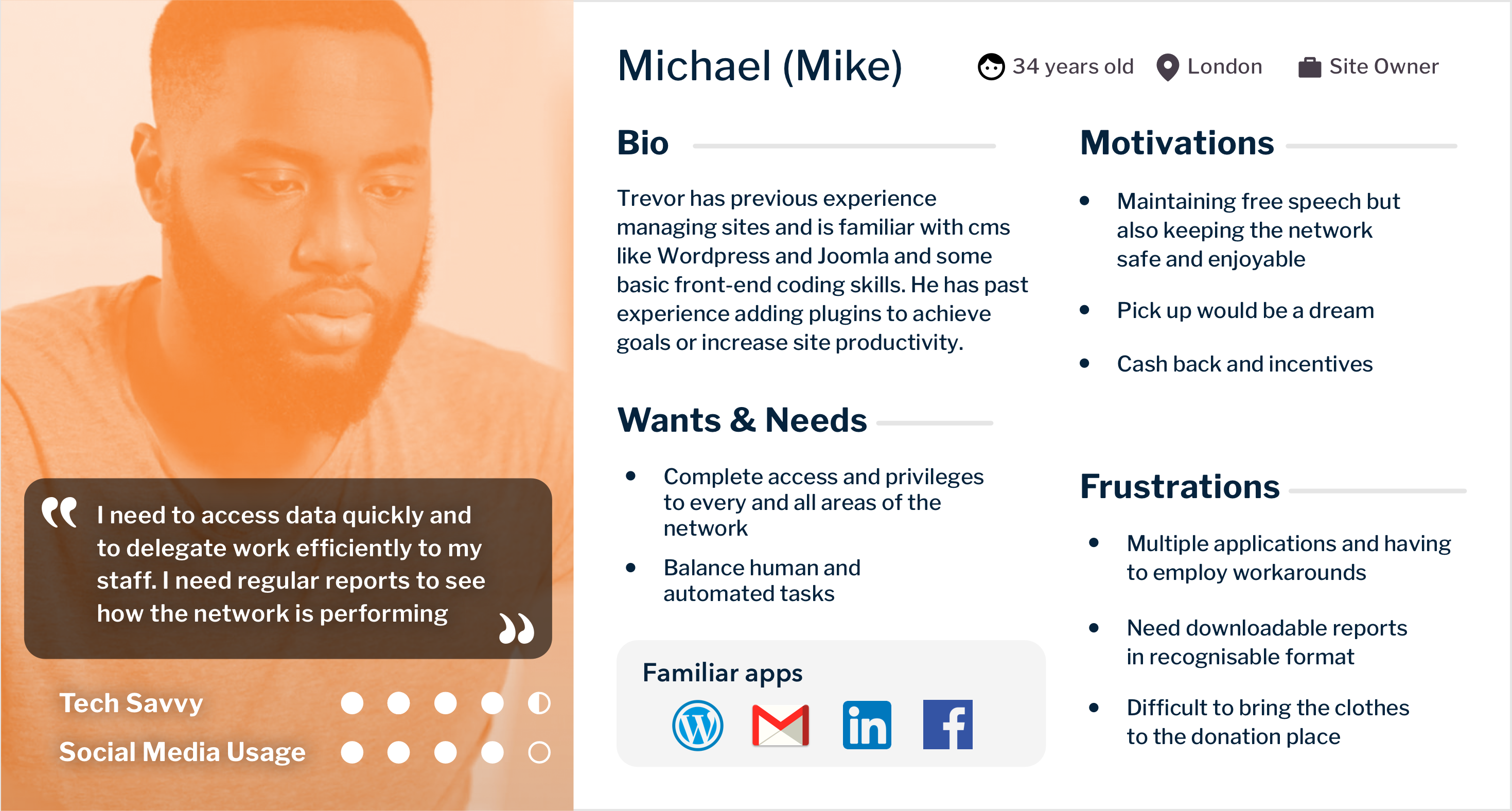
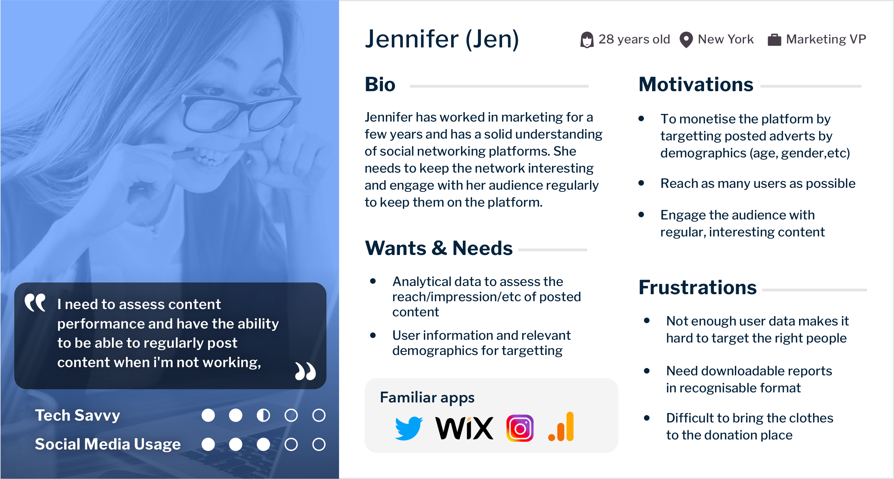
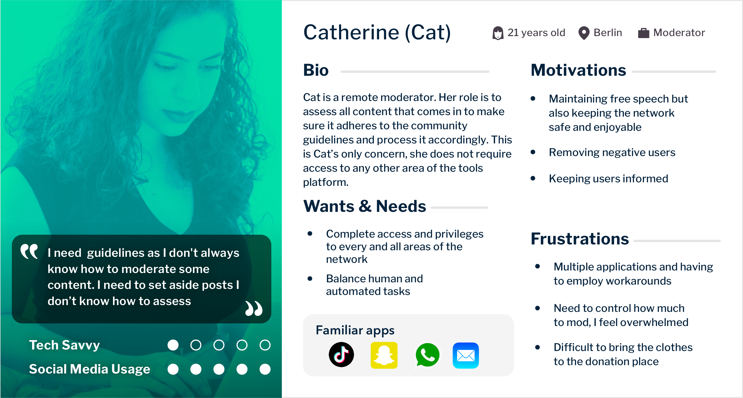
Some examples of personas to understand the more common demographics of users. Certain specifics may not have been essential when defining the users such as age or gender however I included these to generally demonstrate a user as a person and literally envisage who a user would be. I just wanted to put myself in the shoes of a potential user.
Project planning
We held initial kick-off and strategy meetings with the full tech team, with everyone pitching in and sharing ideas as to the best approach to building the product. The CTO, devs, scrum masters, QA team, and anyone involved came together to determine the best technical approach and alignment with MVP planning.
In these meetings, I presented my previous findings and relayed to the team how I felt the product would function. It was important to learn from the previous mistakes of Campus Society and to set in place the best tools to alleviate these problems and create a more future-proof solution to what was currently in place. Having a section of in-house staff working with the existing Campus product proved invaluable for defining how the platform should operate and all the outstanding pain points in place that could be fixed or at least minimised.
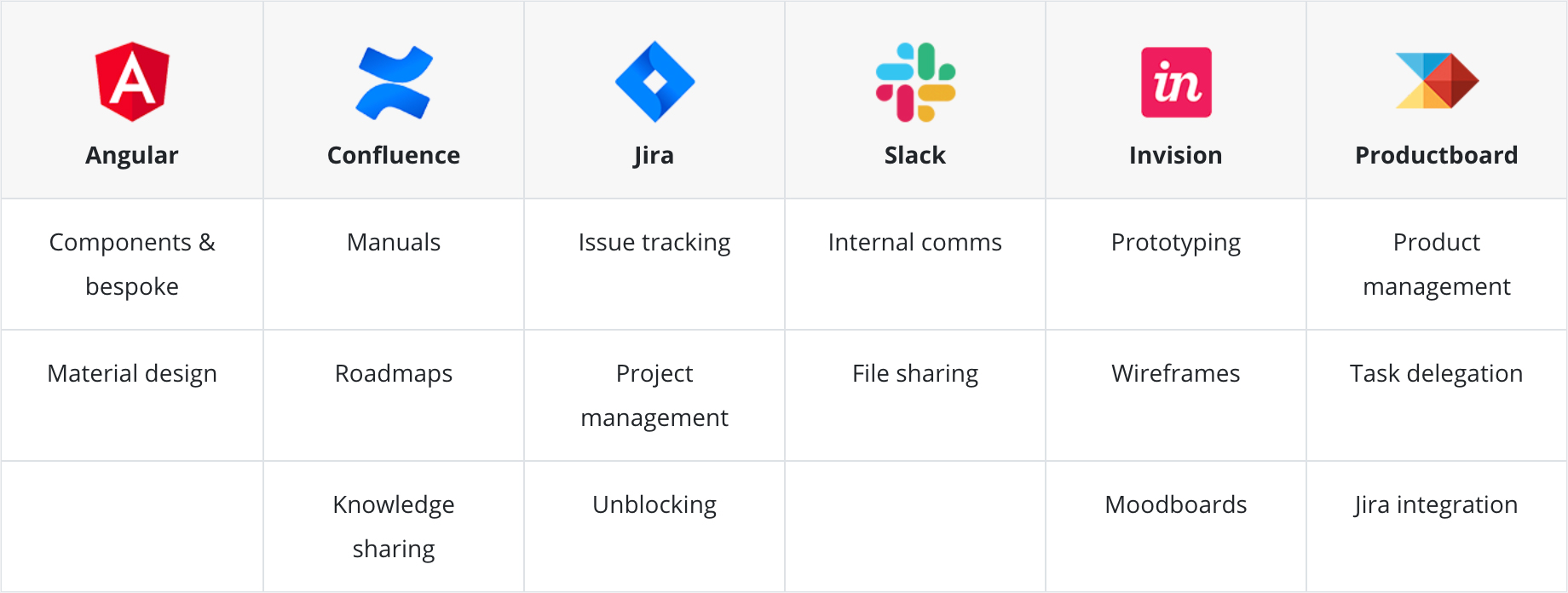
We eventually came to a general consensus on how we would all work together and below is a table of the main tools we would use to achieve the final outcome and uses of those tools
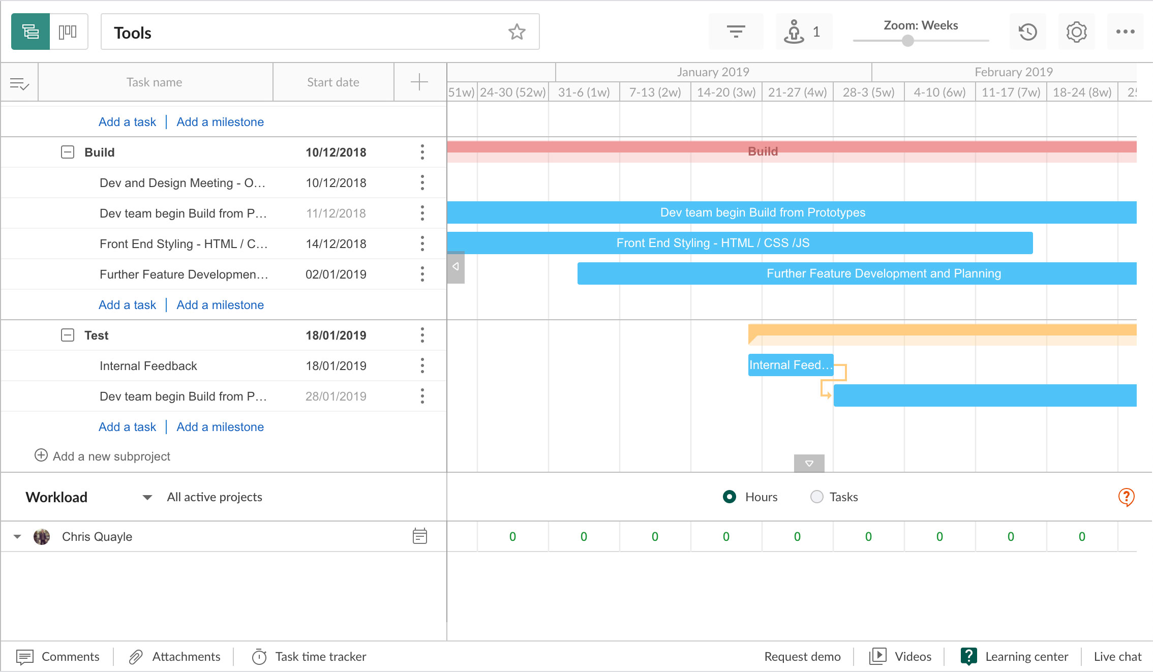
Gantt chart to plan the project from research, design, build and test phase in collaboration with the development team
Gantt chart to plan the project from research, design, build and test phase in collaboration with the development team
Table outlining the systems used on the project. We used confluence to share knowledge and as a resource on how things would work. User stories and prototype links were outlined in productboard. We created tickets on Jira which came in particularly handy for unblocking incidents that occured with devs.
Mapping initial features and menu items
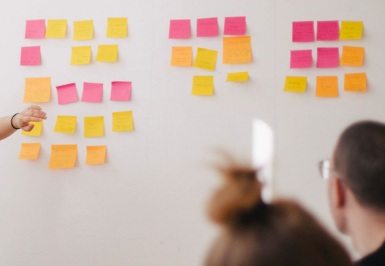
We held workshops to decide what features were the most essential for MVP 1 given resources available. We started by drafting categories and placing tasks on post-its. We then placed these tasks in the relevant section to give us standing on the menu structure.
I then continued to map out the menu digitally and categorise the tasks in terms of parent/child format. I wanted to configure the best way for a user to perform the task they wanted by getting to the start of the process with the least amount of clicks but without being too convoluted within the UI.

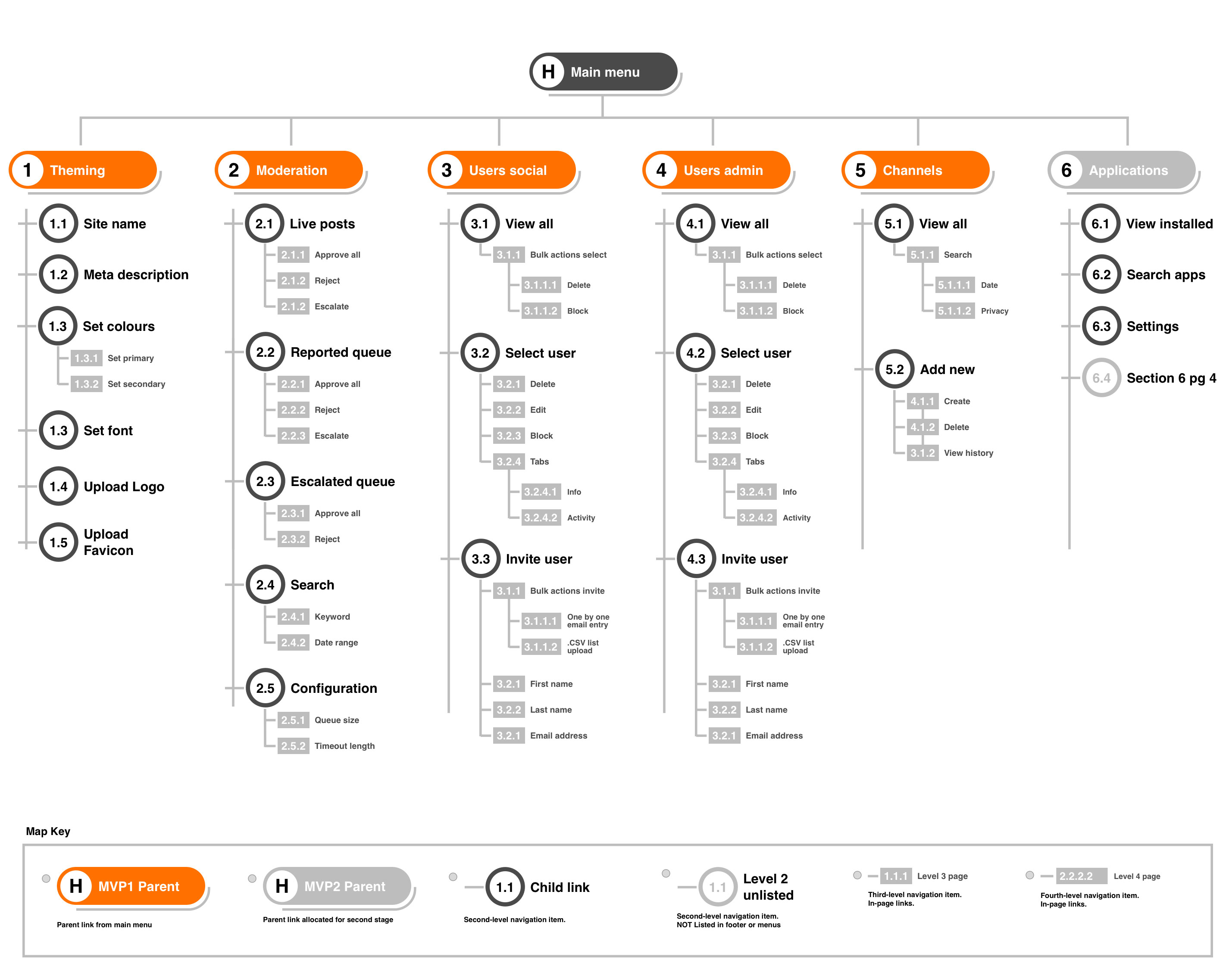
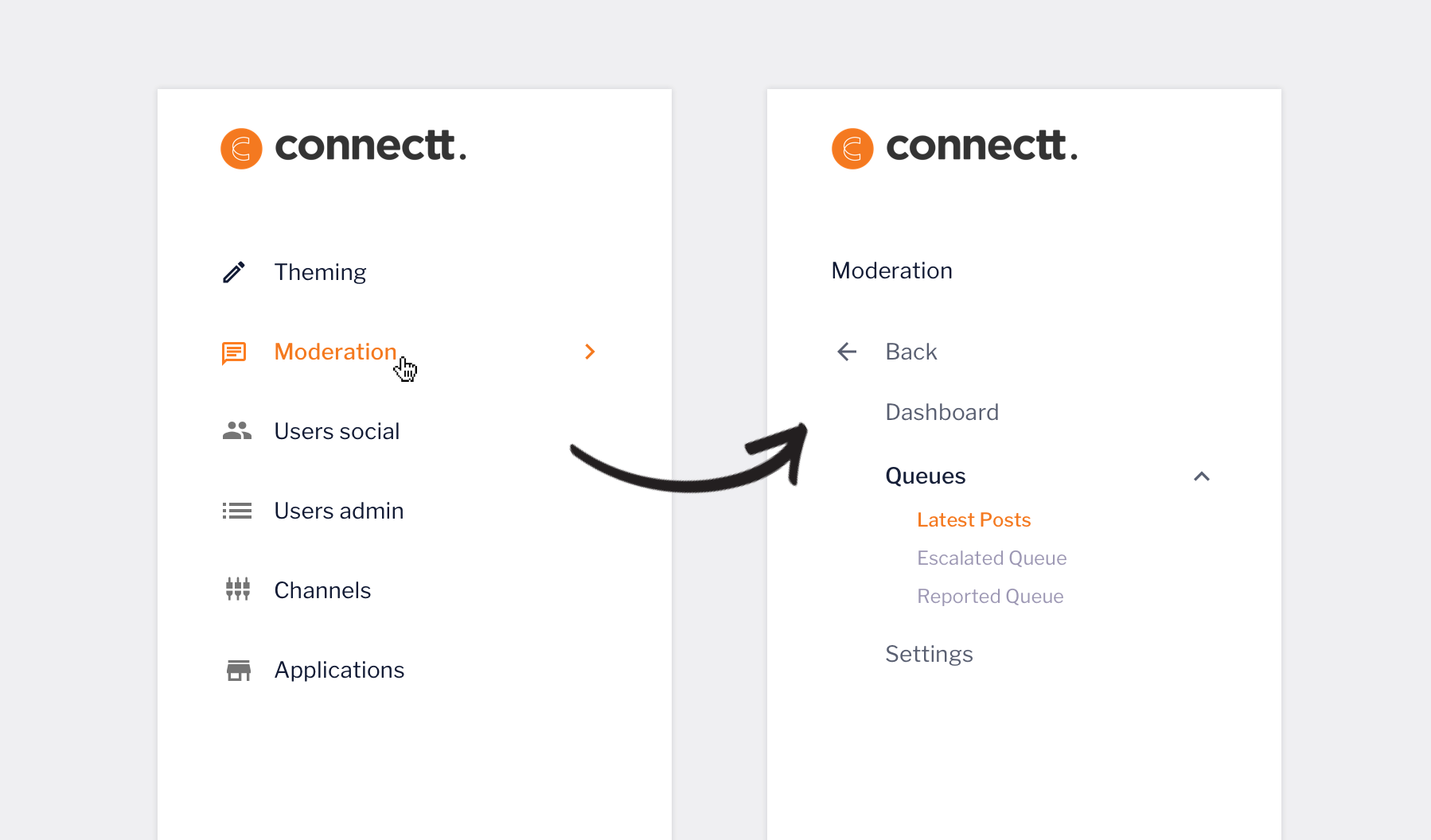
An early version of mapping the main menu out, this would go through various incarnations to determine the best approach. For example, some parent links would encapsulate all tasks, others would require dropdown child menus or in the case of moderation, their own independent solution
Theming
Moderation
Users social
Users admin
Channels
Applications
The initial menu structure for MVP. Various versions were tried including dropdowns to reveal child links which were deemed unnecessary as processes were to be performed once links were visited.
Conceptualisation
After gathering all the data and feedback it was time to start drawing up some blueprints for the product. Rapid sketching is always used as an on going process for me to communicate ideas in the research phase, however, connecting the user requirements to the visual design always requires something more concrete to communicate to the team.
These initial sketches are a stepping stone towards the prototyping stage and are a way for to gain further insight into user behaviour and product functionality. I aim to elimnate or anticipate any potential pain points and will conduct workshops for peer review.
Initial lo-fi sketches
These are some slightly more sophisticated lo-fi drawings of initial UI concepts. I typically sketch out ideas really fast and at a high rate and talk them through with my team or assess them on my own. I will eventually draw out a more 'final' version or versions that will form the basis of the initial concepts and present them to my manager or senior for review. Before the above images, there would have been lots more primitive ideas scrawled out before making it to the above.
Prototyping
After devising rough sketch designs, I carried these ideas over to sketch where I made digital versions using the angular and material design component library. These designs were deliberately minimal and were never meant to be the final versions but it gave me an initial standing to share my ideas with colleagues and start prototyping in invision.
After carrying out multiple rounds of usability tests on the prototypes and as a team we were happy with the basic functionality of them, I moved on to creating a style guide for the UI. Prototyping was a very in-depth and lengthy process on the project and it was determined by the CTO that after getting a grasp on functionality we needed to outline how the UI would look. Prototyping continued further with signed off designs.
First digital mockups
In this project I moved fairly swiftly from pencil and paper prototyping to digital format. This was mainly for demonstration purposes, to be able to translate ideas to stakeholders and the CTO more efficiently. These designs were created quickly by using out of the box, no-thrills angular components and keeping them very minimal. They were always going to change once the UI was defined.
Visual design
The visual design was developed by iterating from mood boards and style tiles to the UI kit and finally in to creating a first version of the style guide.
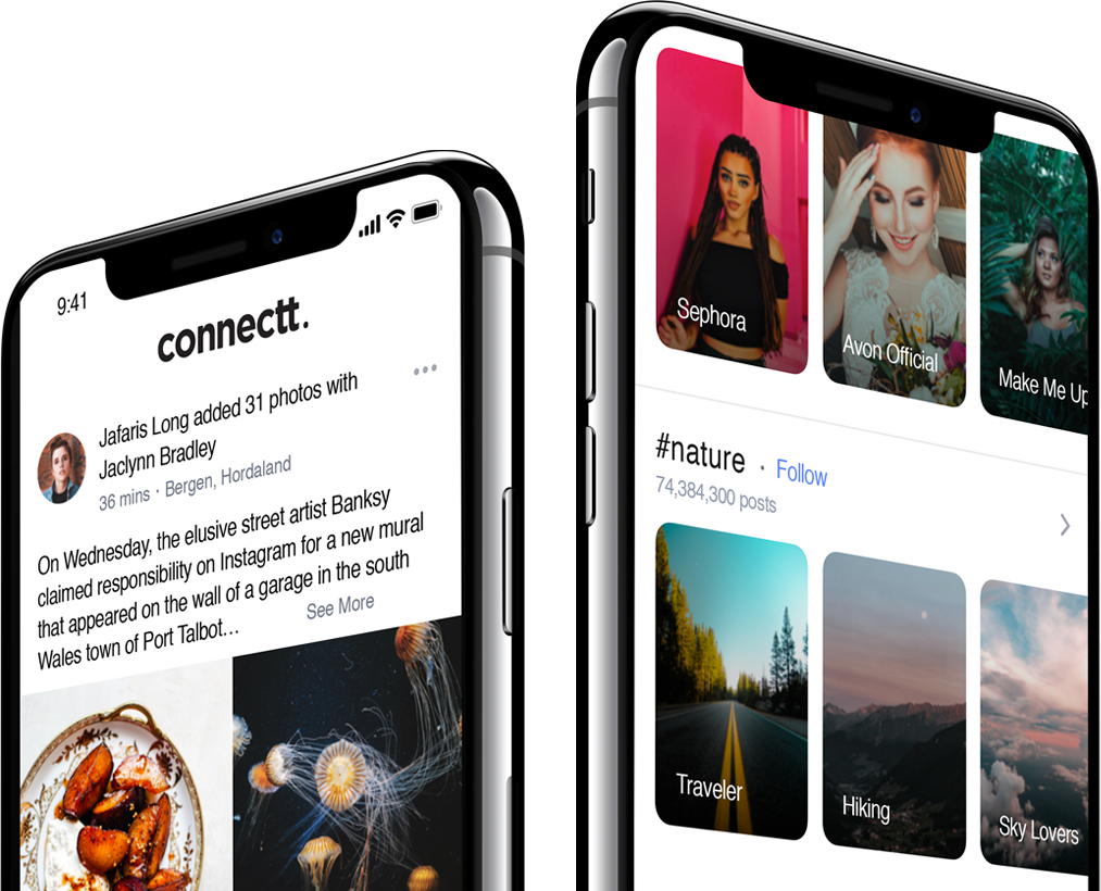
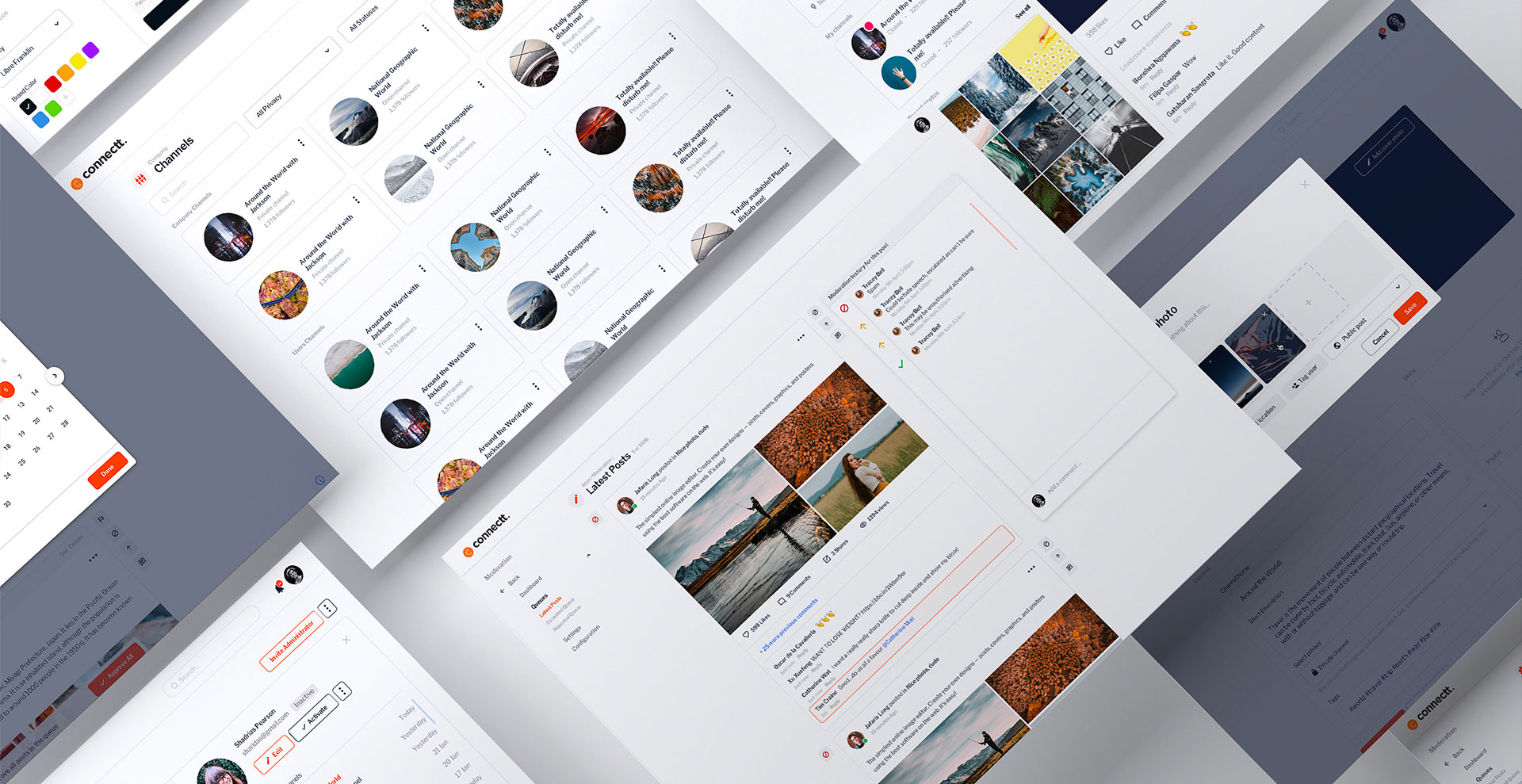
Below is the style sheet of what the connectt platform would be. The colours were influenced by bootstraps colour scheme and were not hugely important as they were changeable according to whatever the client would ultimately choose for their network. I tried to keep the components subtle and create a synergy with the social side as we didn't want any disparity from the front-end side and the tools area, there had to be a consistency between the both.
 Theming
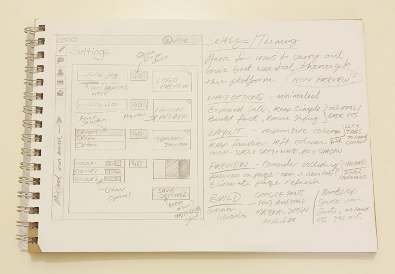
Theming developed from fairly basic origins of just uploading a logo or setting a font library. It was clear that other factors needed to be taken into account for users such as customisation of the login screen or network invitation email design.
The idea was always to have some sort of preview panel so that the administrator would not have to create settings, save them and then have to open a new tab or refresh the page to view their chosen settings. Given that the theming expanded, I decided to group them into tabs to edit the email, site style and welcome template.
After internal testing, we decided to keep one overall save button to reduce clicks. In hindsight, a reset all option could have been introduced, however theming was not something that a user would have to return to often, given such branding changes would be infrequent.
Styling can be made to the app or web based platforms and will displayed once saved in the theming area. There are options for Web android and iOS versions.
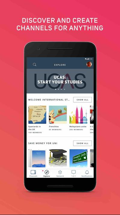
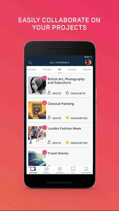
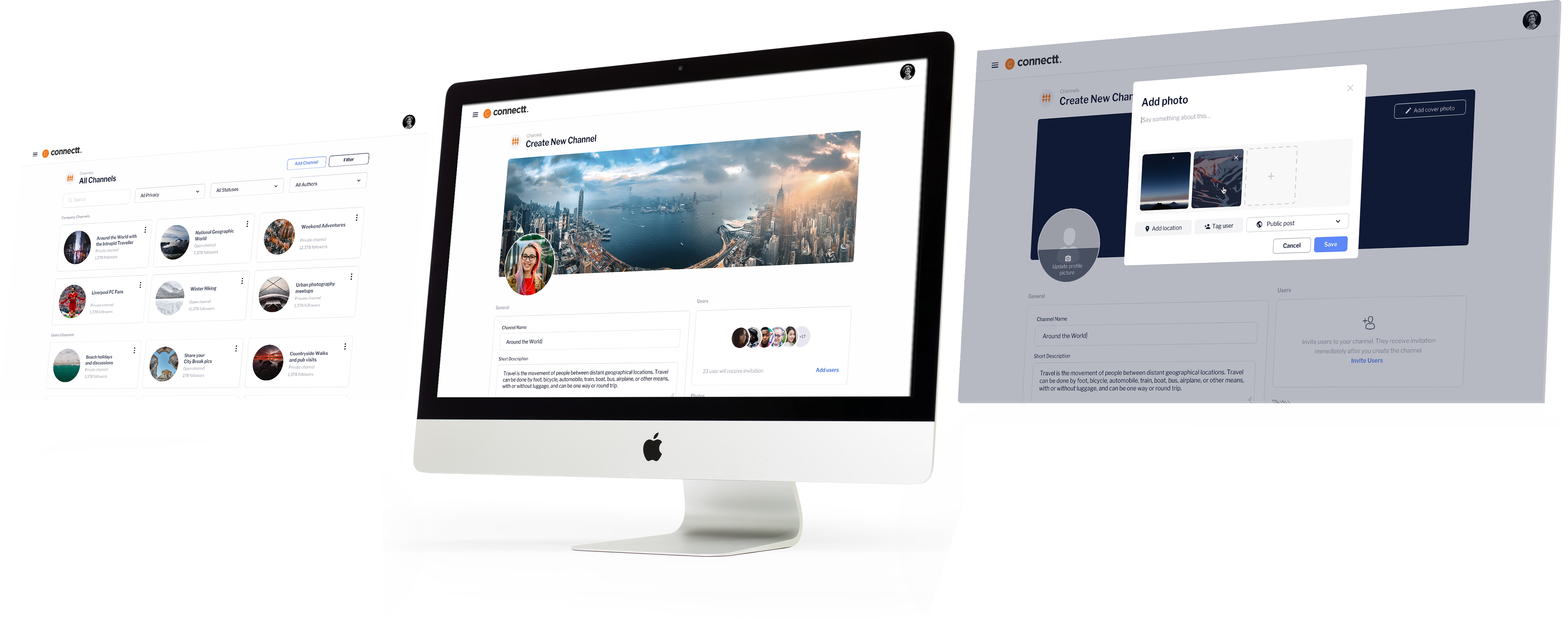
 Channels
It was first considered to re-use the list style as featured in the admin/user sections for channels but it was agreed that the tools area would contain too much of the list style view. Instead, the visual style of the social side platform was included in a 3 column row style. After feedback from the research stage confirming that channels were overused and dormant, it was felt that there would not be massive lists of channels.
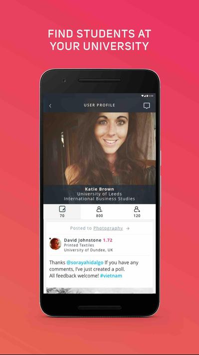
 Users
Users
It was first considered to re-use the list style as featured in the admin/user sections for channels but it was agreed that the tools area would contain too much of the list style view. Instead, the visual style of the social side platform was included in a 3 column row style. After feedback from the research stage confirming that channels were overused and dormant, it was felt that there would not be massive lists of channels.
After considering a modal style, it was decided that the new channel process should be performed on a separate page, it felt more natural to do this than cramming all the info to a modal. These screens show the uploading of images, email invitation, channel info and privacy settings.

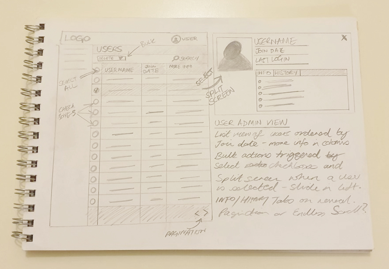
Landing
Administrators are featured in a list view with various options to filter, search, and perform bulk actions as well as see individual user details and actions. Pagination appears at the bottom right to indicate how many pages of administrators there are and to navigate through them.
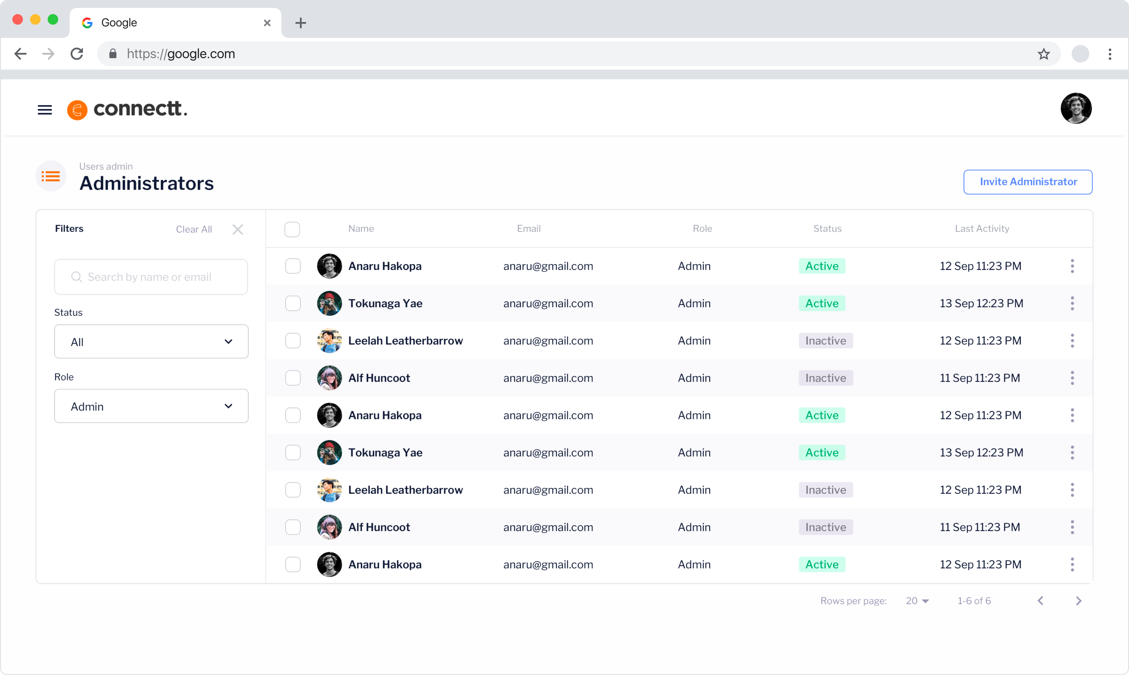
Filters
The filtering link was introduced to the left side of the UI to keep it separate from the user information on the right. this works via a push mechanism, once clicked it shifts the list content to the right. The link is separated by a light border and the text is rotated to save space.
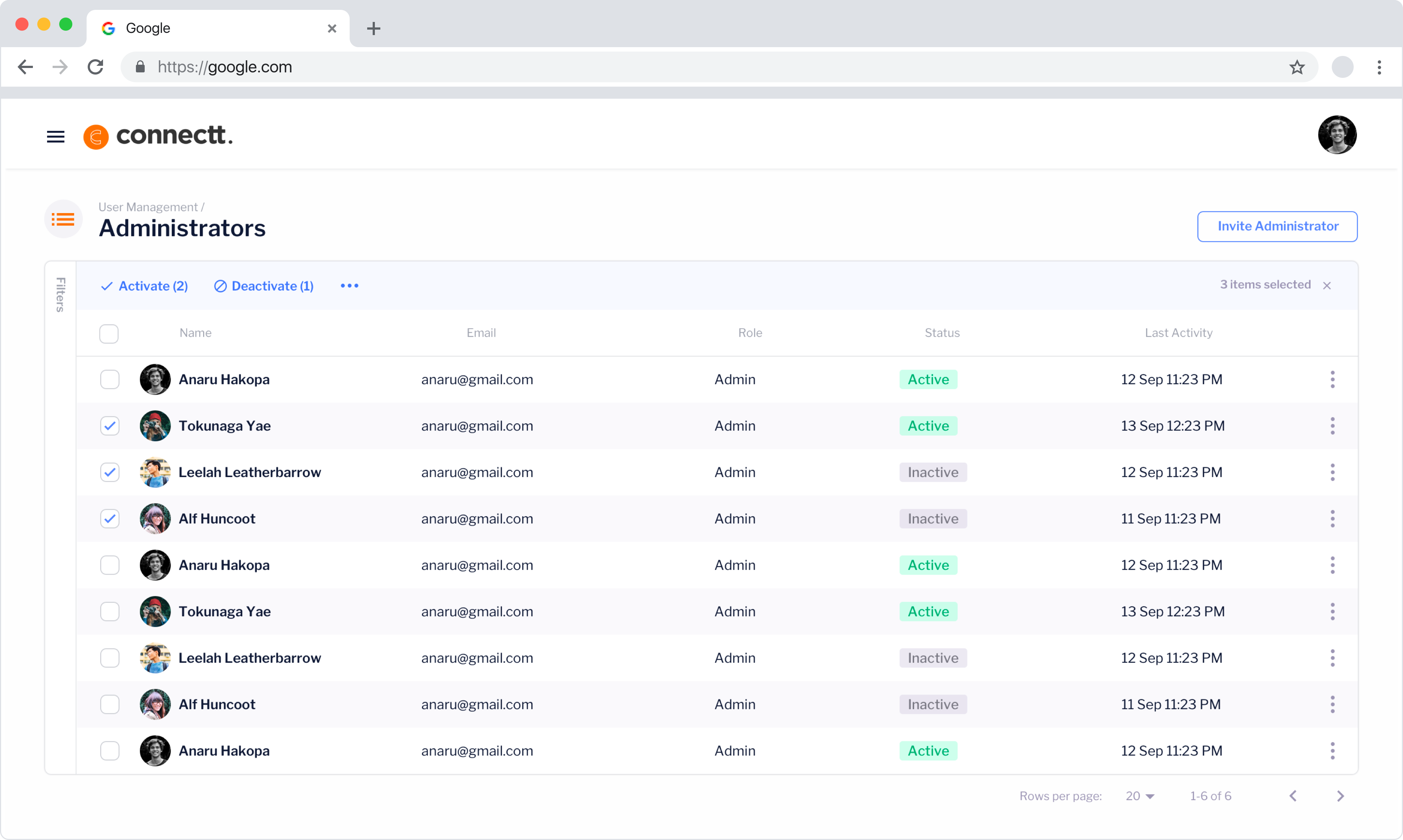
Bulk actions
Bulk actions can be actioned by selecting one or more administrator with the checkboxes and then opting to delete them for example. After clicking to carry out such an action, a modal asks the user if they are sure before committing. The links appear in a top menu bar similar to most email clients.
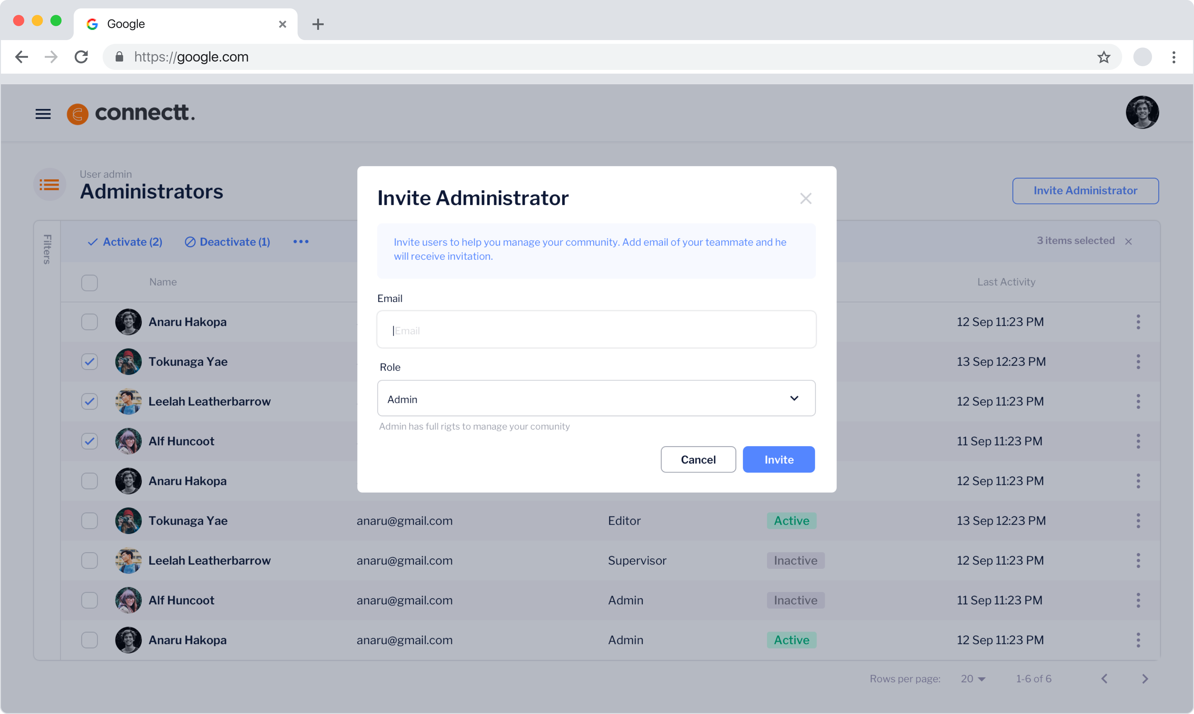
Invites
A new user can be invited to the network via a top right button on the UI as is consistent throughout the tools platform. The invite button populates a modal that allows a user to enter the name and email of the intended admin who will receive an email instruction link to create the account.
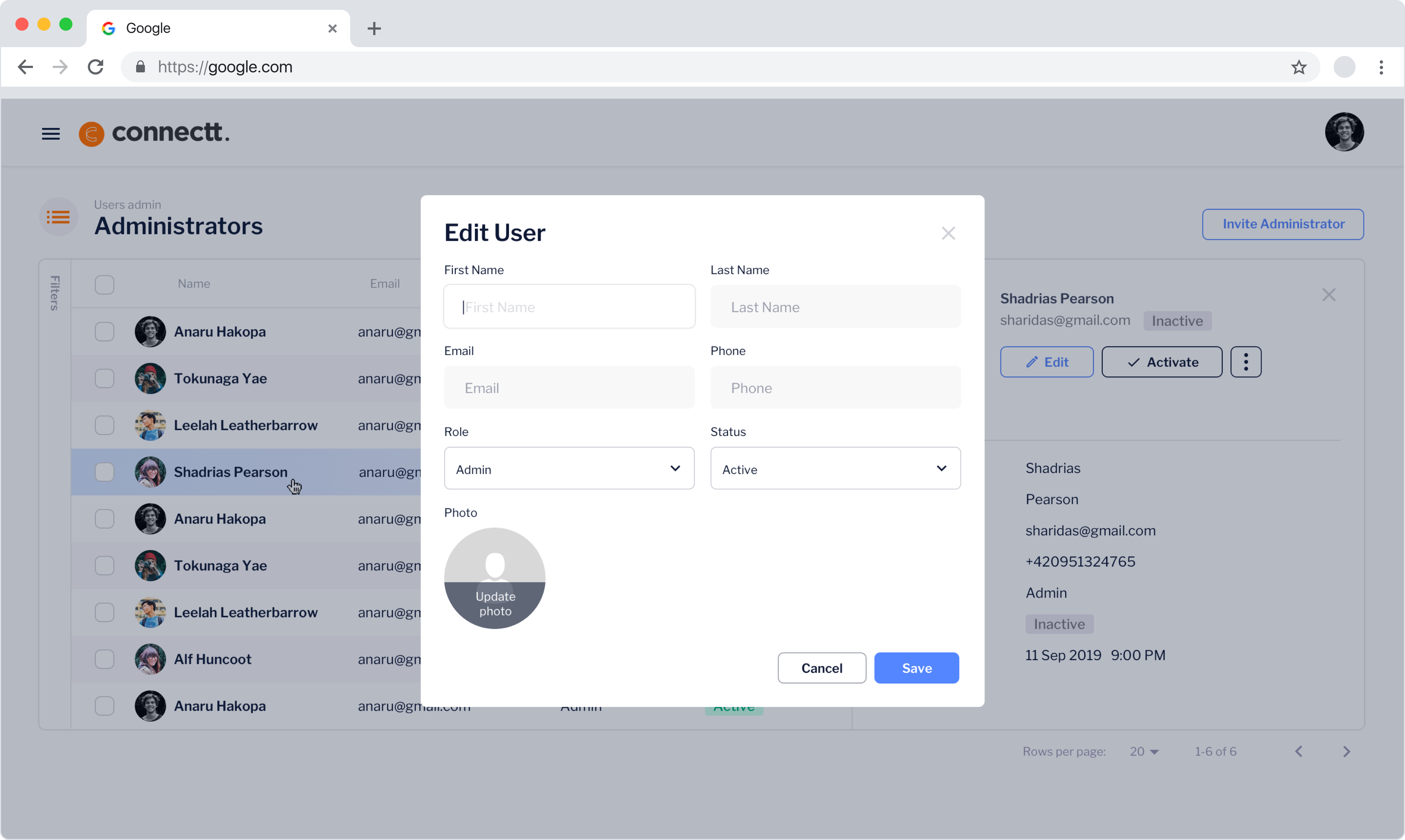
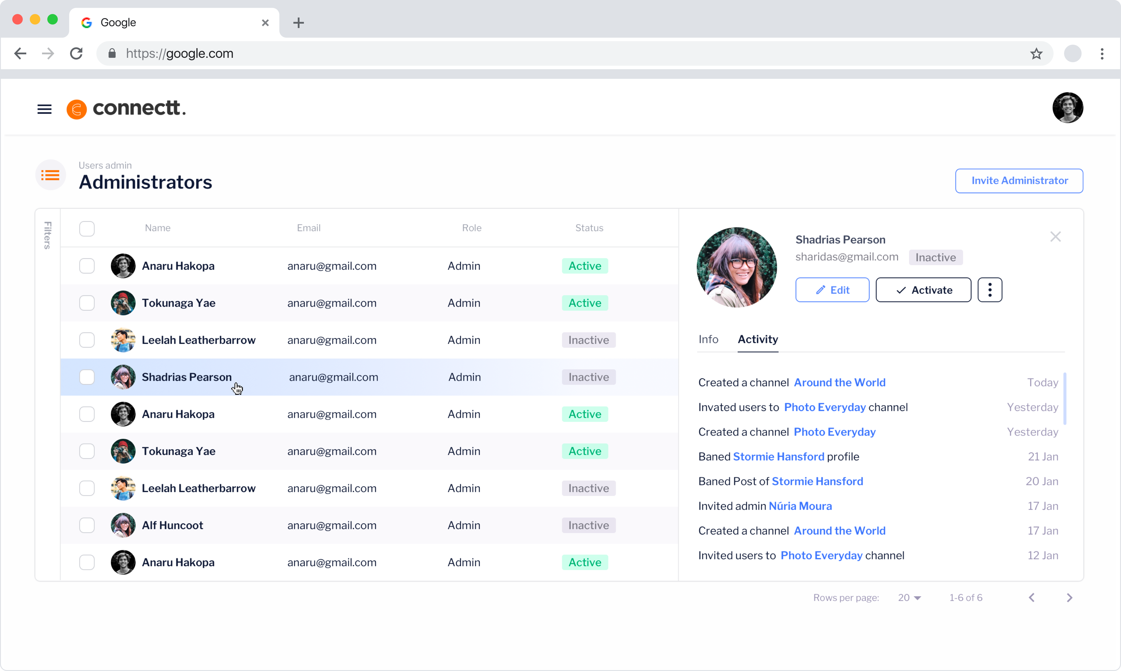
Edit user
A users' details will change colour on hover and once actually clicked, their details will push from the right-hand side to reveal their information. The edit button appears here and once clicked will populate a modal allowing them to change the details of the admin.
User info
Within the administrator open pane, various options are available to see the active status of that admin, their activity history, and their info. Here various actions are available such as deleting that their account or making their role inactive.
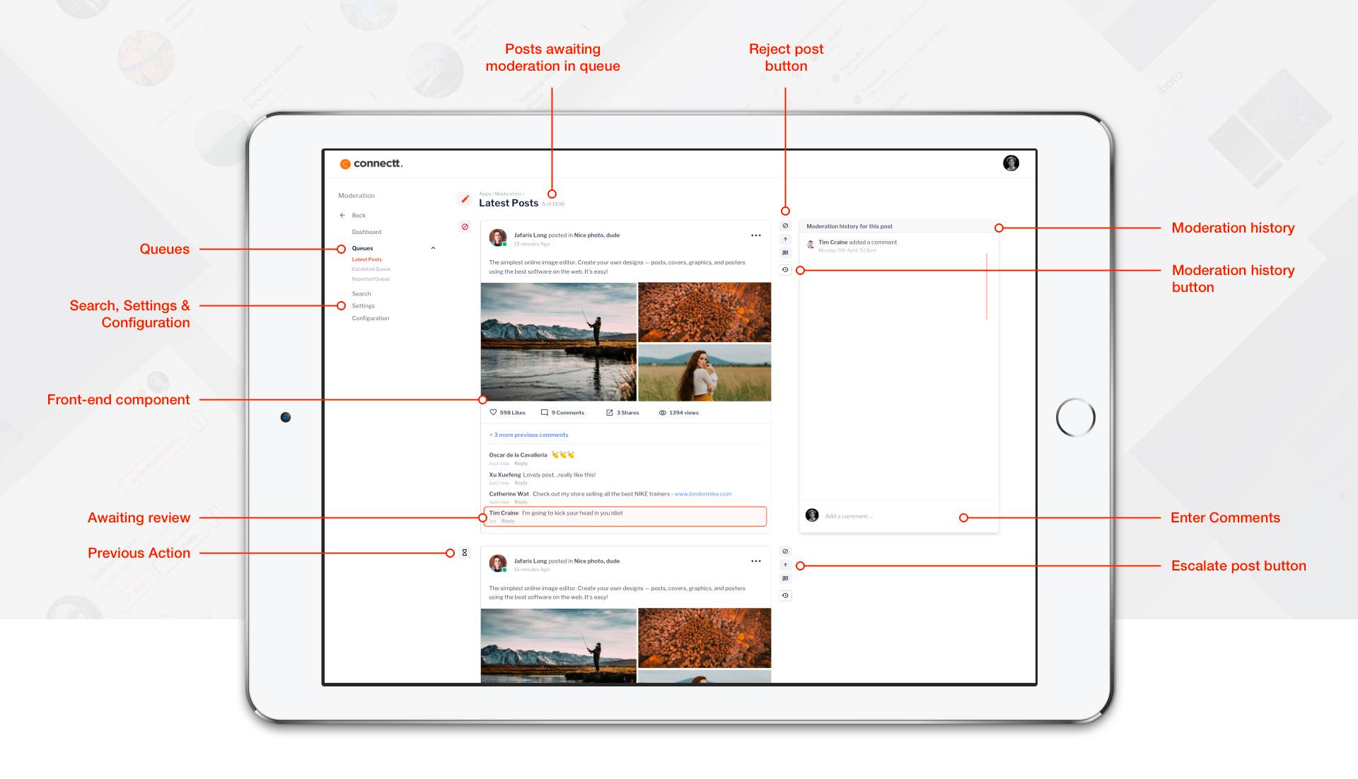
 Moderation
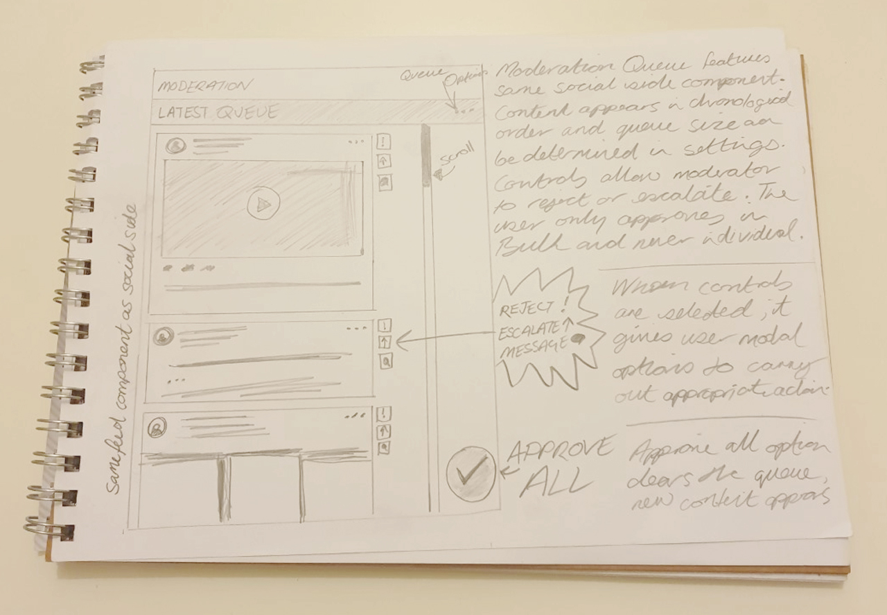
With such large amounts of content coming in on a continoual basis, it was important to formulate an effective system for moderators to assess it swiftly and easily. After collating the data from the research phase I set about devising a system where the content would appear in the interface
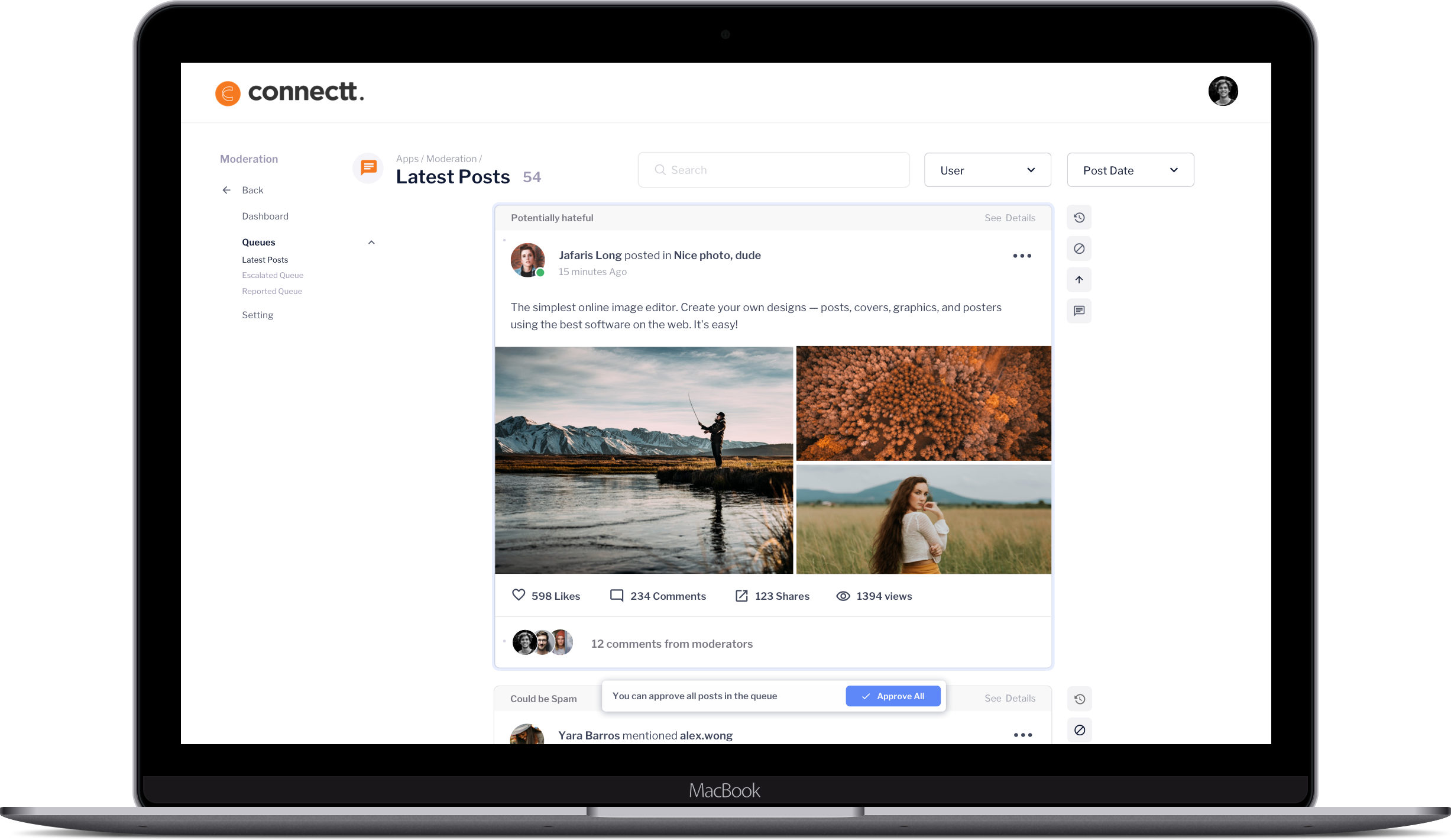
Moderation process to reject content
1.0 - User selects Queue
In this example, they have chosen the live posts queue. This is any content that has appeared or been made from the front-end, a comment perhaps or a new post.
1.1 - Live post queue
Once queue is selected, user will see the front-end components listed within the queue. Content appears in chronological order, the user will know the latest piece to be moderated as it will be highlighted in orange.
Action content
User has a choice of moderation options as outlined in the corresponding column.
1.2 - Select reason
When the moderator chooses to reject a piece of content, upon clicking the reject button the rejection modal appears. The first option is a dropdown of option relating to breach of community guidelines, such as 'spam' or 'bulying'. The user chooses the relevant violation.
1.3 - Ban length
If necessary, the moderator can choose to ban the user for , here they select the time length or no ban at all.
1.4 - Email template
After the moderator has selected the first 2 options, the text box loads the correct email message to send to the user. Eg - You have broken the guidelines for copyright and will be banned from the platform for 24hrs. This text can be edited by the user to include sopecific information to the case.
1.4 - Reject post
User rejects the post after completing the rest of the form which then automatically bans the user (if specified) and sends an email notifying them of the ban and why,
Moderation controls
![]() Approve all
Approve all
This clears and refreshes all the content in the queue. Content is moderated on an approval basis, meaning the user does not have to individually need to click approve multiple times to 'ok' a piece of content.
![]() Reject post
Reject post
If a piece of content does not meet the community guidelines it must be rejected. Once the moderator options to reject the content, the rejection modal appears.
![]() Escalate post
Escalate post
If a moderator is unsure on how to delegate a piece of content, they will opt to move it to the escalation queue, the escalate modal appears.
![]() Moderation History
Moderation History
Moderation gives a list of moderation actions taken on the item. For example, if it was moved to an escalation or rejection queue. Or when it was posted.
Usability
Working with a dedicated in-house team allowed constant testing to take place throughout every stage the design process, from research to build. I was lucky enough to work with people that were already using an existing product on a daily basis so held meetings on almost daily basis to present prototypes to them and have them test them out for efficacy. This meant that I was able to discuss ideas and present them rapidly to see if they stuck.
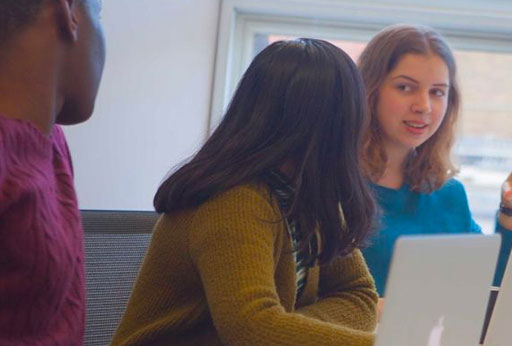
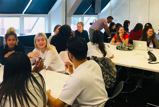
Images of an internal staff review and on the right a focus group of external reviewers
Conclusion
Working at Connectt was a great challenge and was the largest scale project that i've participated in to date, with a big team working together to build what was planned to be a global social network. With this being said it would be fair to say that it was not without it's frustrations. The product design team was built solely around myself and although I am used to working solo in my career, it would have been great to have been able to touch base with at least one other creative within the team to share and critique ideas. On such a large scale project this really would have been a great help as with just myself dealing with over 30+ development staff, some in-house and many remote, it was a challenge that really need more people involved from a design and organisationaly point of view.
I reported to a CTO for feedback and sign-off of on designs and would typicaqlly have to wait lengthy periods to get these designs approved due to him being spread so thin within the organisation. The MVP's set in place were extremely tight which led to the company having to outsource large chunnks of work at the last minute due to difficulty getting in-house staff in London. This led to a sense of disorganisation within the tech teams not knowing who was essentially responsible for what tasks due to a lack of definition of roles or sufficient team integration/building.
Eventually more organisation did come 9 months into the project in the form of a product director who sought to be an efficient go between two separate agencies based in Belorussia and India and the in-house team based in London. At this point the designs I had researched, conceived, prototyped and tested months earlier were only within the very early stages of being built by the devs. It became clear that with such disorganisation, low morale across the board and an all over hap-hazard management approach that being able to see the product realised would take a very long time, if at all. I decided after much thought and ahving waited 11 months that I had taken the project as far as I could and found a new opportunity. Approximately 6 weeks after this, the company went into liquidation.
Working on this project was a real challenge and one that I am very grateful to have been a part of, not all projects go to plan and this is always a risk of working for start-up's. It is important to learn from mistakes and I undoubtedly learnt a great deal from this experience, both technically and in terms of organisation and management. I am proud of the work I produced, have no regrets and will look to apply the knowledge I gained from my time at Connectt to future projects