Redesigning the booking flow
for Greeces' national airline
Project background
Aegean Airlines intends to to improve their onboard experience for their customers, from searching for the initial flight to adding a host of new extras. They want to improve customers' experience of managing their booking and improve the overall experience of their internet flight booking system.
Branchspace has an experienced team of UX and UI designers that helps airlines to create, test and implement new ideas, from concept and design through to prototype development and product testing and have previously conducted a variety of different projects related to this request. Branchspace has the necessary skillsets to support Aegean Group in their request as well as all future phases of this initiative.
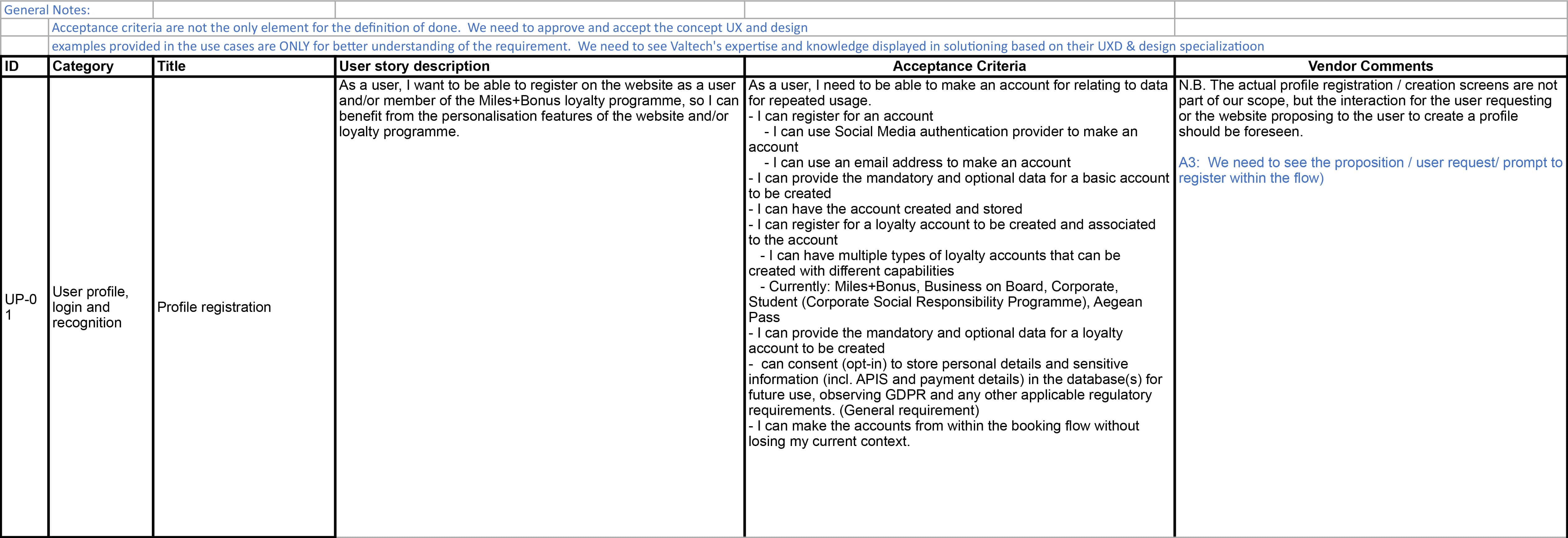
Acceptance criteria
By initially condensing a vastbusiness requirement document set out in conjuction with the internal Aegean team, the project was divided and categorised into sections, with each area given a category ID for organisational purposes and ease of reference. Each category contained a set of task and corresponding user story description for its role within the booking flow. The Acceptance criteria outlines the necessary elements needed for each task, as well as the minimum requirements related for their completion. This document was essentially the cornerstone of the project and served as a vital foundation from which to work from.
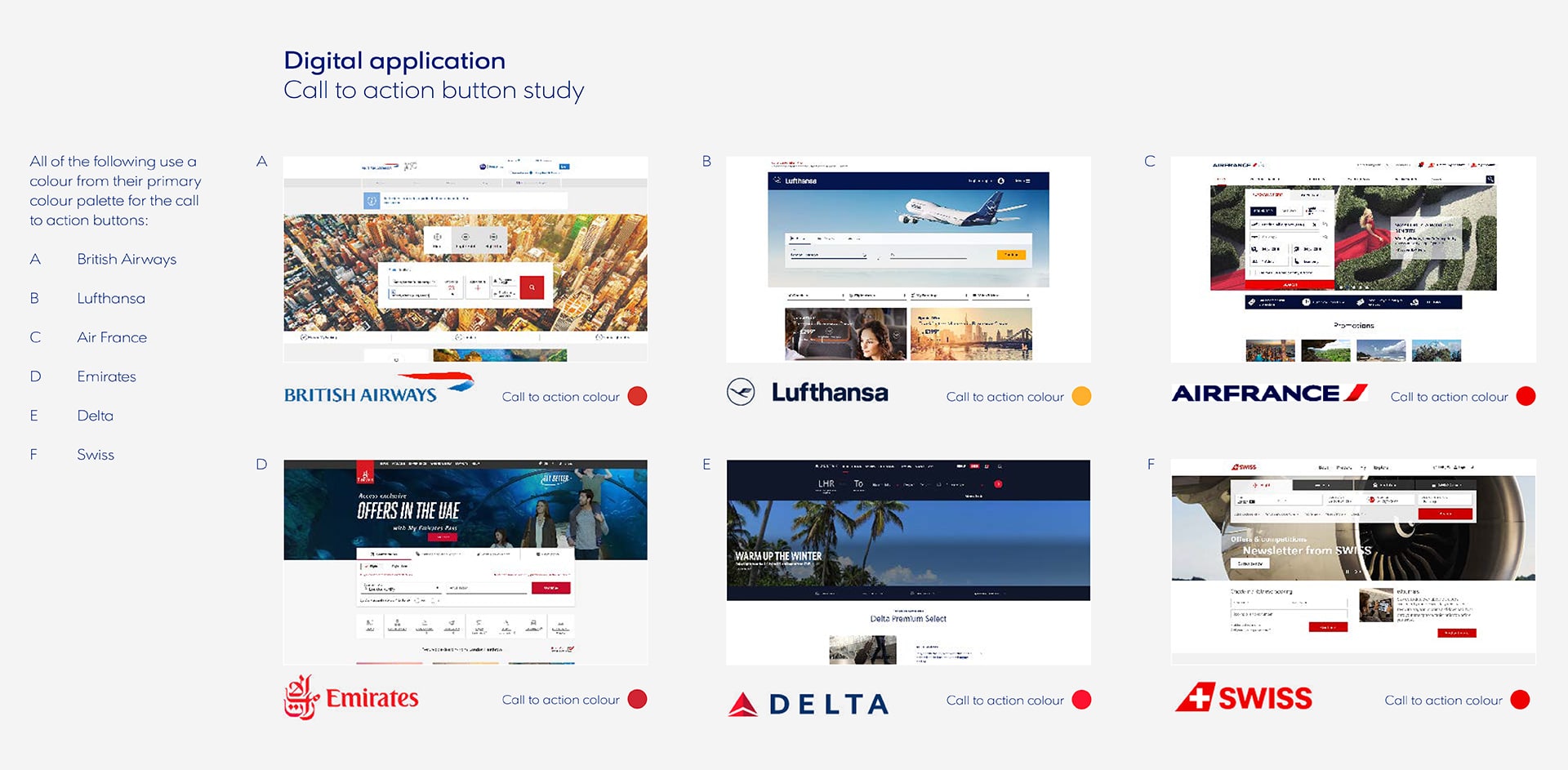
Competitor Analysis
Reviewing the competititive landscape was a constant on this project and we analysed many different airline company booking flows to guage how other operators were carrying out their bookings. Everything from animation transitions in the booking flow to other, more overarching elements such as Airmiles and rewards systems were compared to decide best practice. During this process it was surprising to see how dated many flight booking systems really were and the ones that got it right, really stood out from the crowd as strong benchmarking candidates.
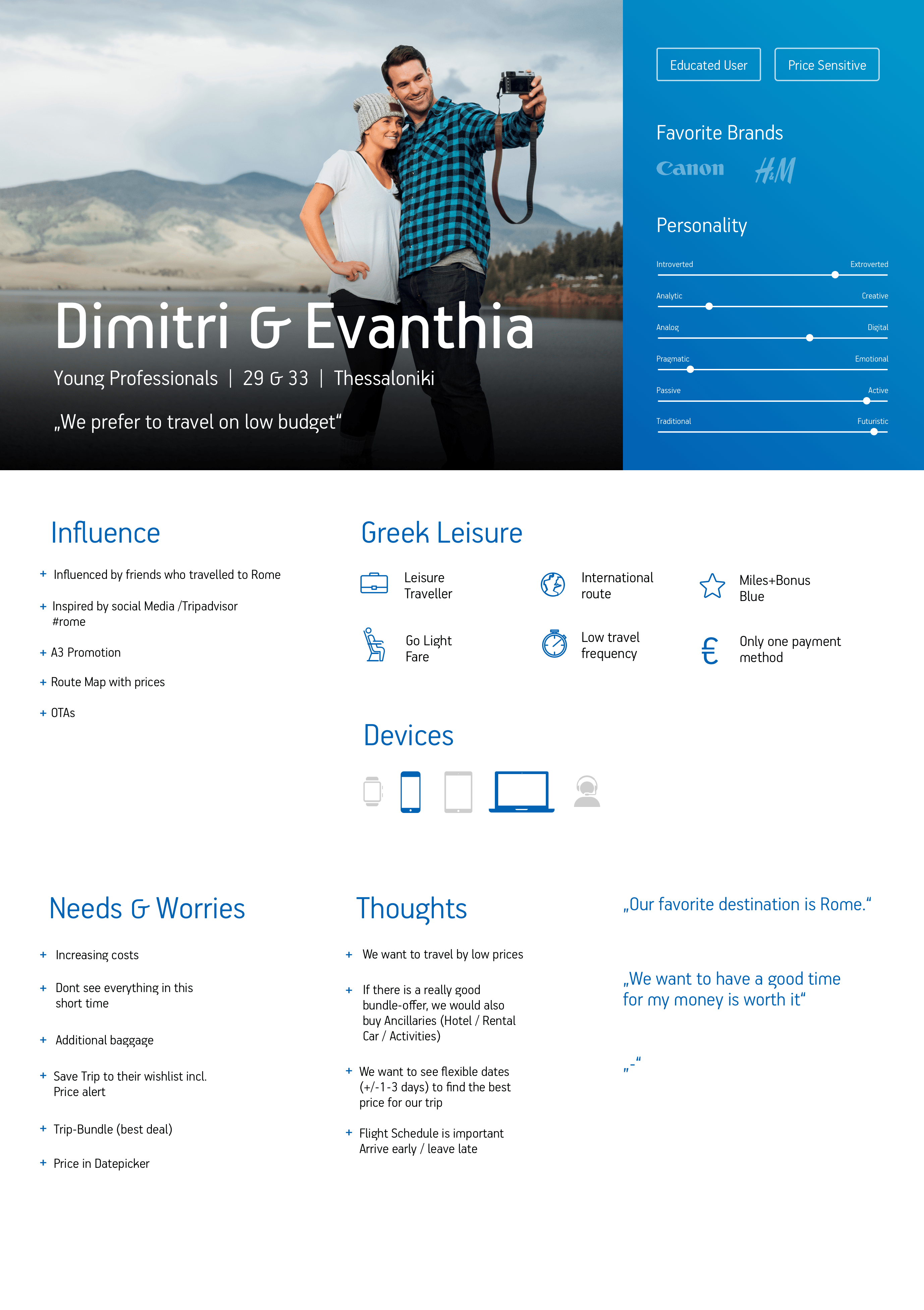
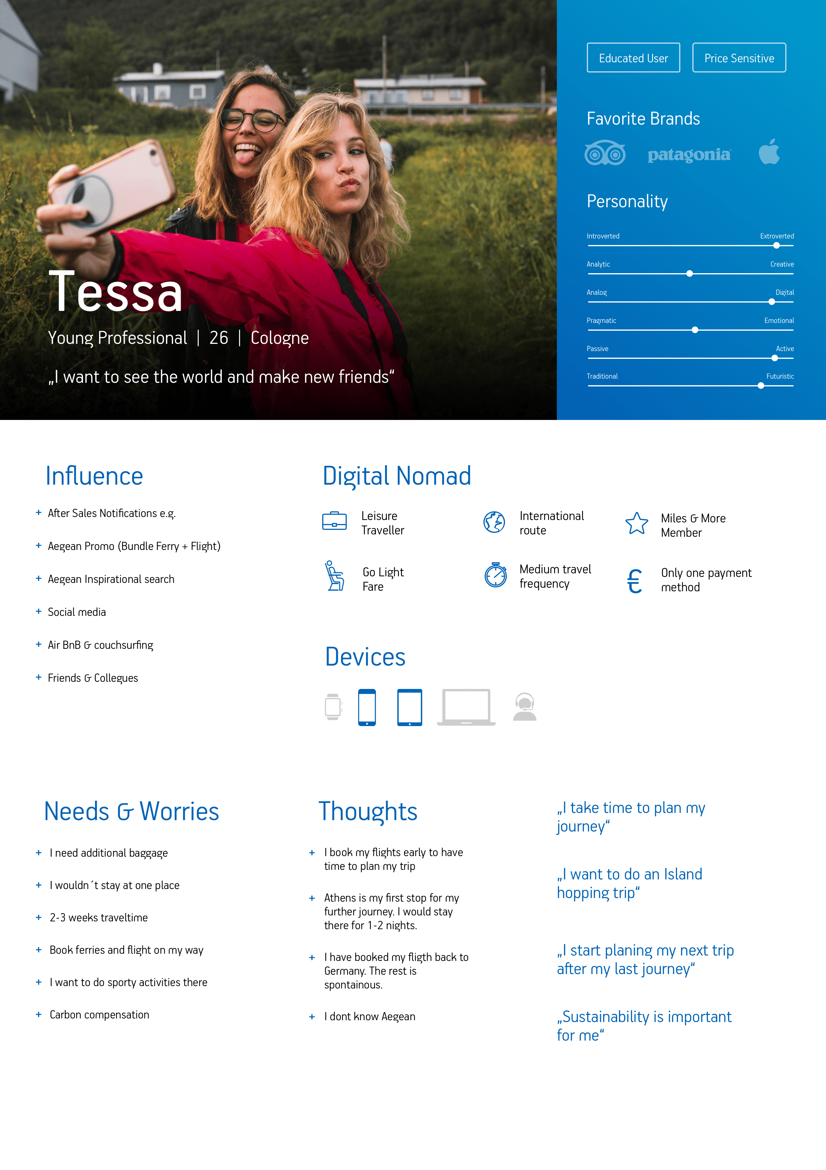
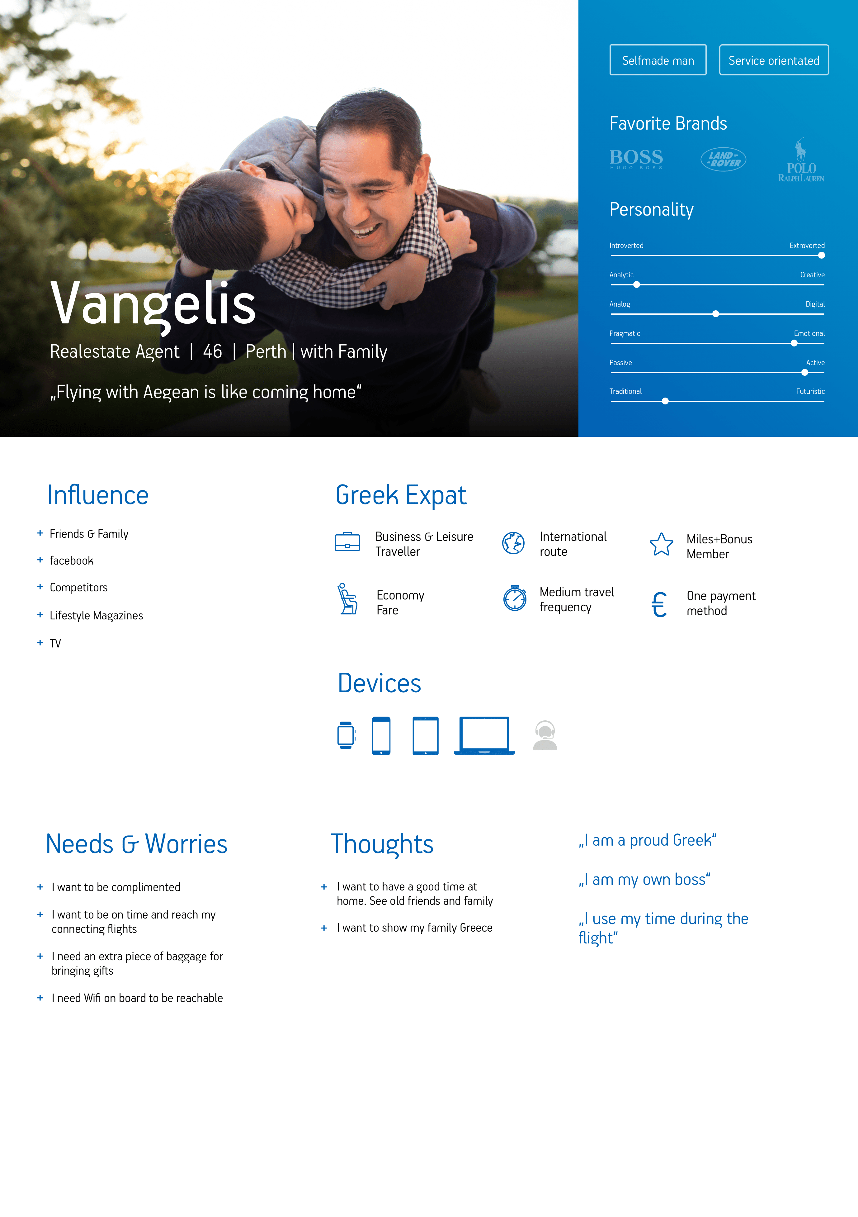
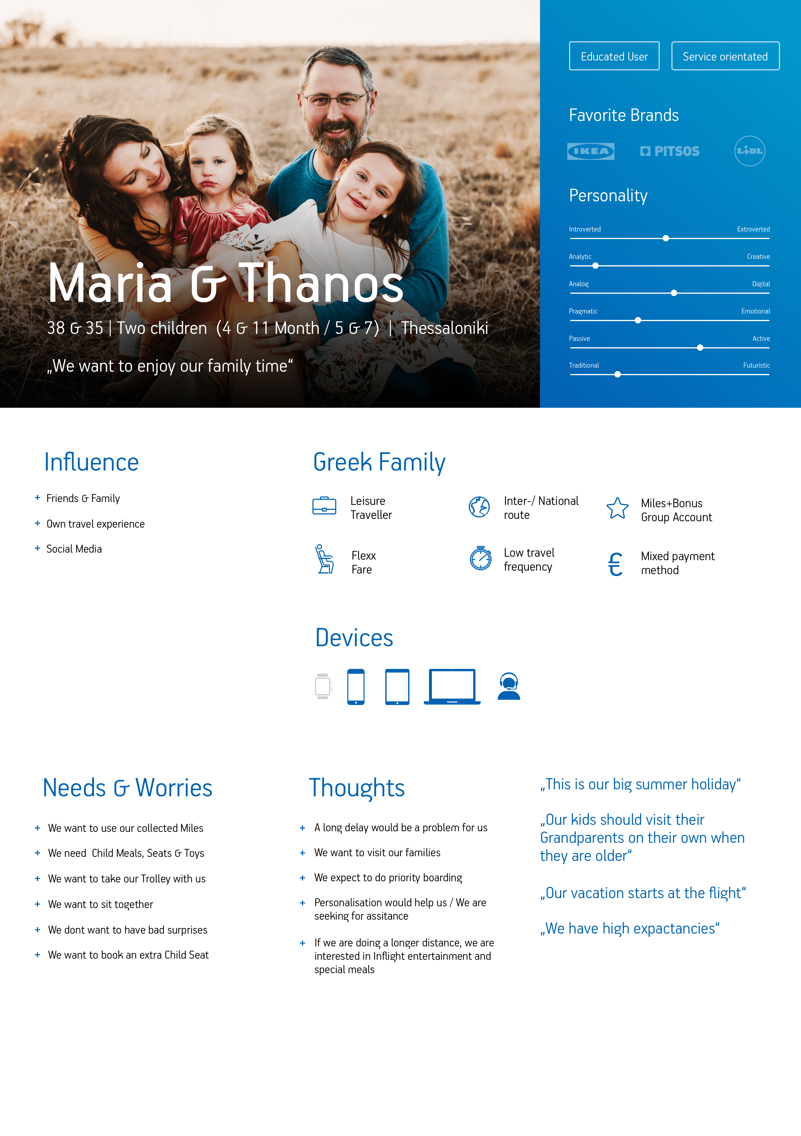
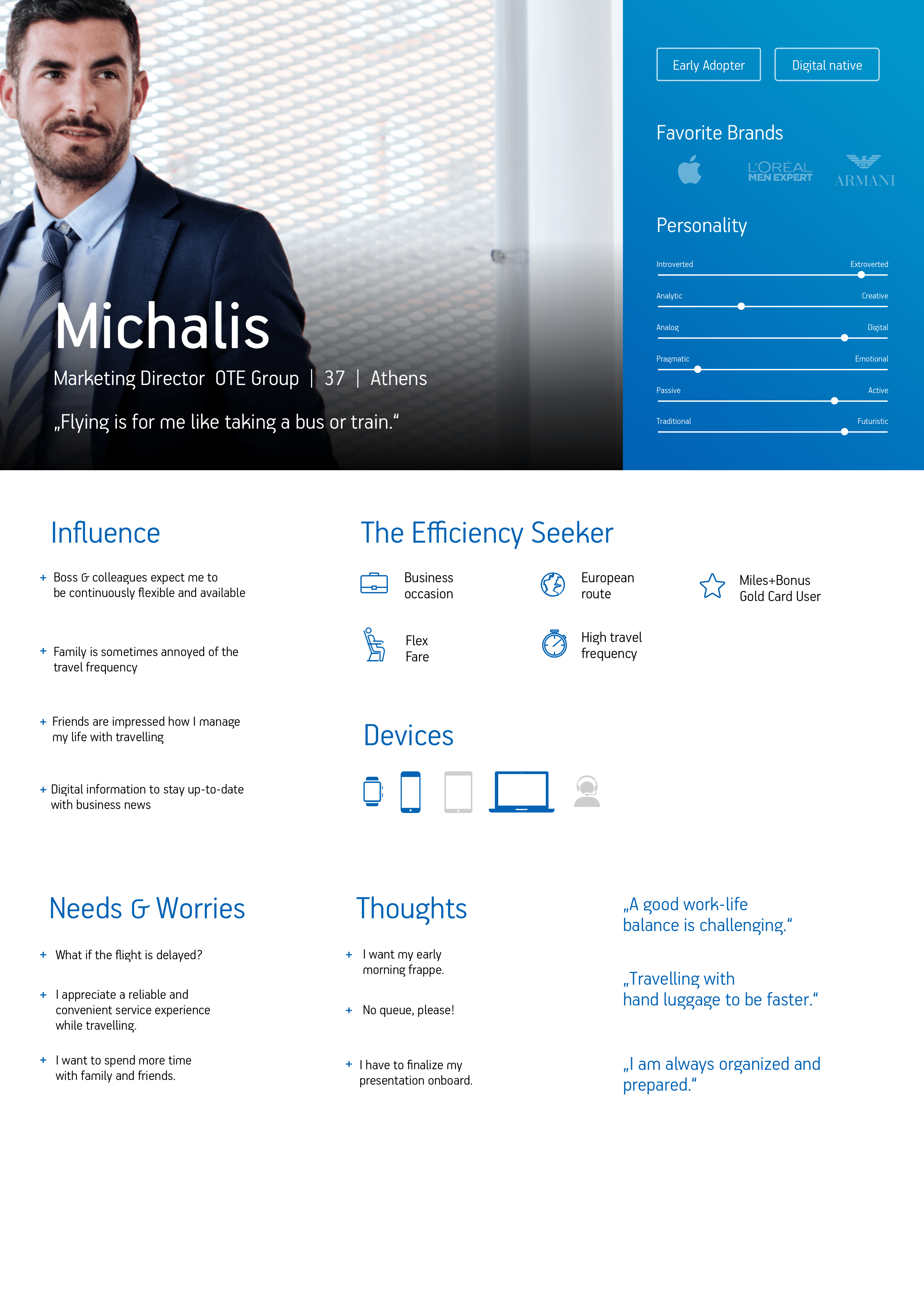
User personas
We wondered whether the booking flow could be adapted to accomodate the various different types of flyer and be fluid enough so as not to alienate a particular passenger type. Regular business travellers wanted to book their trips as fast as possible without as much thought for budget where as a family would typically want to consider budget or adding any potential extras to make a trip easier with their children. These persona types helped understand the needs and wants of customers and were taken into great consideration throughout the deisgn process.
Project Planning
The team went to Athens to visit the Aegean HQ for a kick-off workshop and to determine how we would run the project. We set out project goals and deliverables for each week with an initial foundational set of designs for the internet booking engine (IBE) process from a guest users' point of view.
The project was then split into sprints, with the first review to asess the IBE designs and kick off the Manage my booking (MMB) and Check-In (CKI) flows. We aimed to conduct testing 4 weeks in, carry out any refinements and get started on a base UI design for the product.
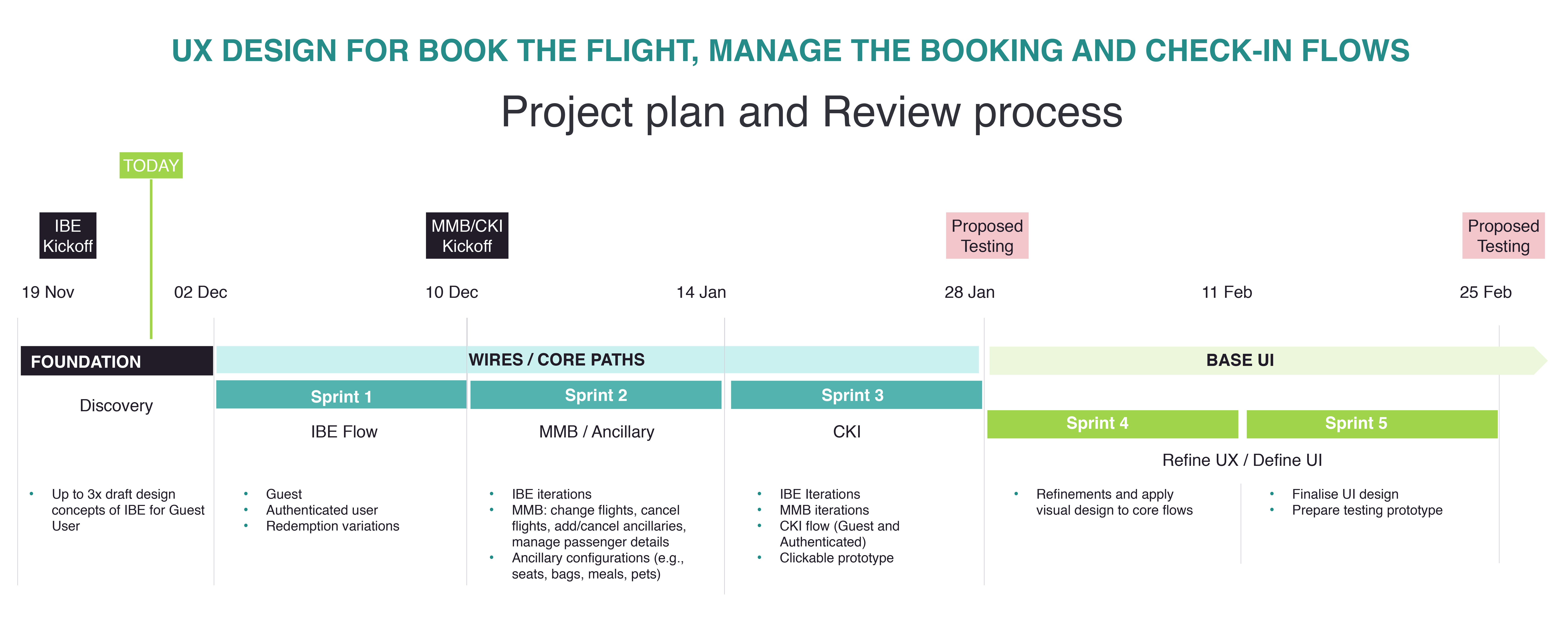
Aegean had previously enlisted a design company to draw up some designs for their new booking project but were not satified with them, feeling that they were too similar to that of an existing competitor airline. At the kick -off meeting we used these designs as a review point, assessing the pro's and cons of the ideas and yaking away any good ideas they may have included.
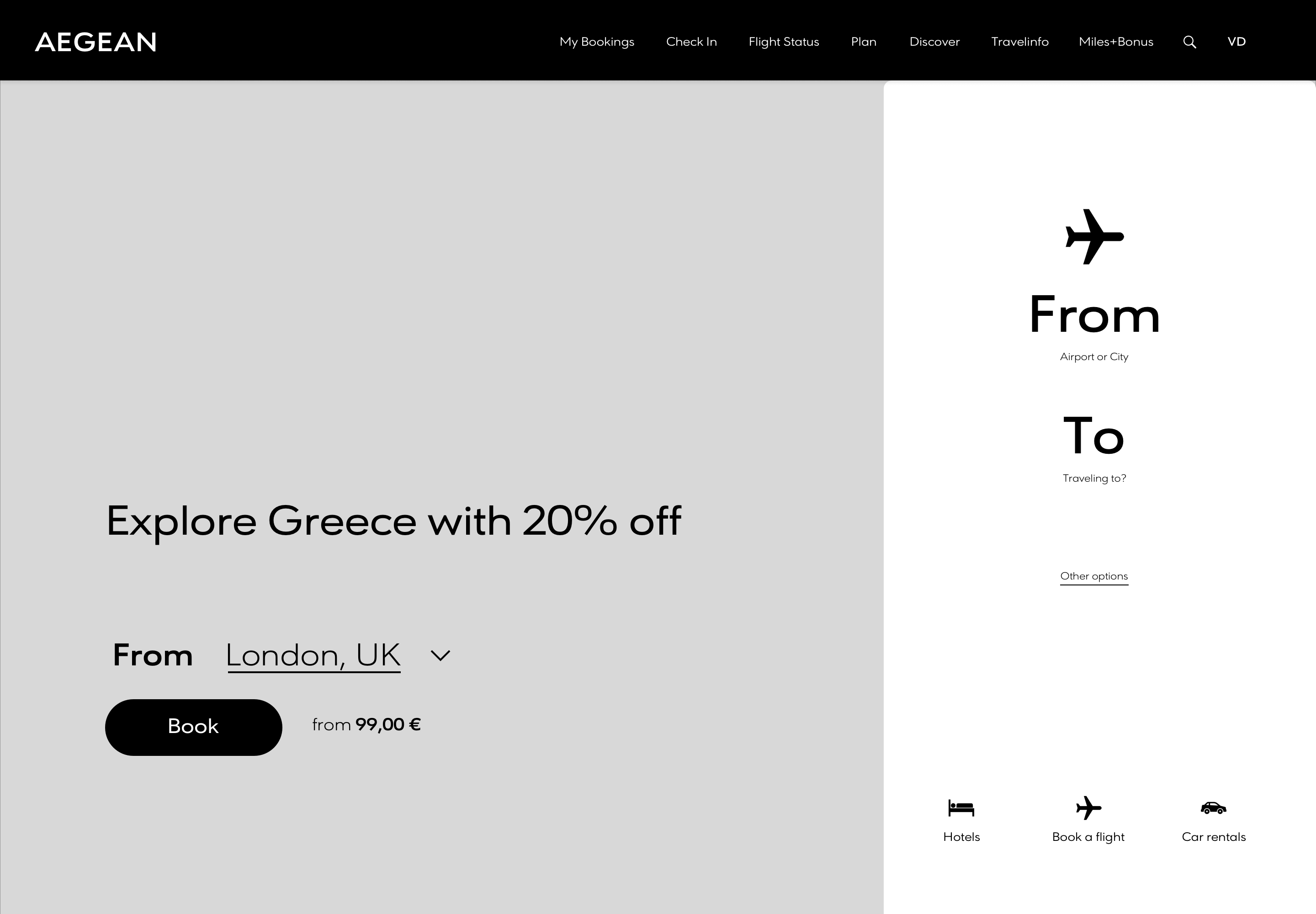
Foundation designs
The first decision we made for the foundation designs was to simplify the wireframes by removing all colour and imagery, unlike the previous colour designs. A lot of feedback from the kick-off workshop was centered around stylistic points and this was a distracton from the overall functionality goals we needed to set out.
After the initial kick-off we reviewed the minutes and the agreed timeline internaly and set about each individually designing wireframes. We then held internal meetings to share our ideas, discuss and review them and merge the best parts of each to create a final design. It was decided that mobile frames would be commenced once a footing was grounded in desktop.
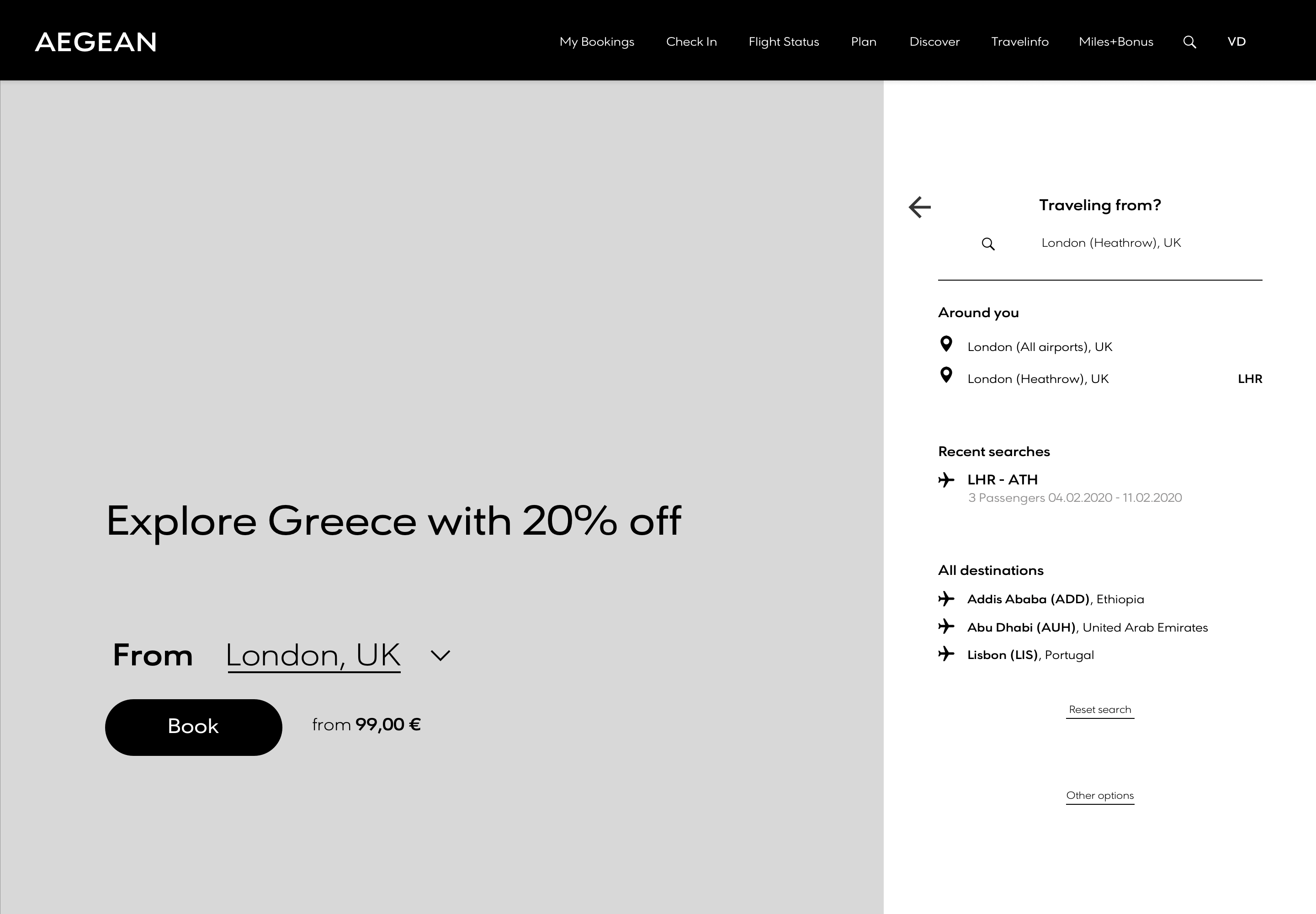
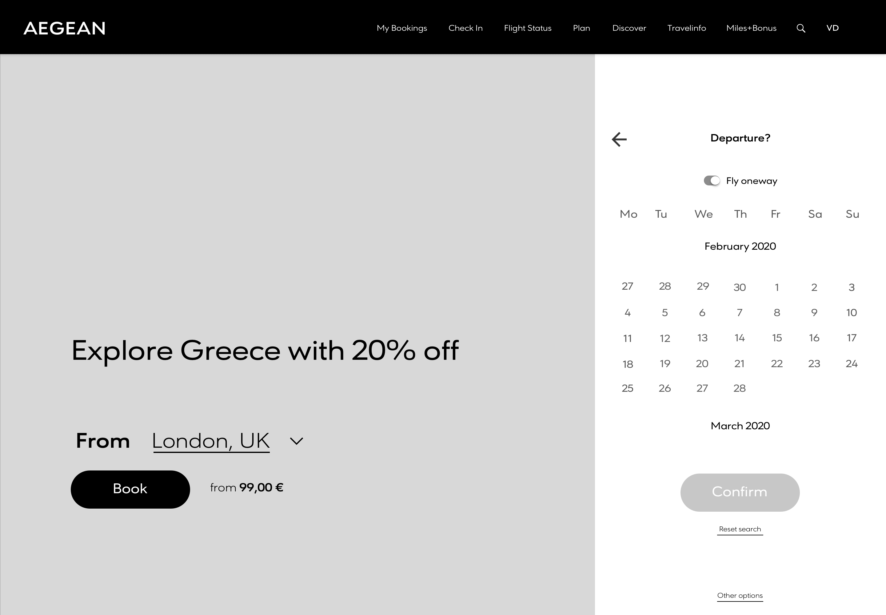
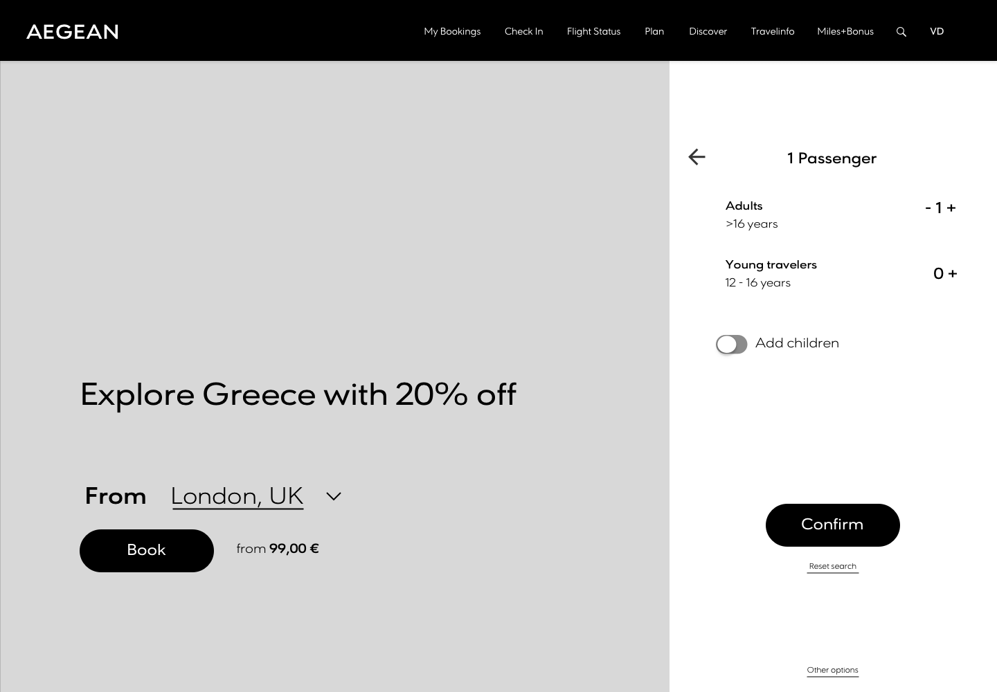
User flows
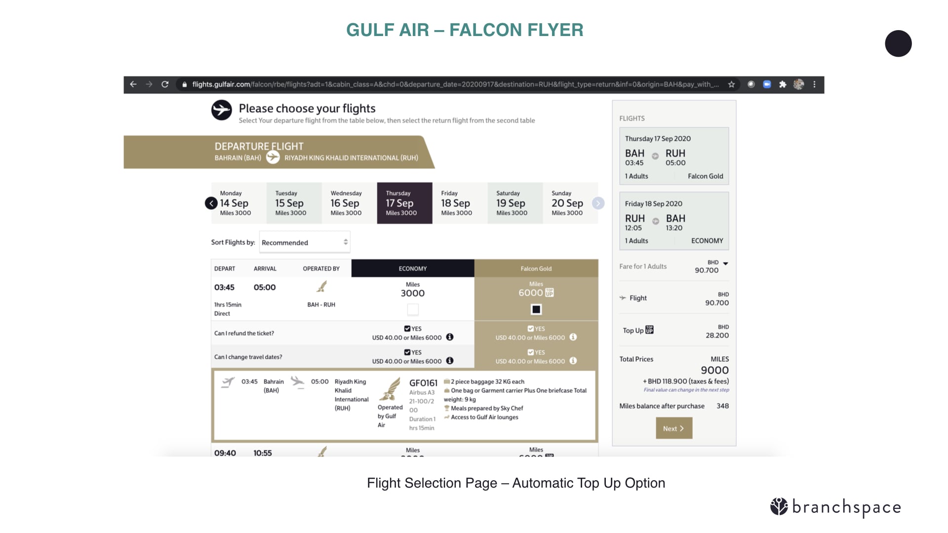
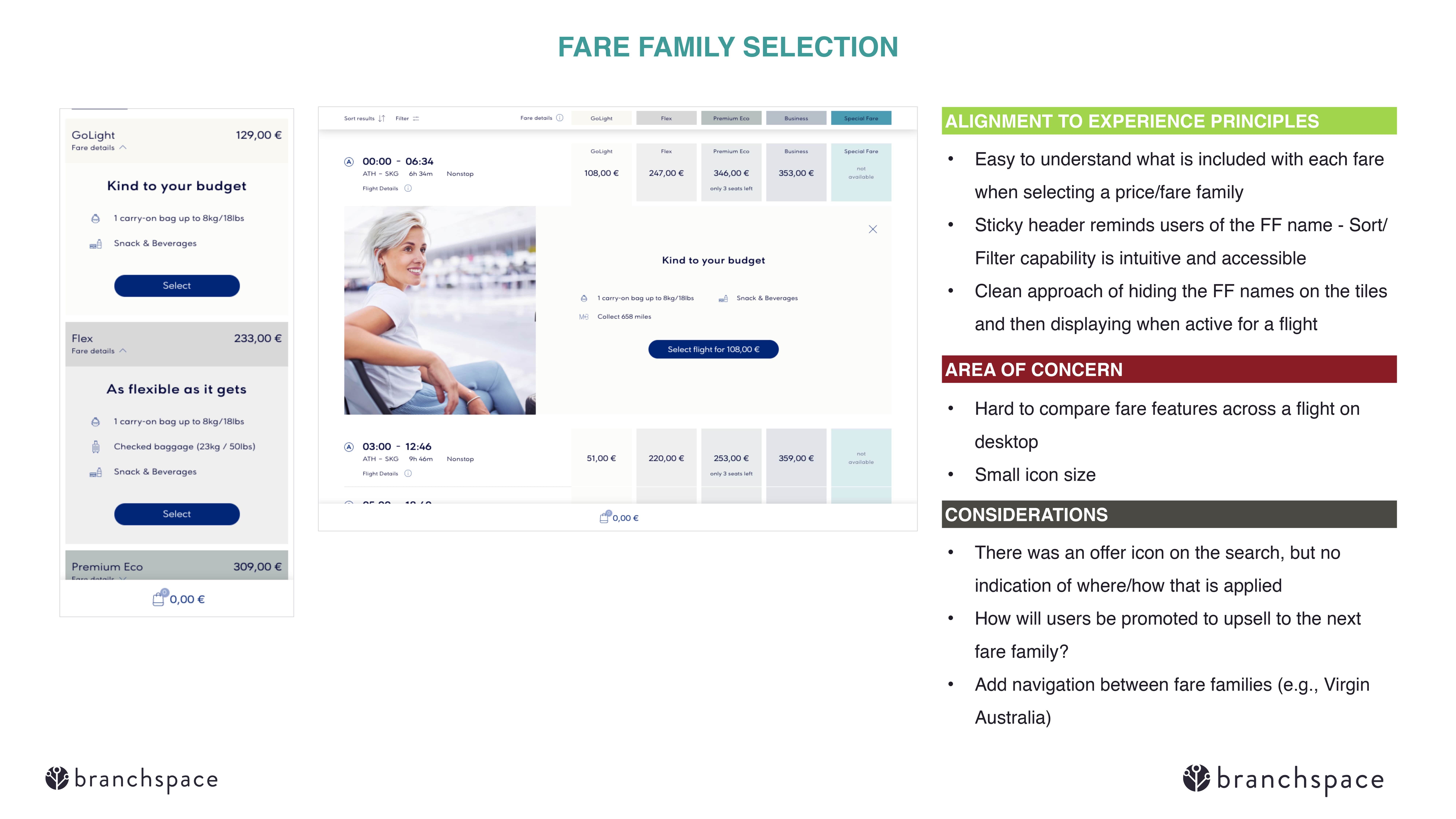
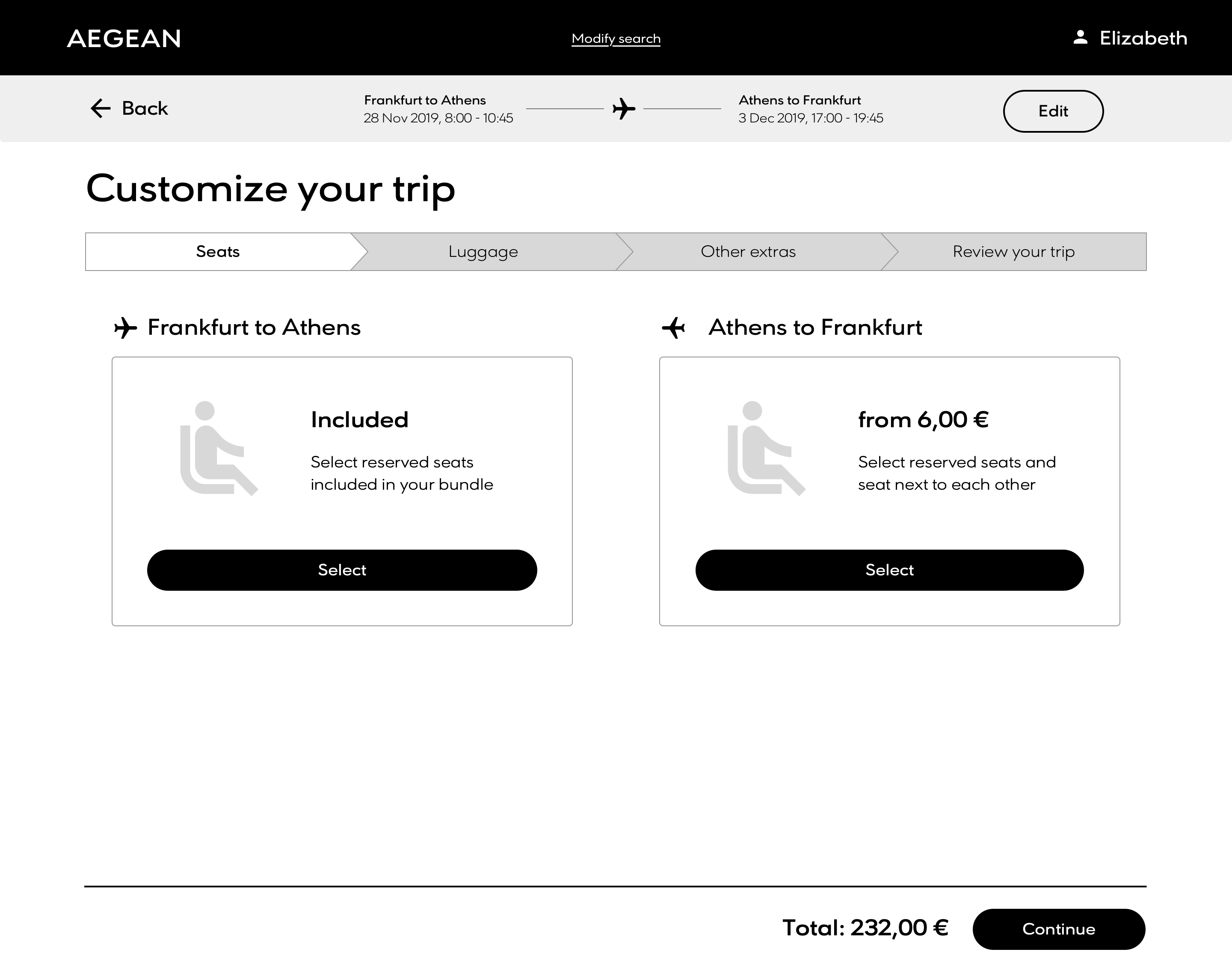
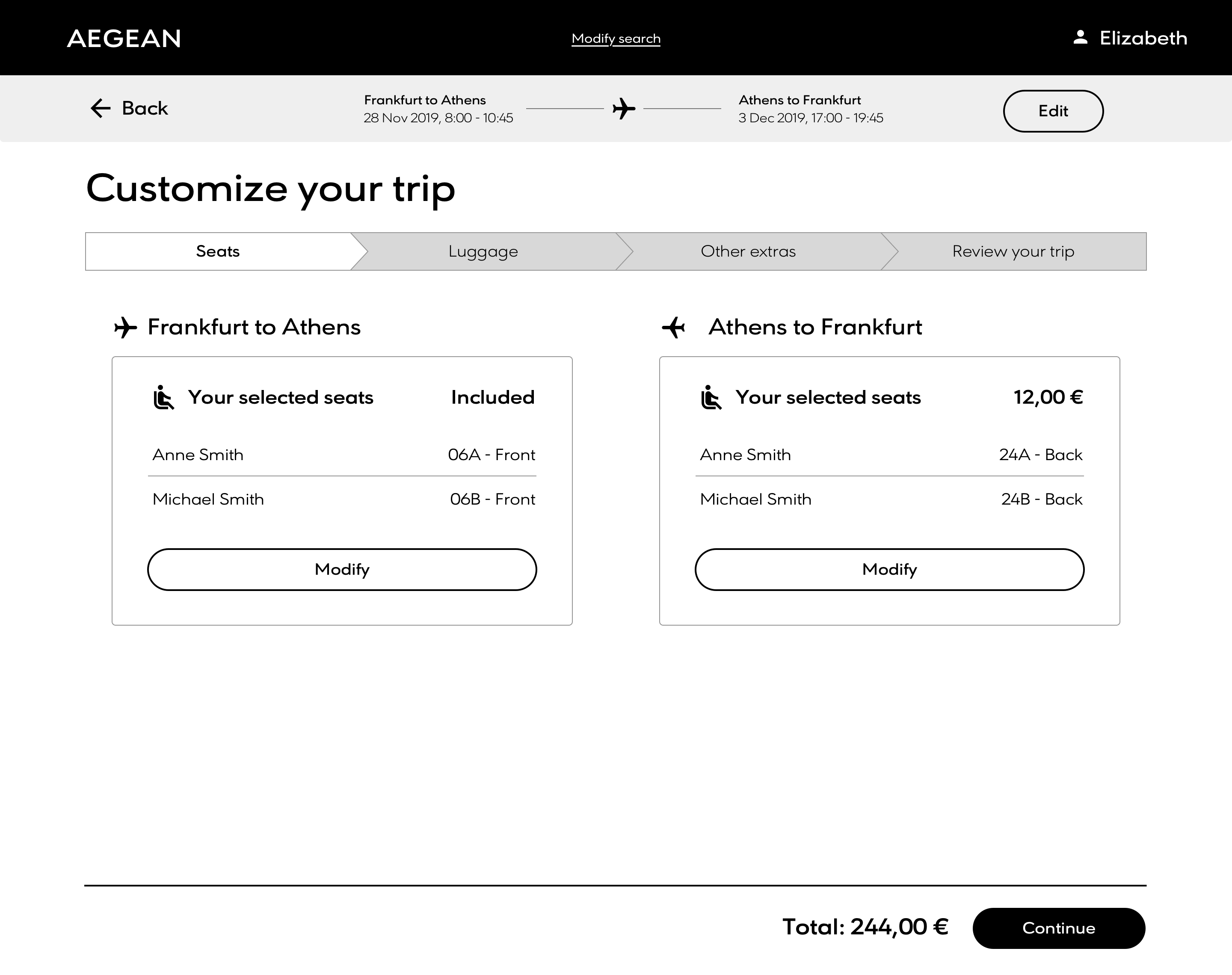
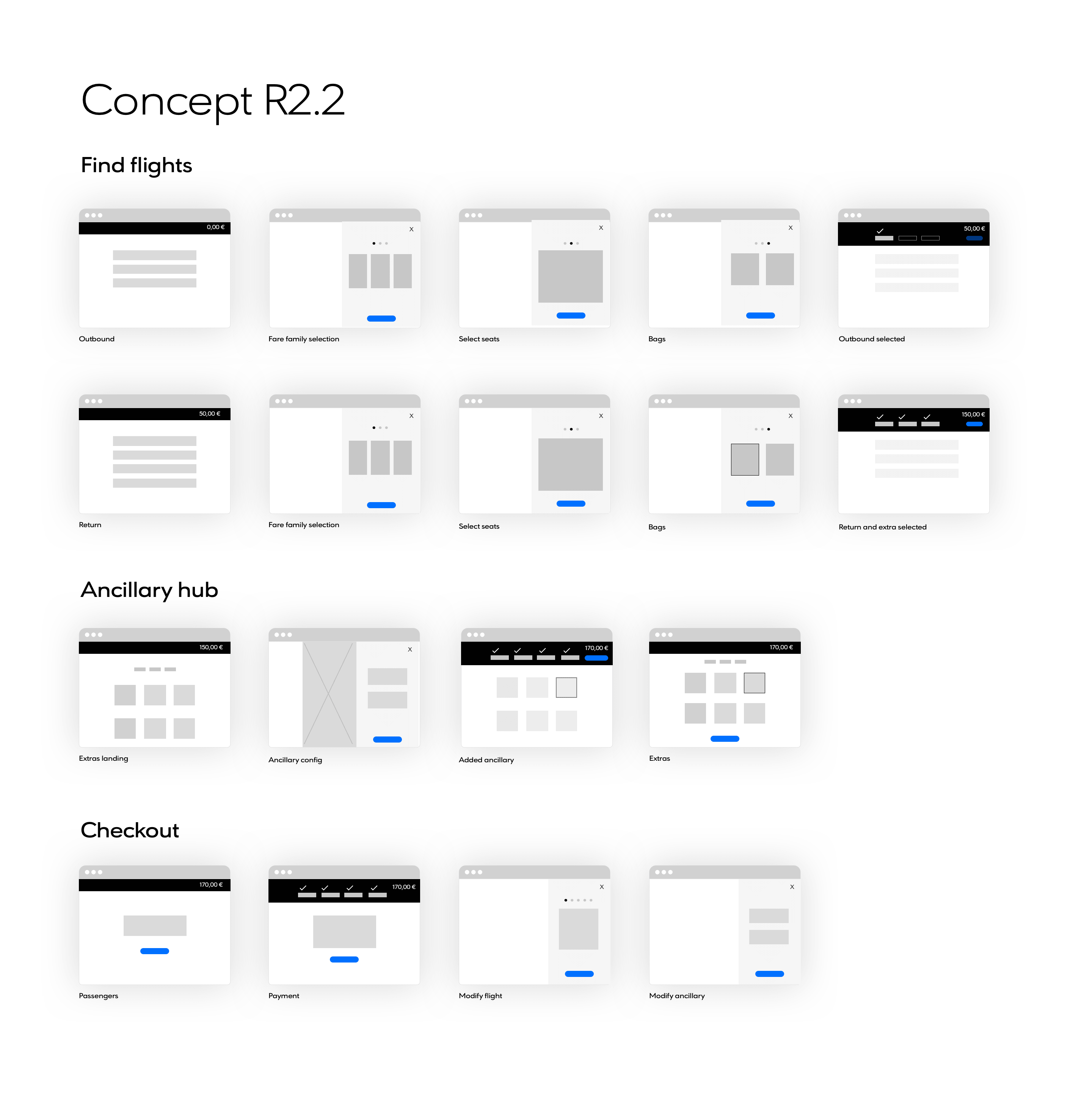
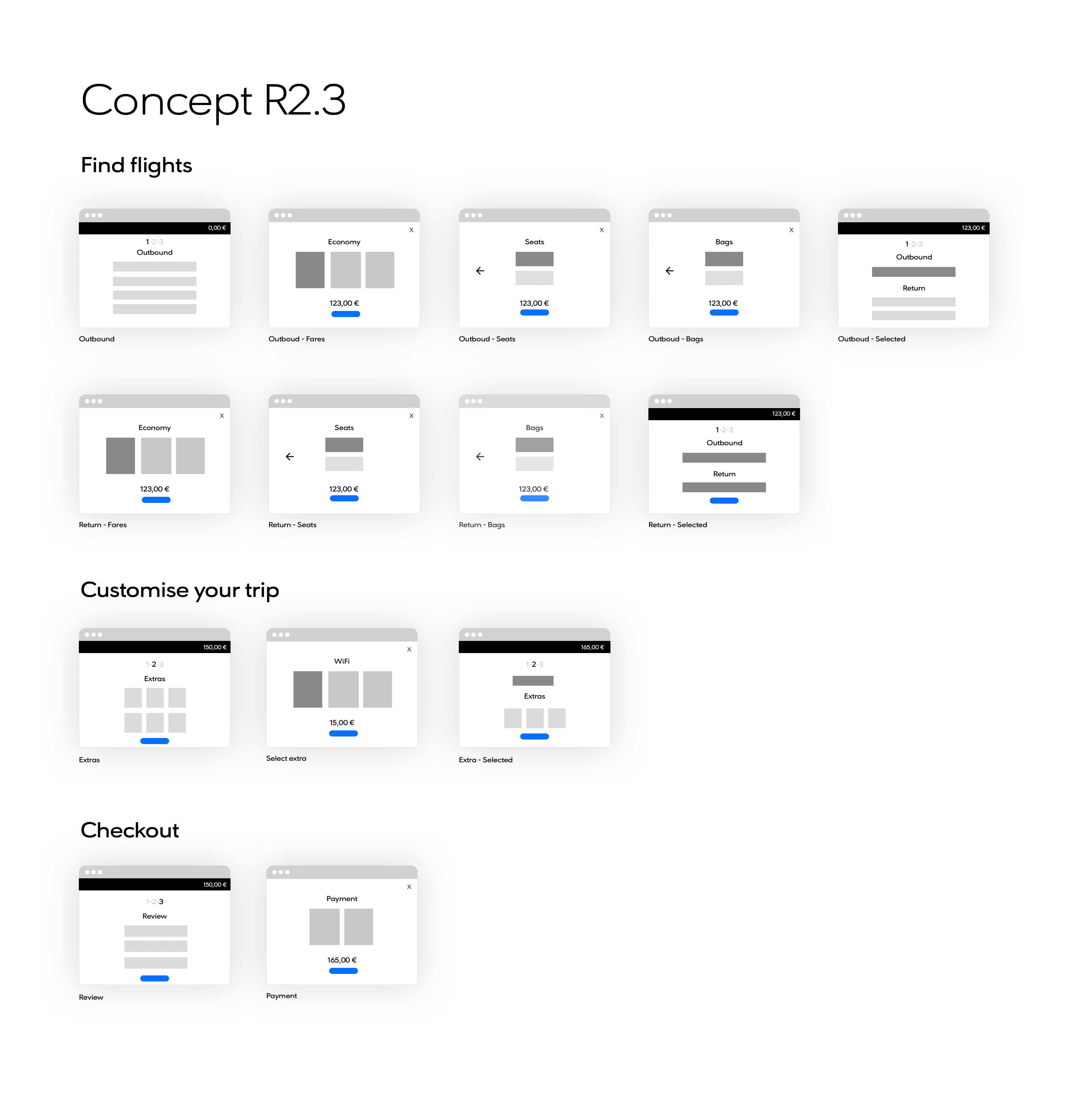
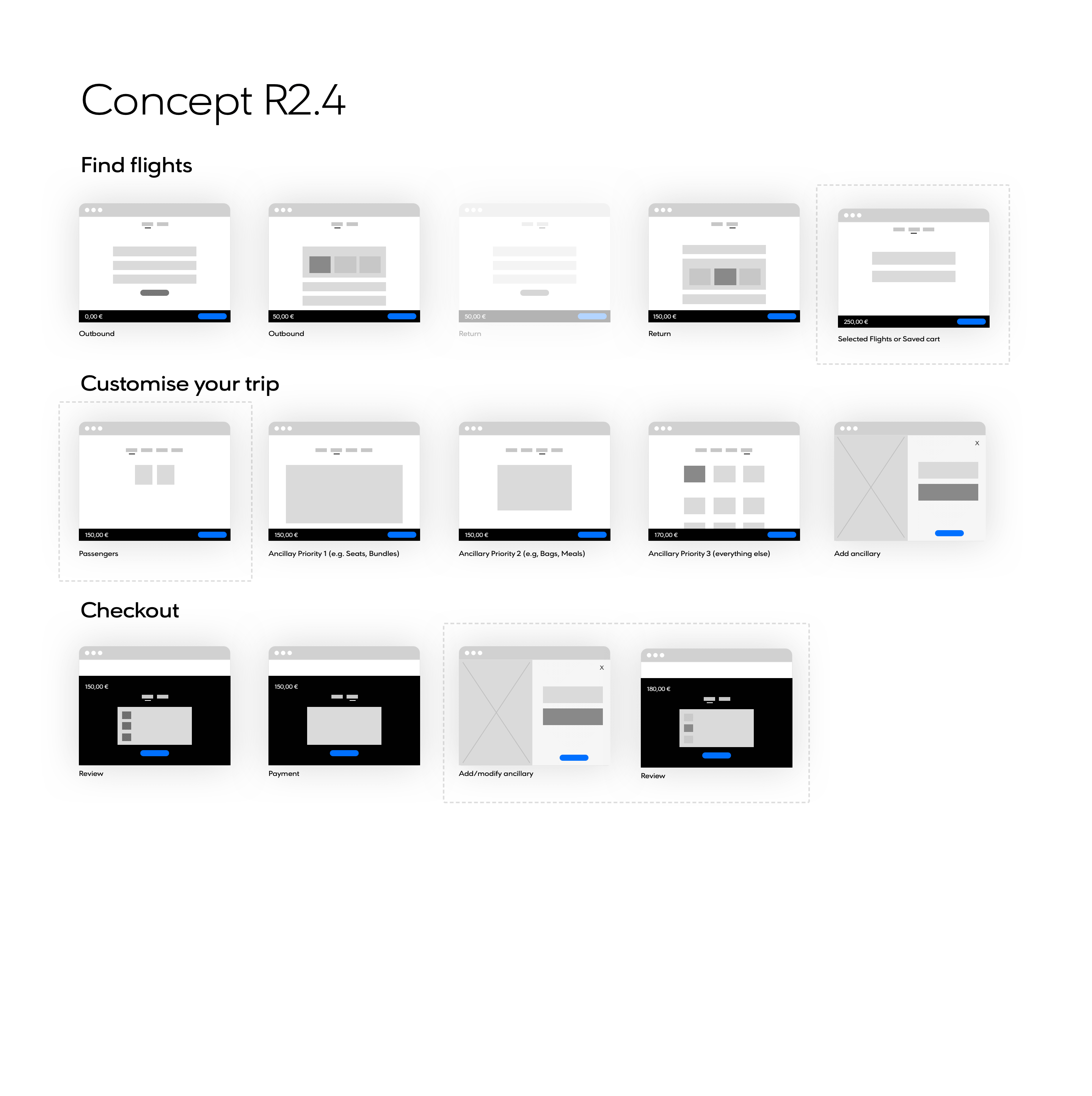
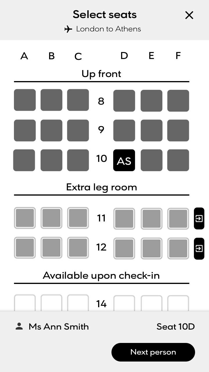
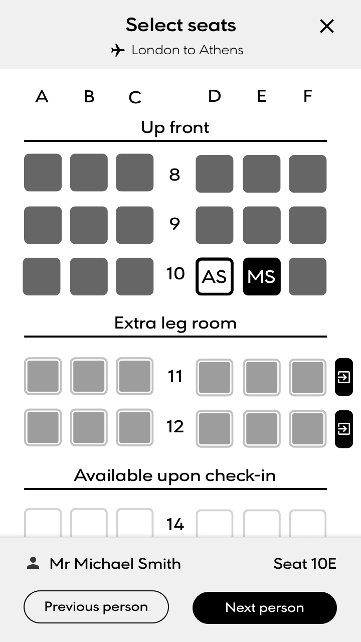
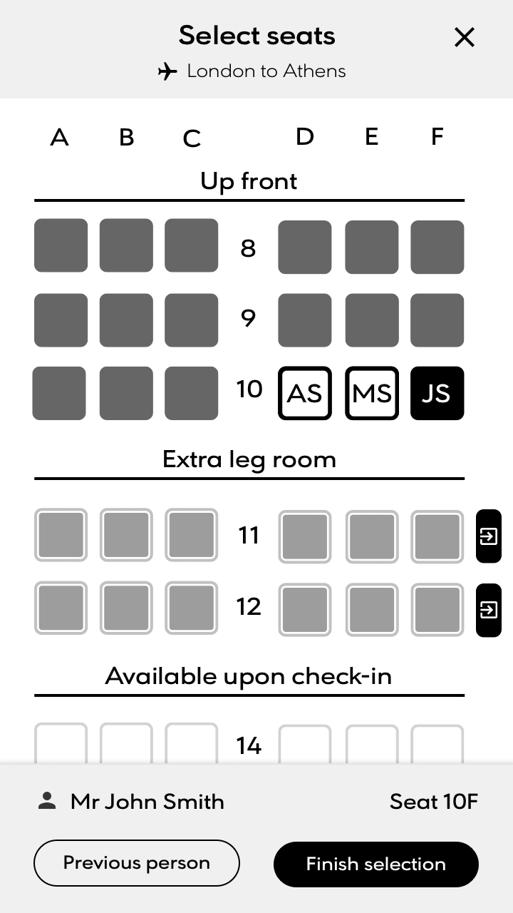
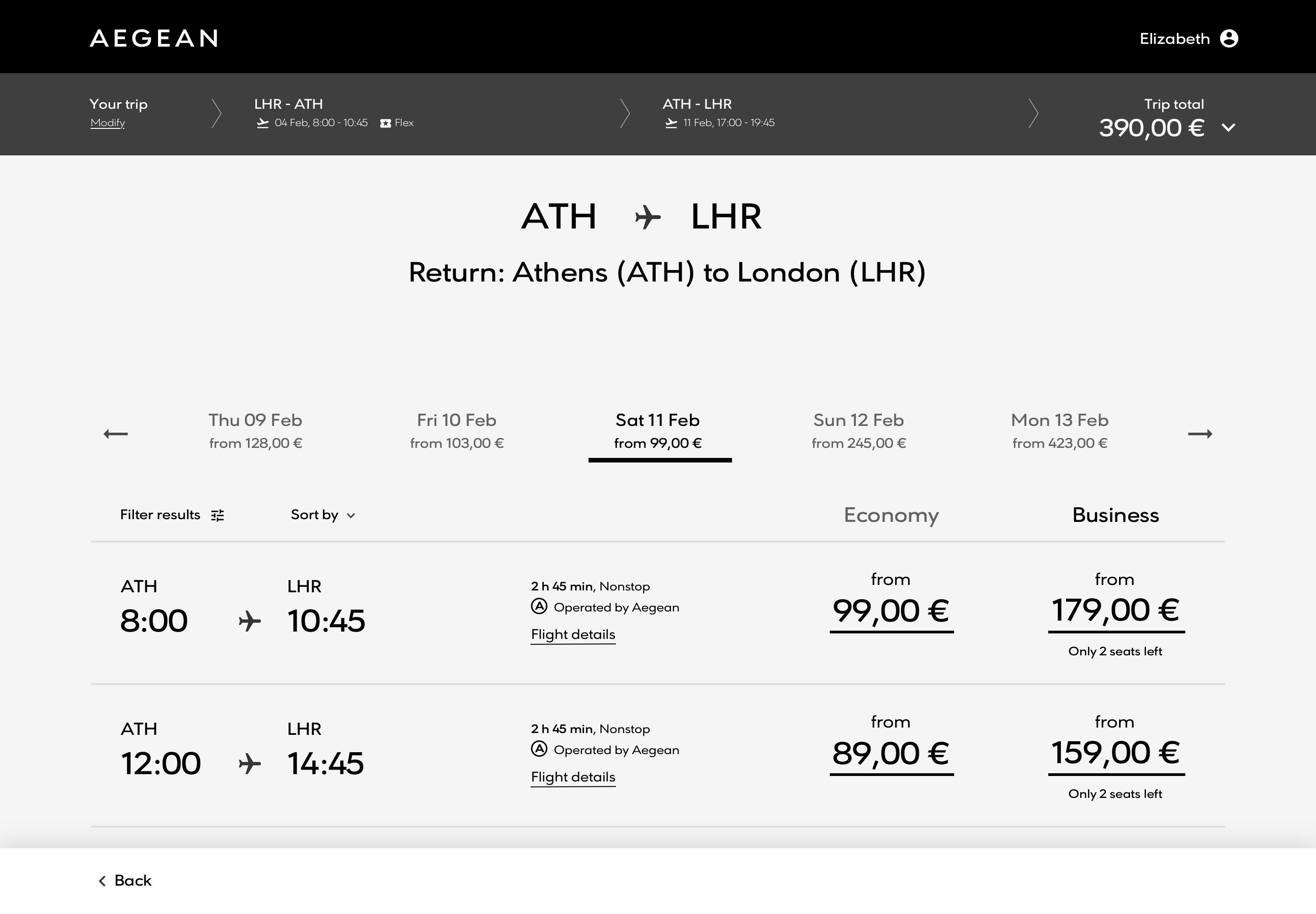
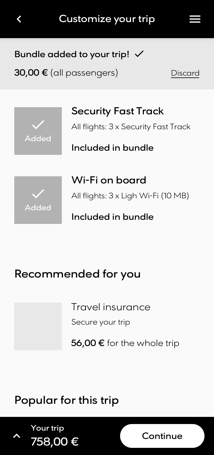
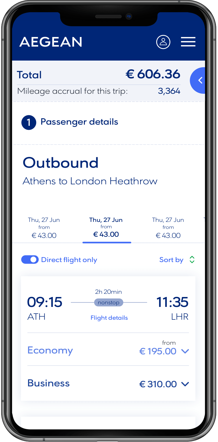
Below are 2 examples user flows for a economy and business travellers. Although essentially the overall flow of the booking would be the same process from user to user, the direction of user choices would determine the products and offers shown. A business traveller may be offered a bundle more appropriate to their typical needs such as faster boarding or wifi on board where as a family may be offered meals.
Certain fares come with extras as standard which meant certain stages of the flow would require different outcomes. An economy traveller would be given the opportunity to select a seat for both bounds at a cost, where as a business traveller would get seat options included. This meant ordering the process via fare type and this is how the direction of the flow was determined.
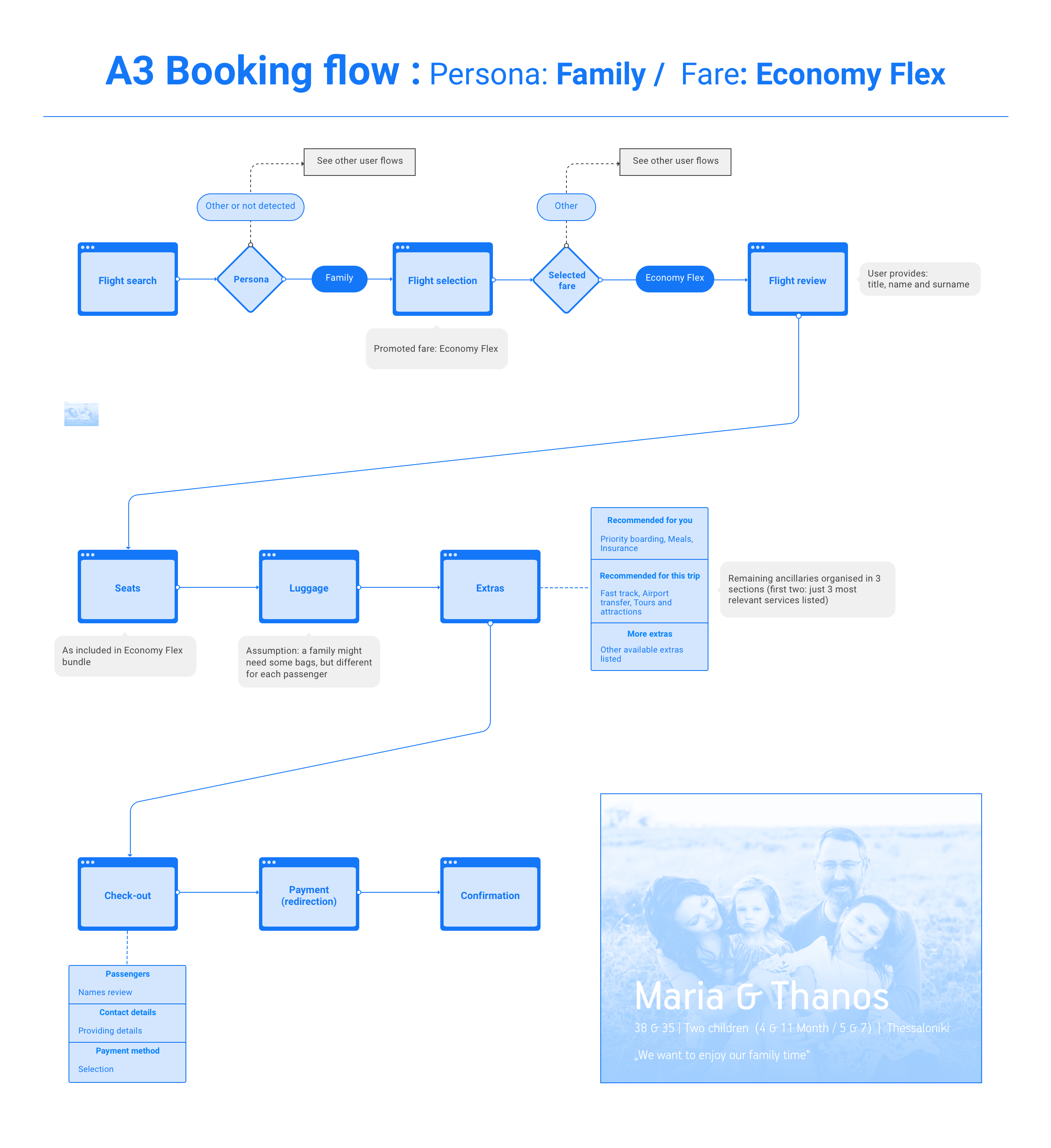
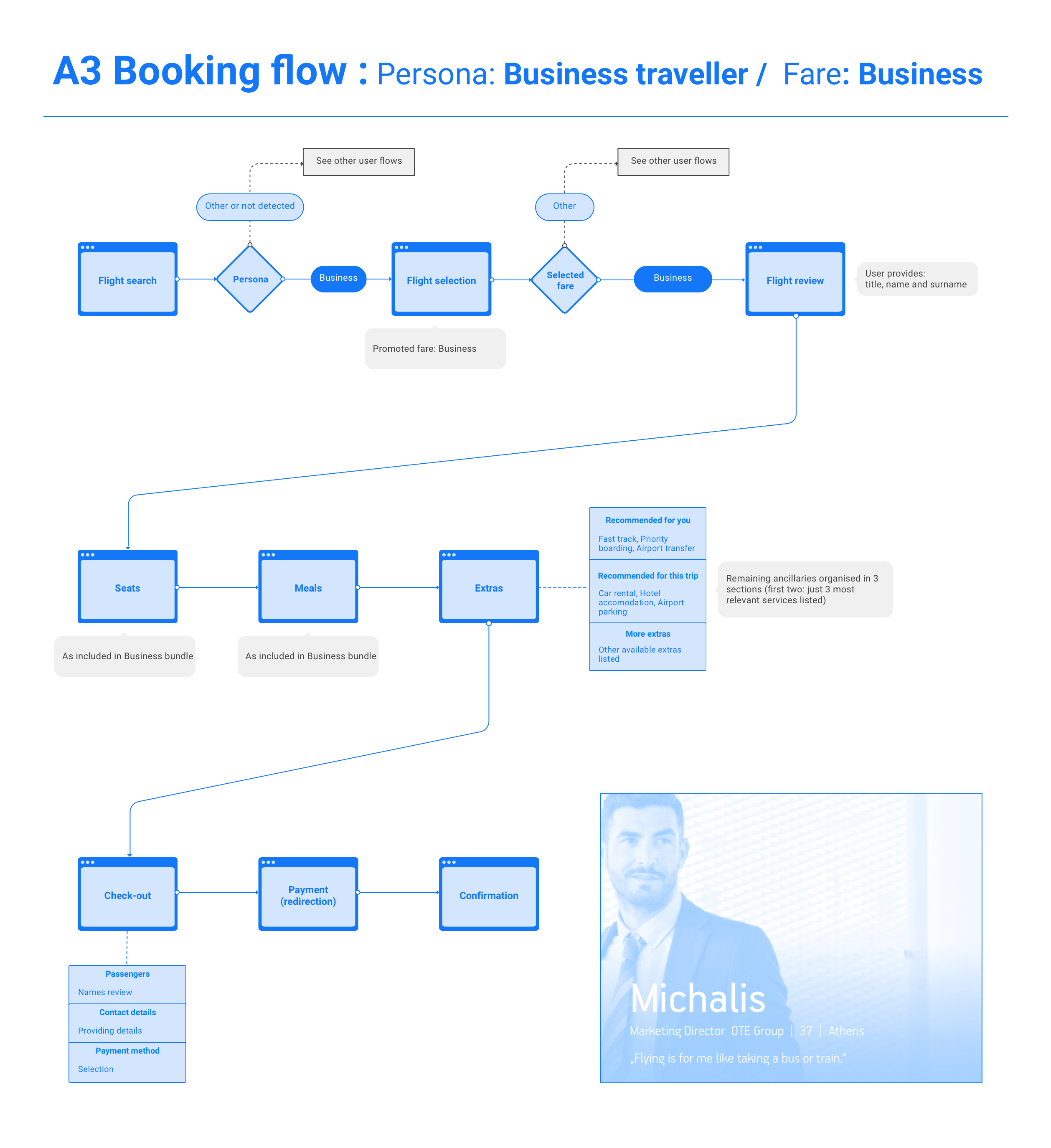
Concepts were thought out to explore different options of how the flow would run. We didn't want to incur any page refreshes and wanted any information displayed to be transitioned on the page smoothly and in the least intrusive way. The way information was displayed was always being scrutinised and presented to Aegean for review.
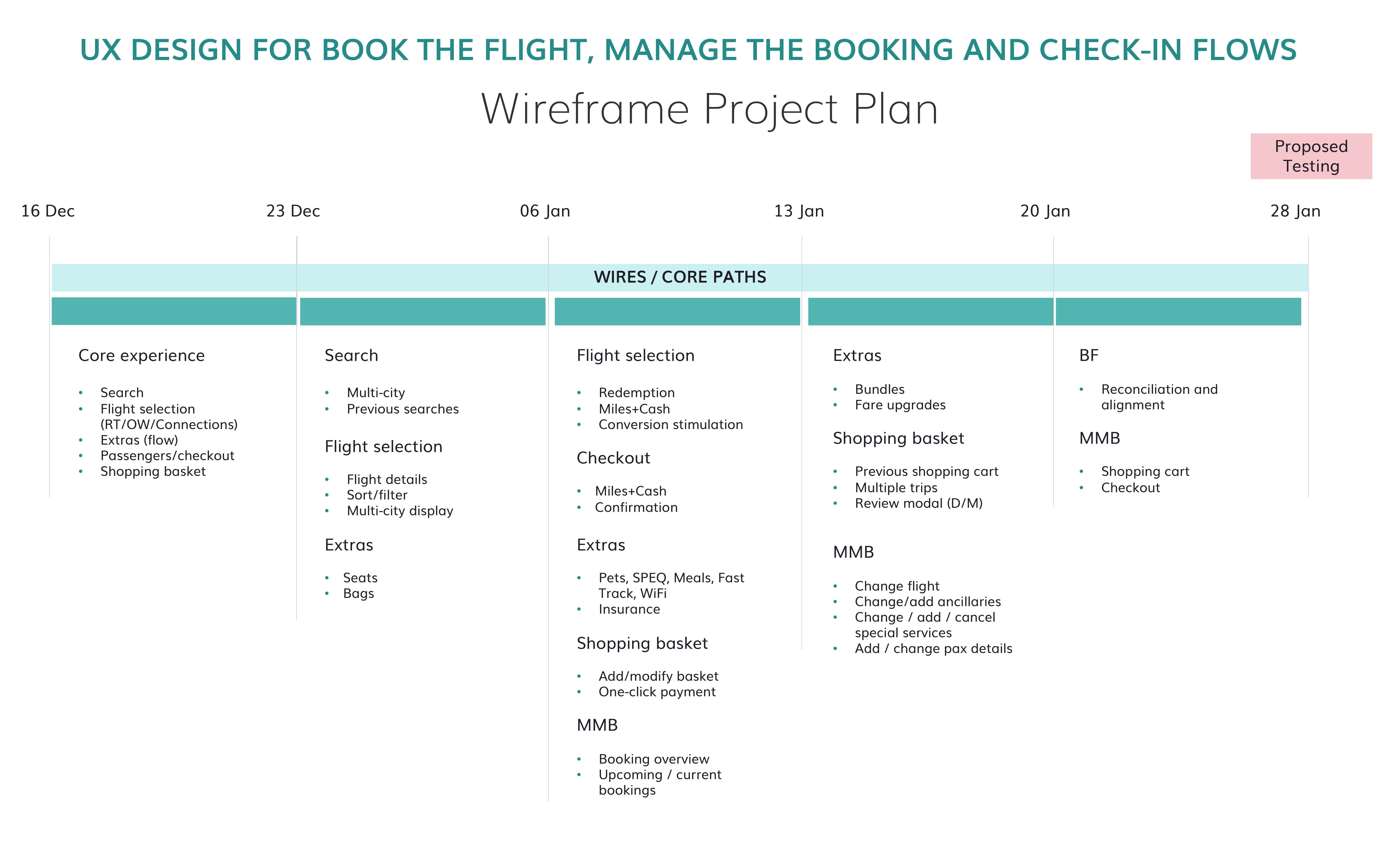
Sprint 1 review: Expanding designs, adding mobile
Moving forward from the initial designs, we continued to explore options for flight selection and how to display the available flight options of the desired parameters. The first seat selection design was included and payment summary screens were included for review by the Aegean stakeholders.
The first incarnation of mobile designs appeared including sticky footer overlays to display selection information and CTA's to proceed to next steps in the booking flow. As was mentioned in the first sprint review, trying to make the interface not look too cluttered would be a consistent challenge throughout the project.
Sprint 2 review: Core experience and feature expansion
The wireframes were broken down into a proposed timeline with the core flow being the priority and the more complex assets to be added over the coming weeks. The original kick-off meeting had given us a clear idea of what the stakeholders were looking for and we pressed on with variations of the core elements to reach their vision for the experience.
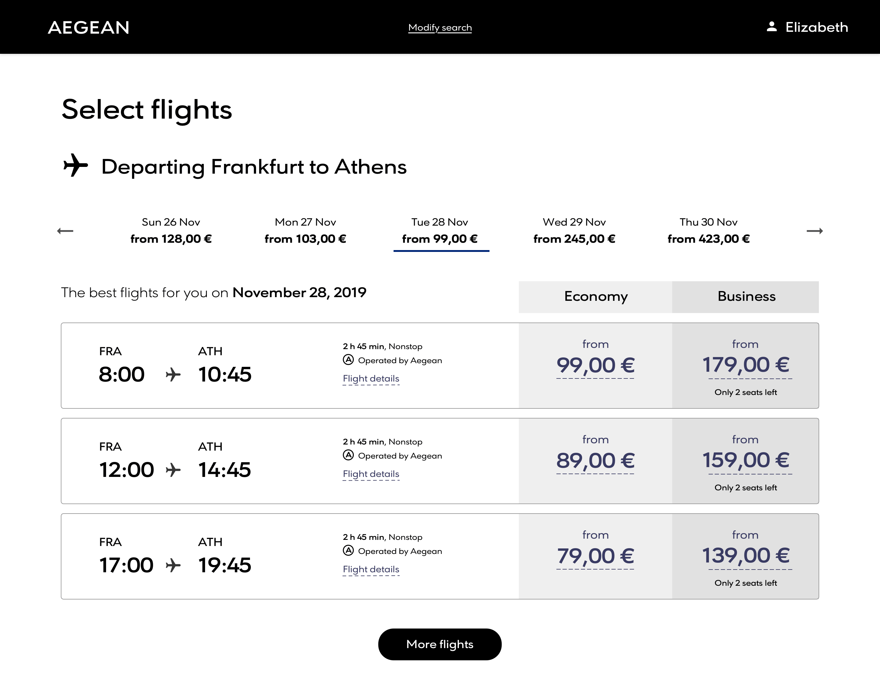
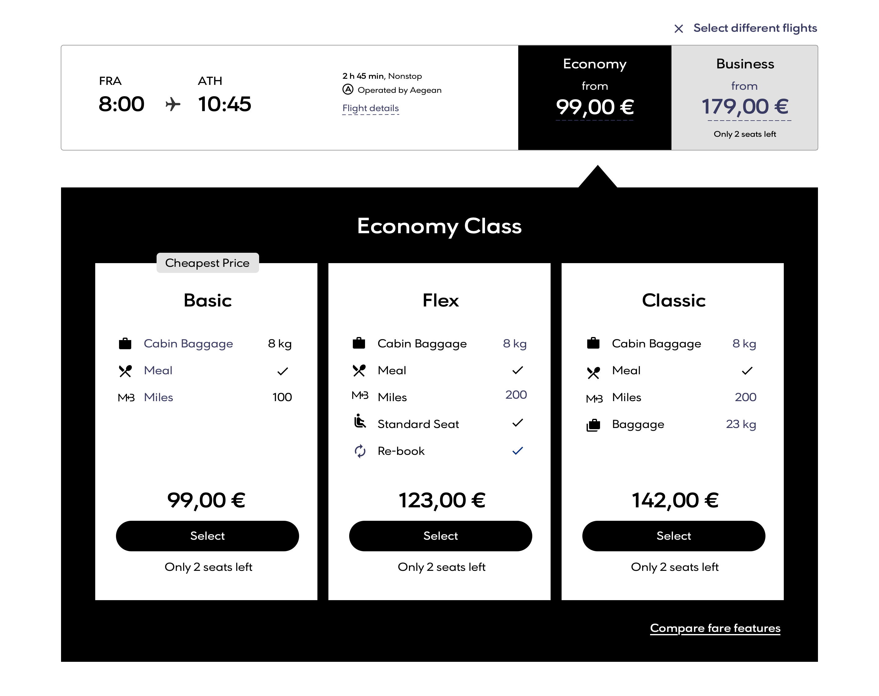
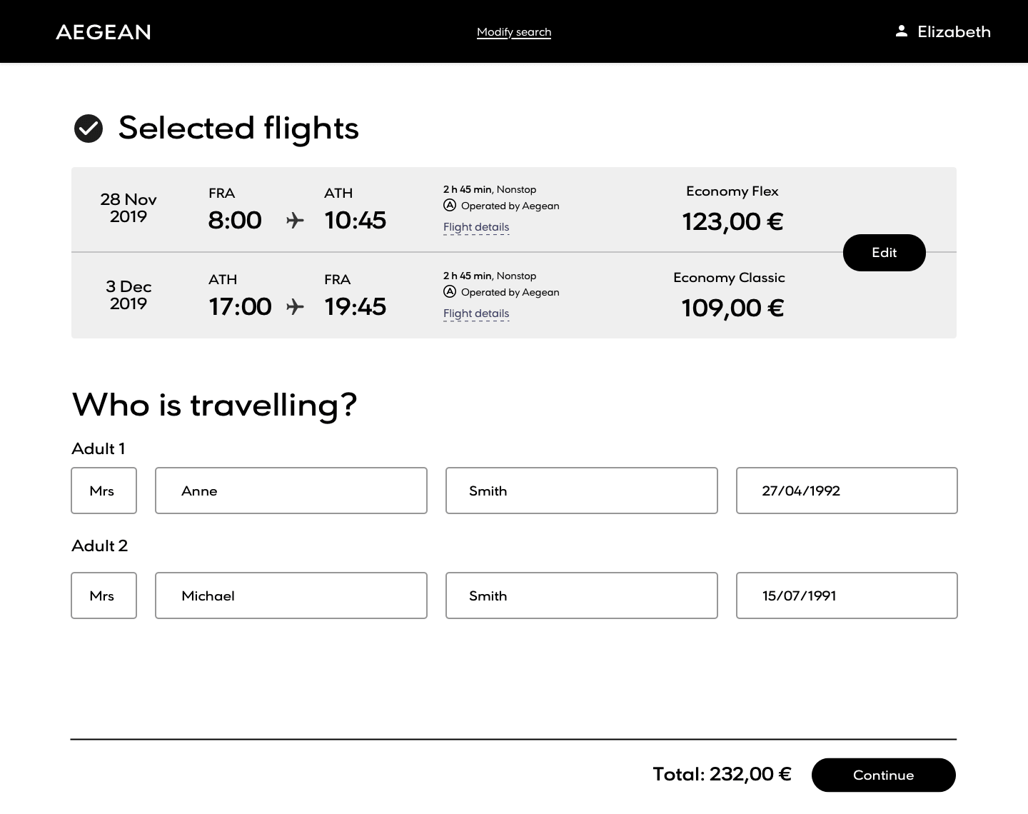
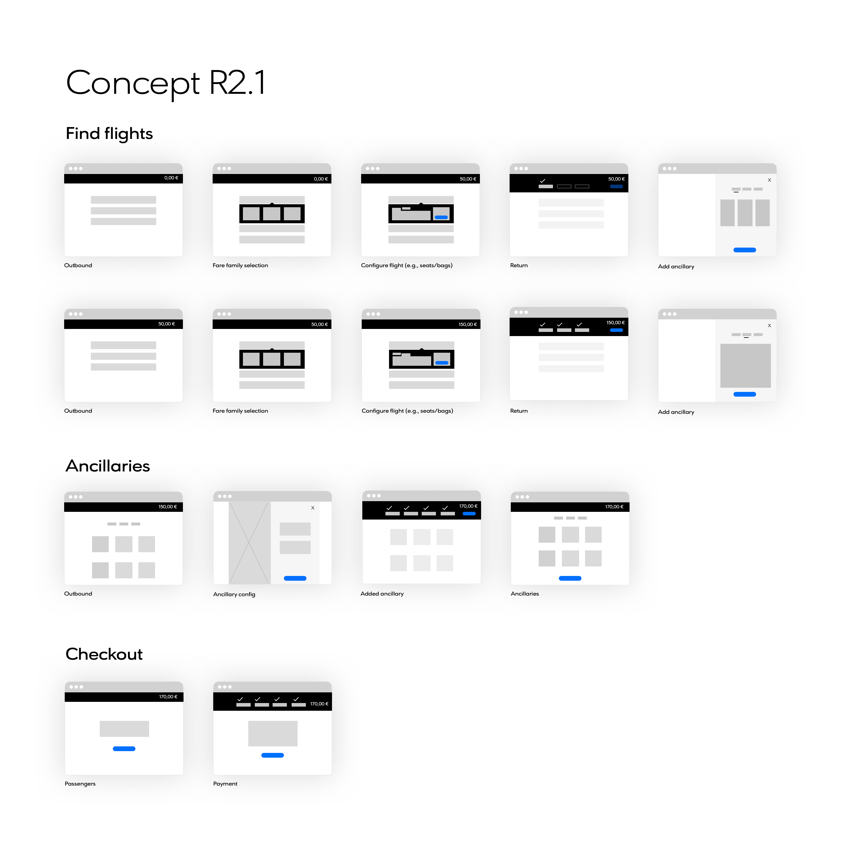
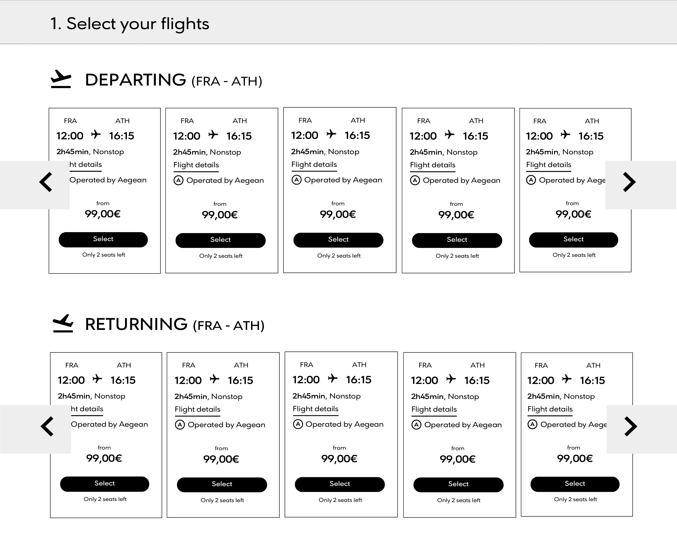
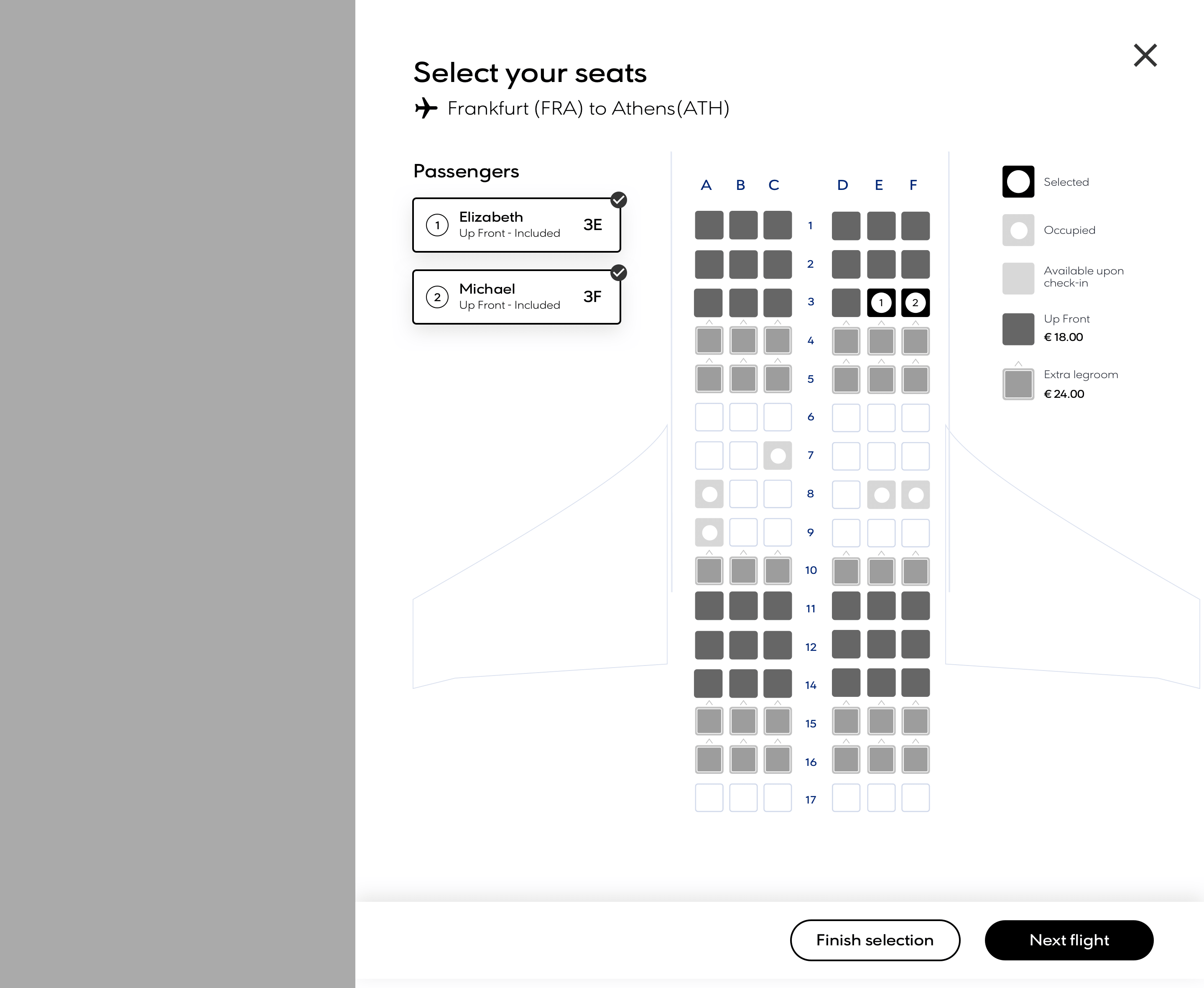
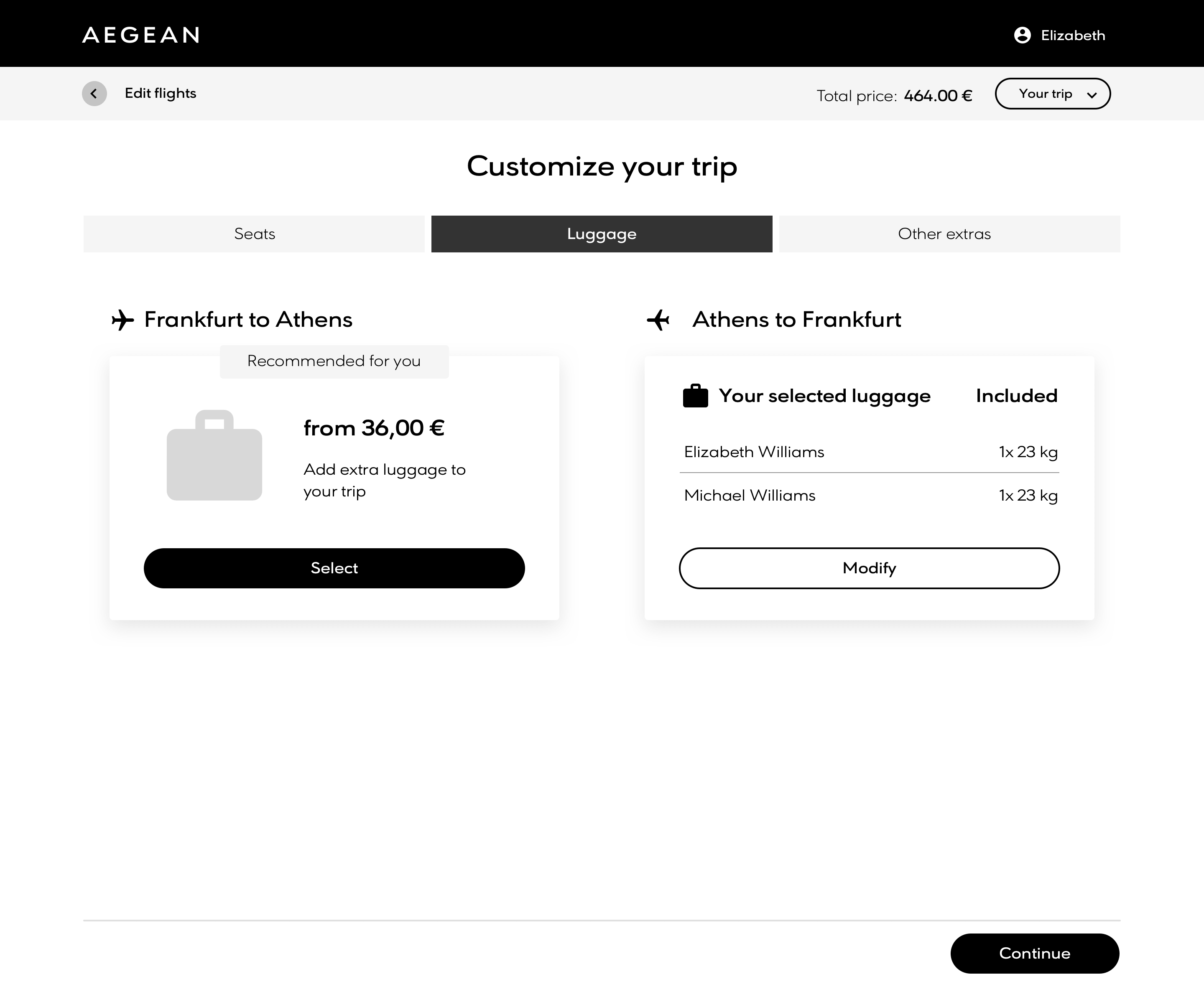
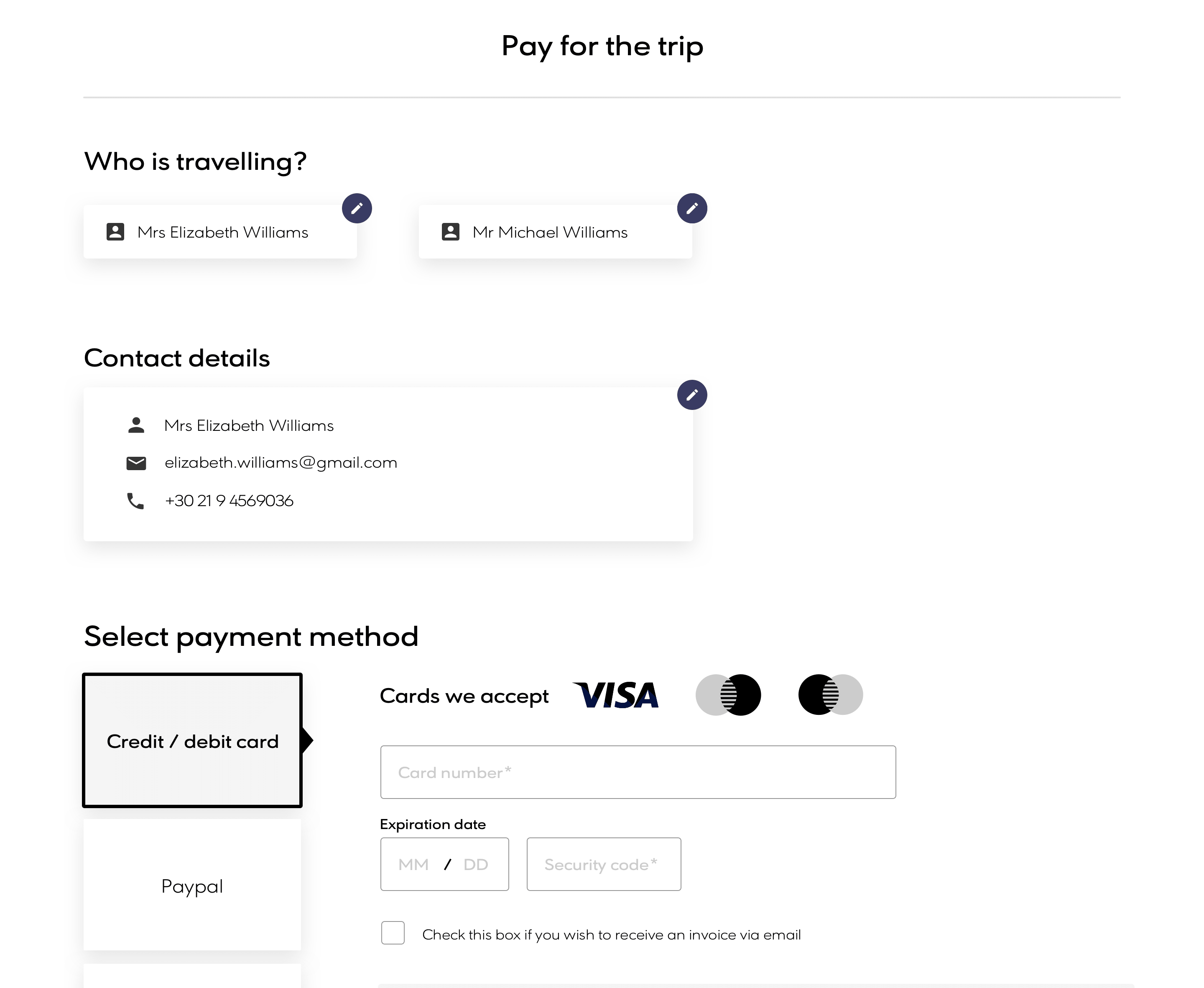
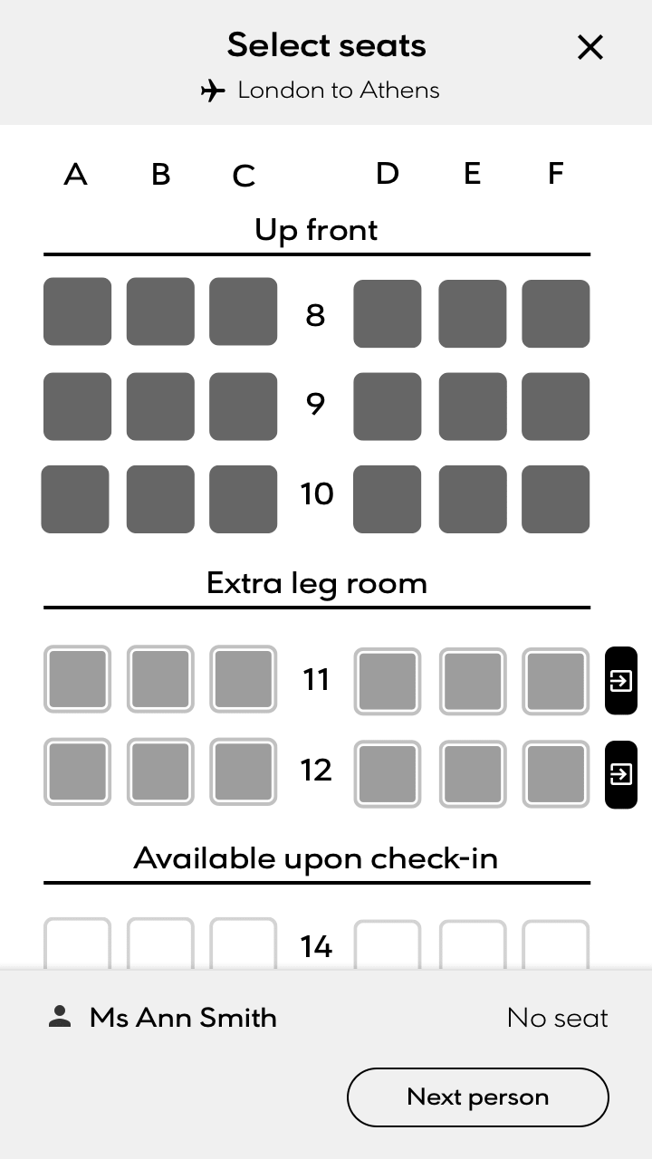
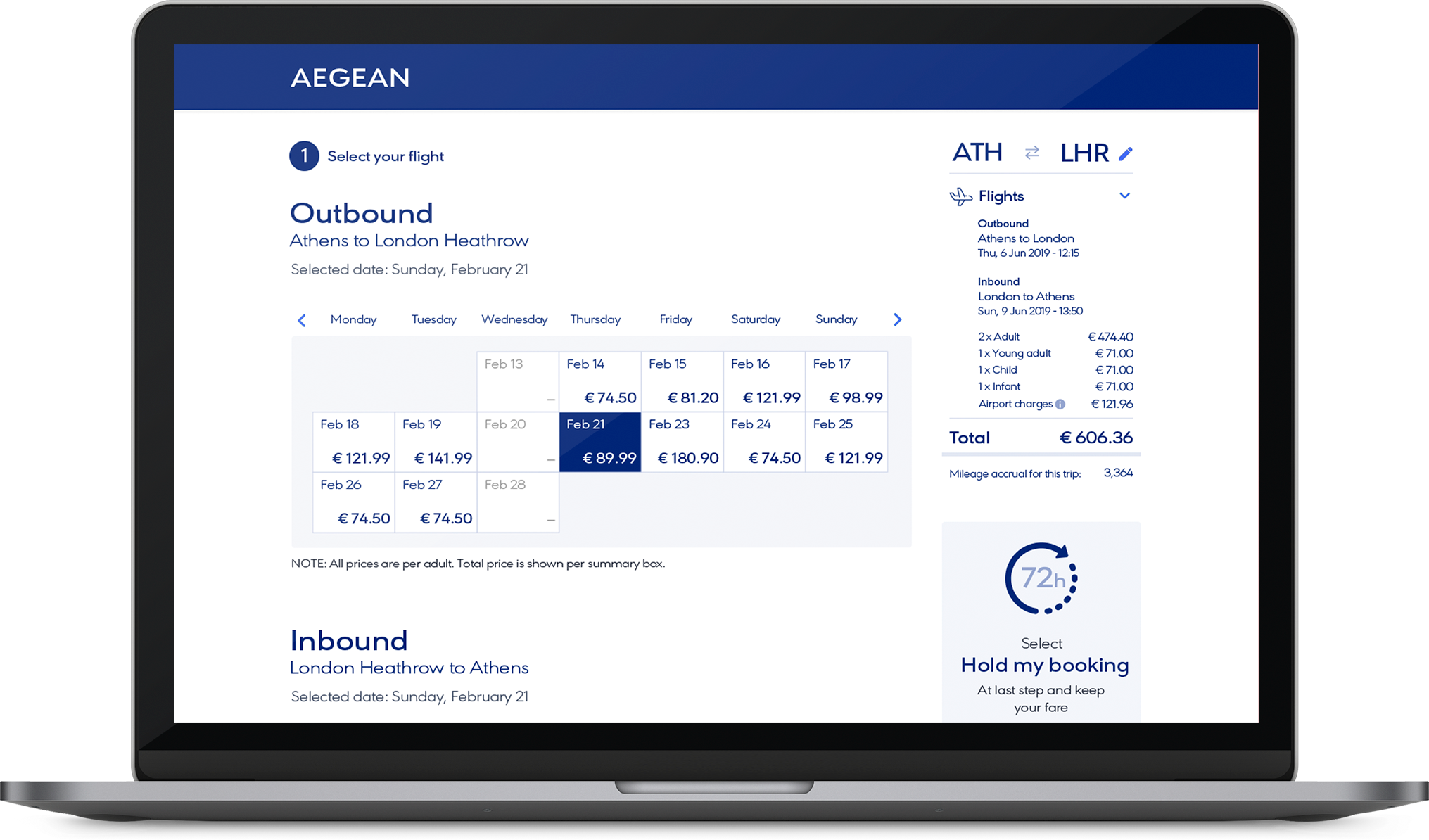
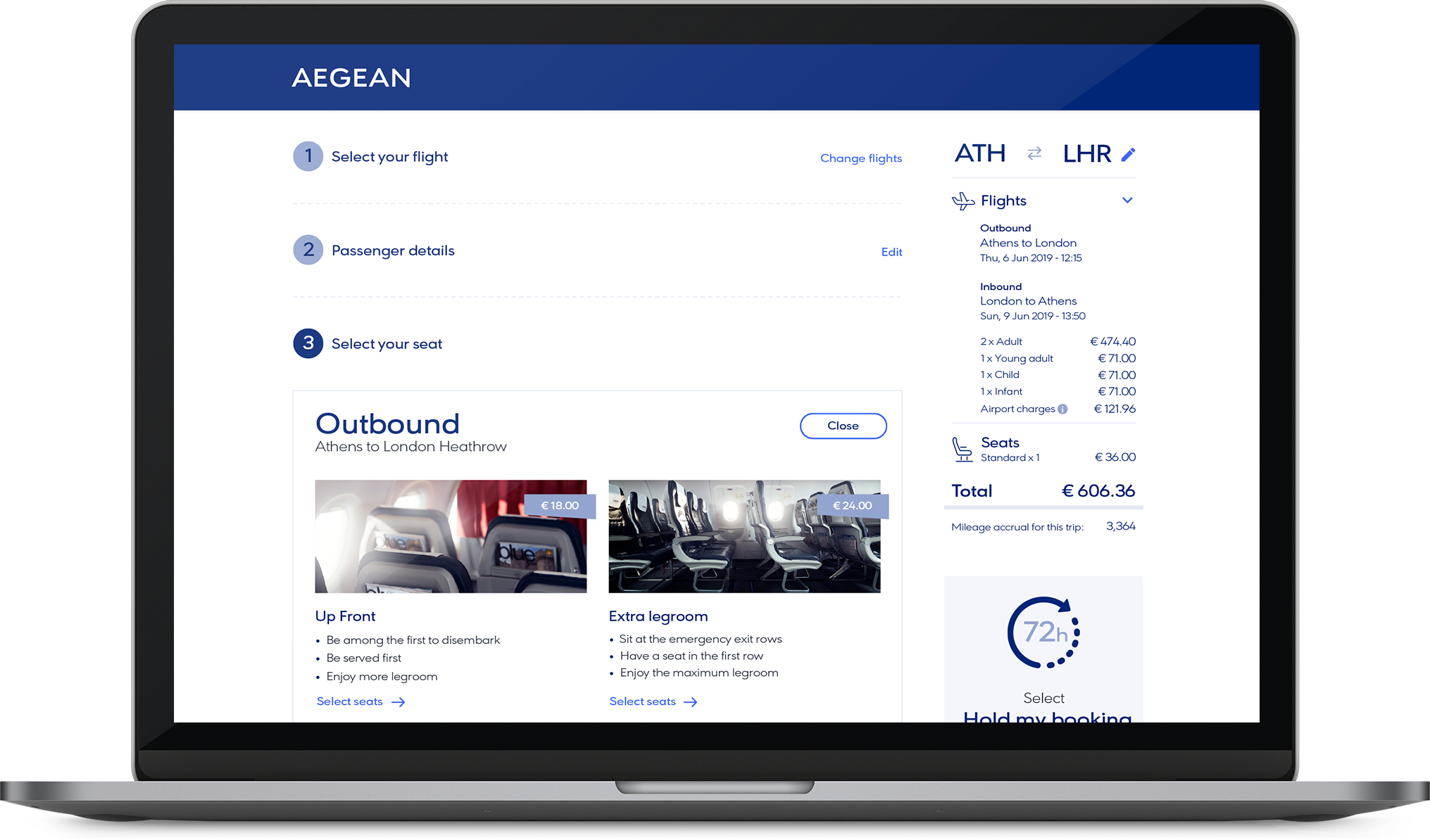
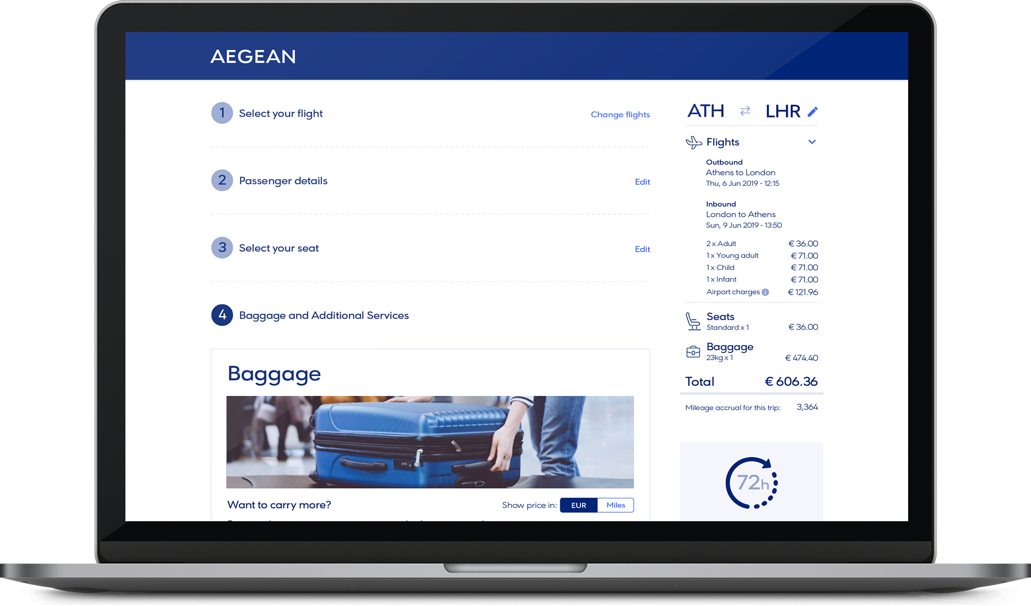
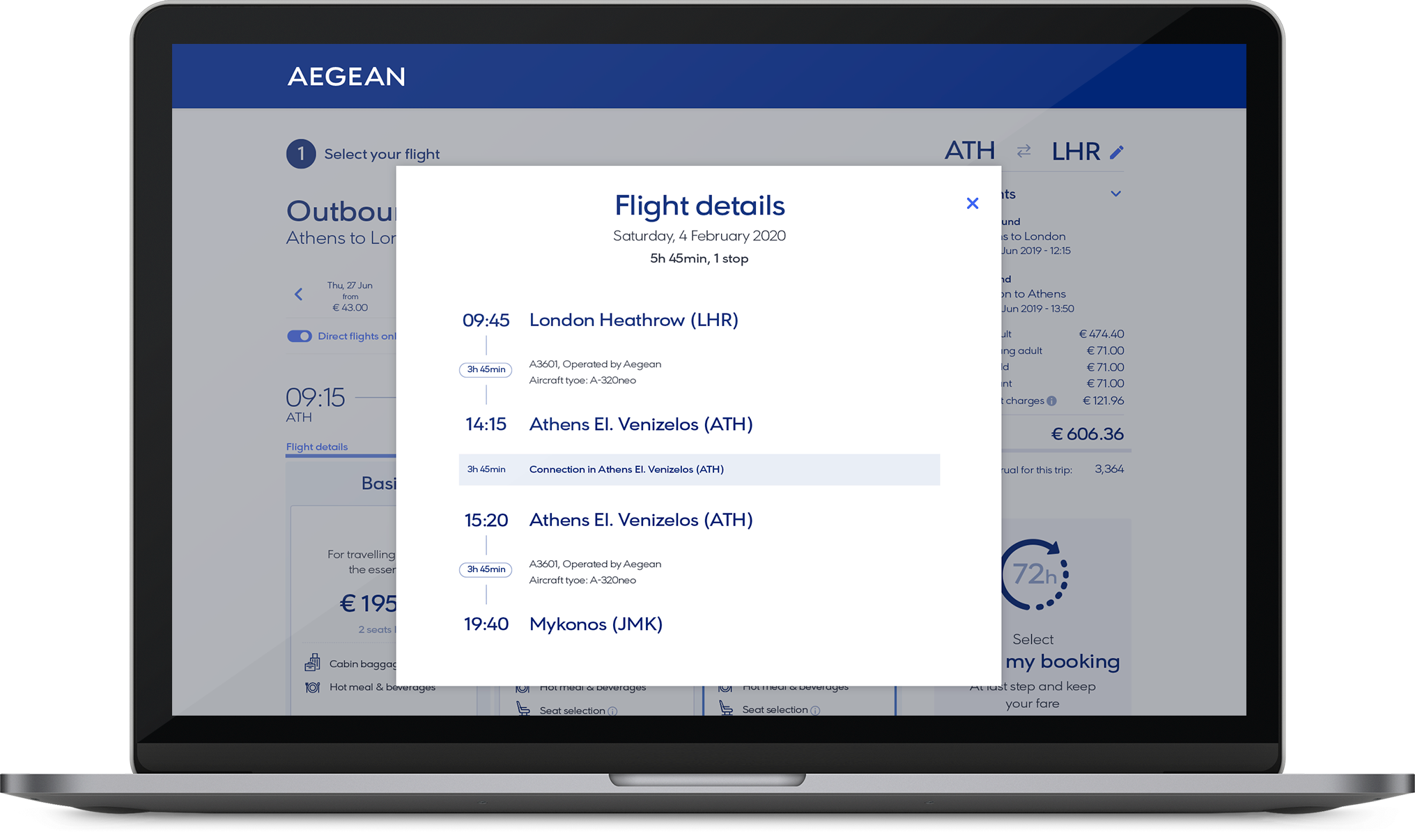
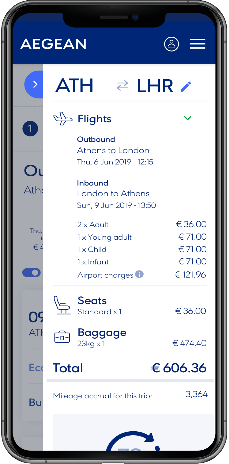
Below are some of the IBE screens from the earlier days of the project. We needed to find the best way to have the flight information consistently displayed as the user goes through the booking process which would prove to be a big challenge owing to the amount of information required for most flights of at least more than one person. Flight numbers, times, destinations, fares and more all had to be compressed on to a screen that already had to show a lot of information relating to which step it was at in the booking process.
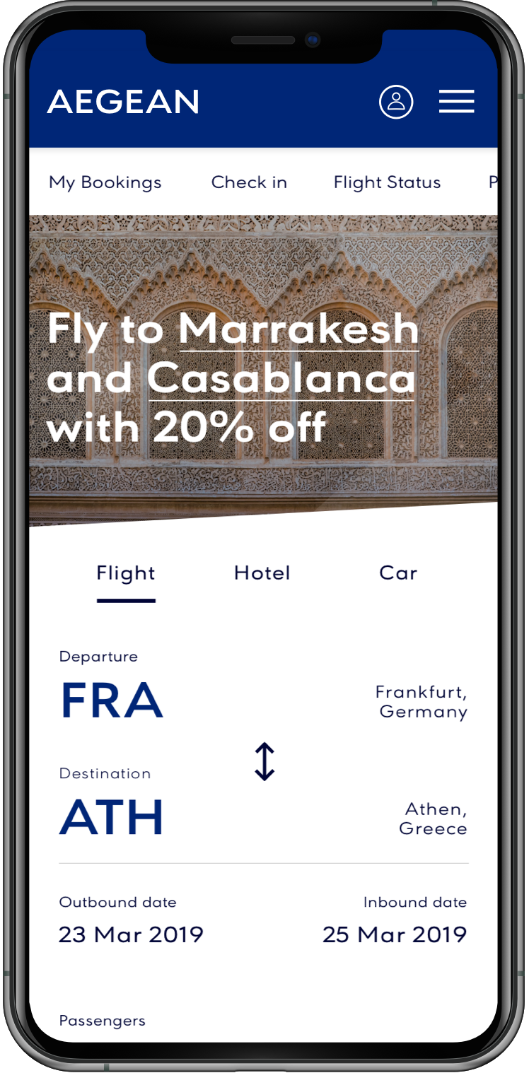
Search home
Select destination
Select dates
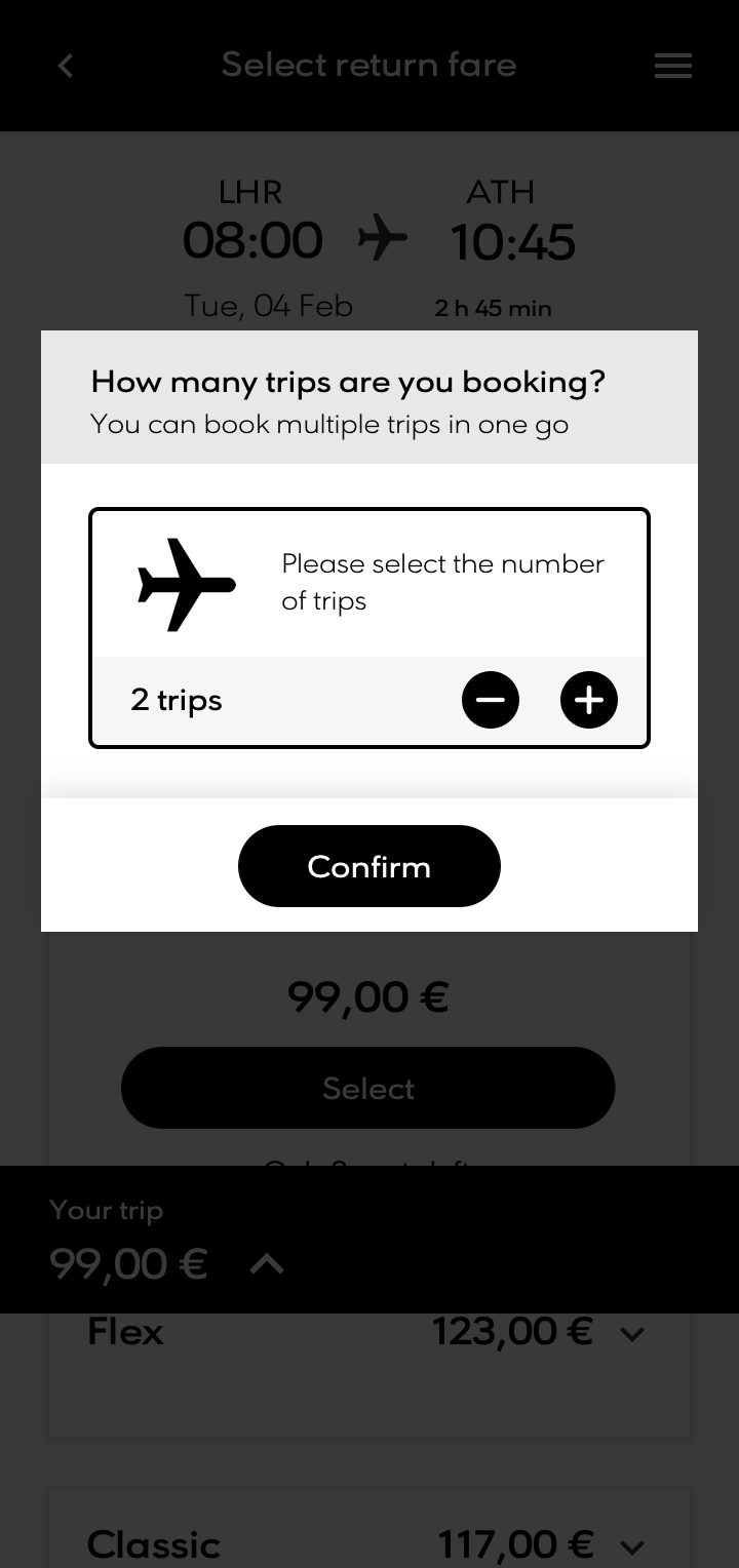
Select passengers
Select outbound flight
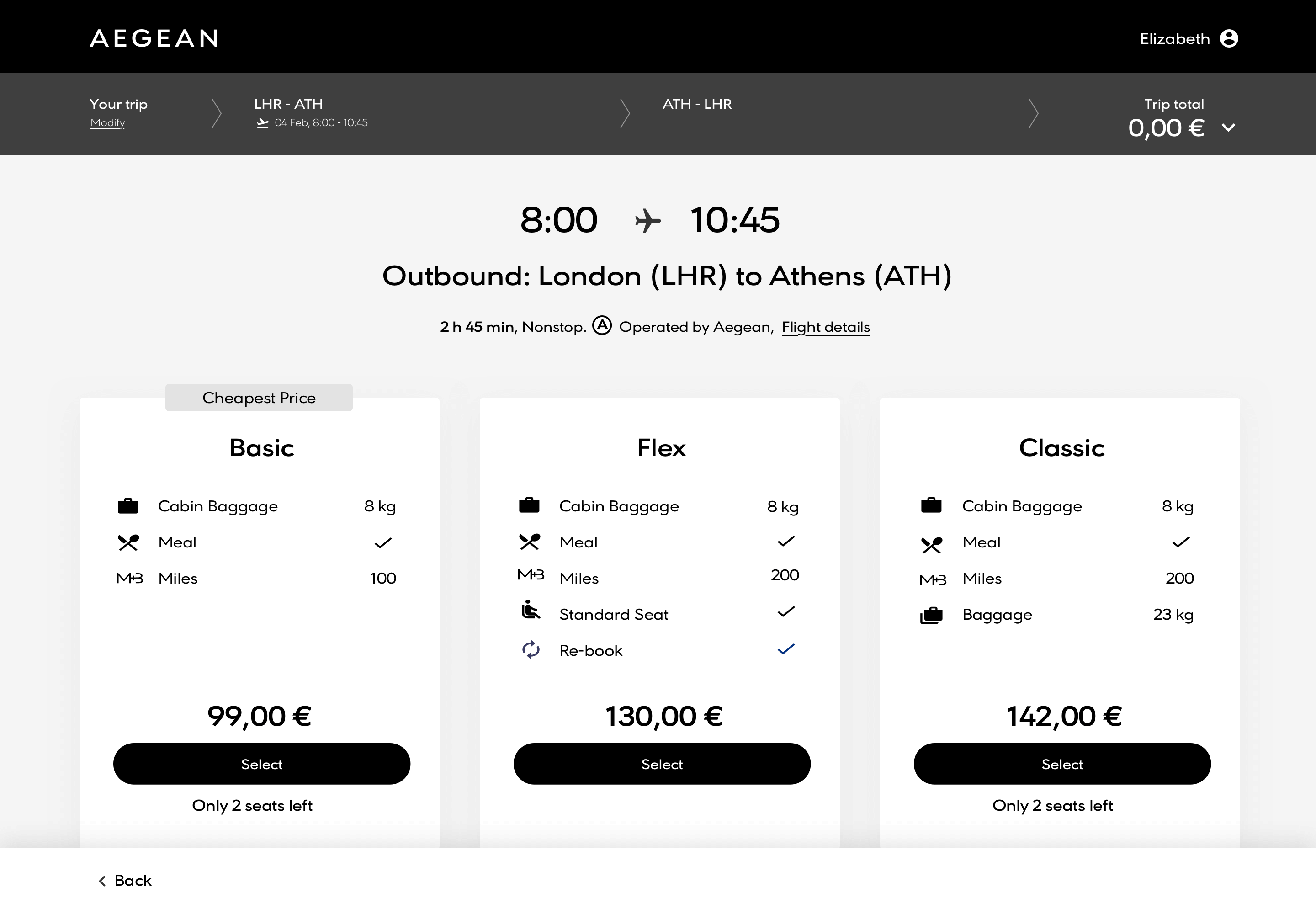
Select outbound fare type

Select return flight
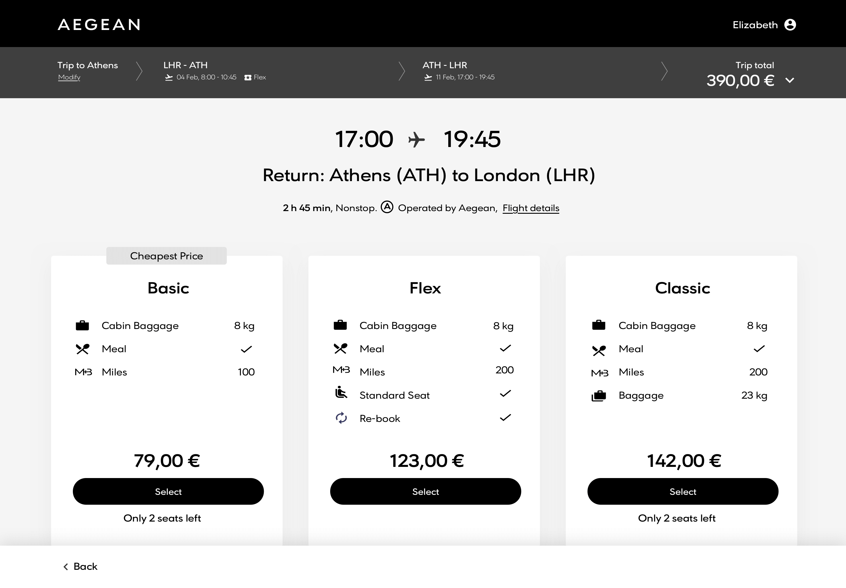
Select return fare type
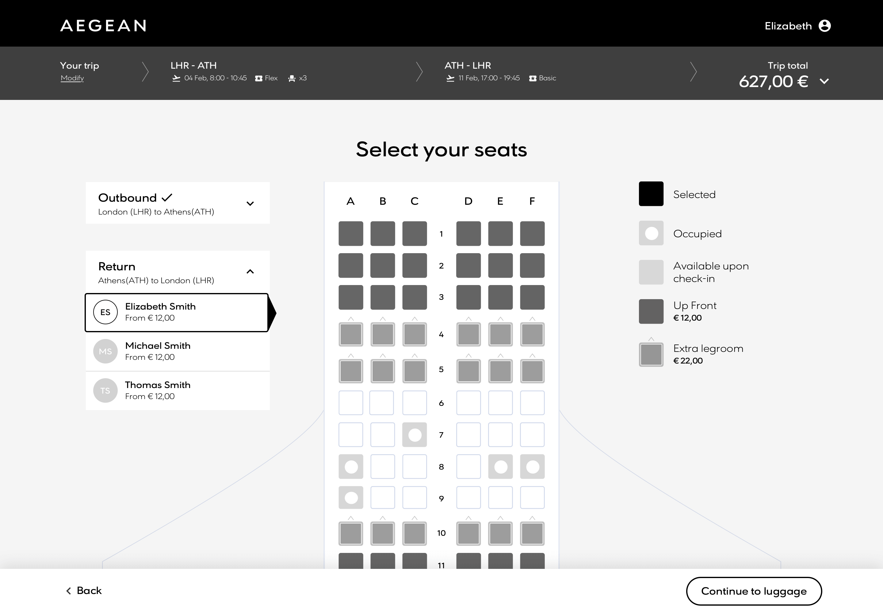
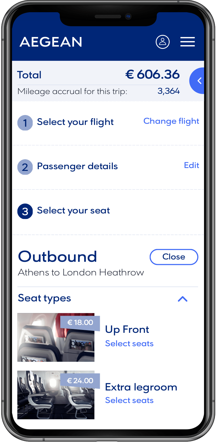
Seat selection
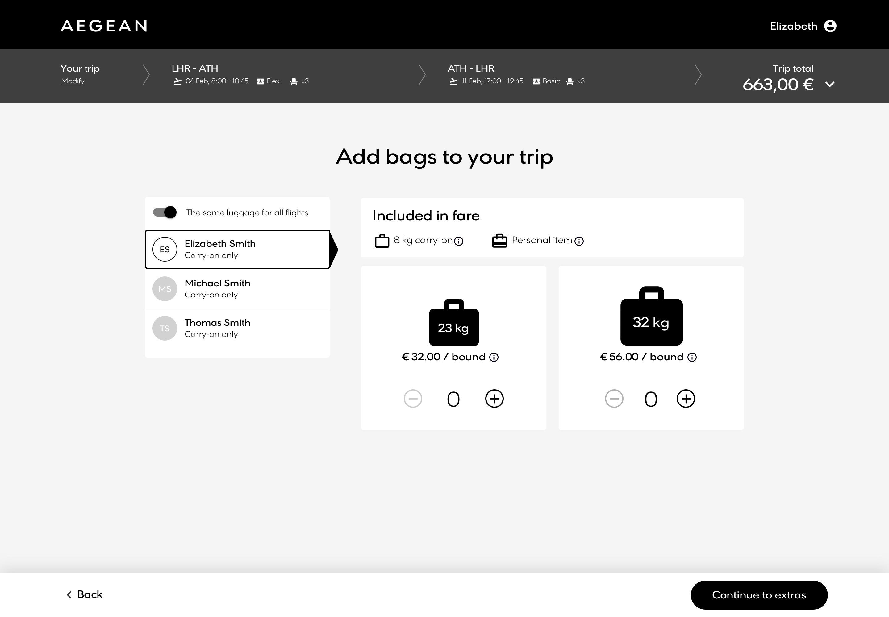
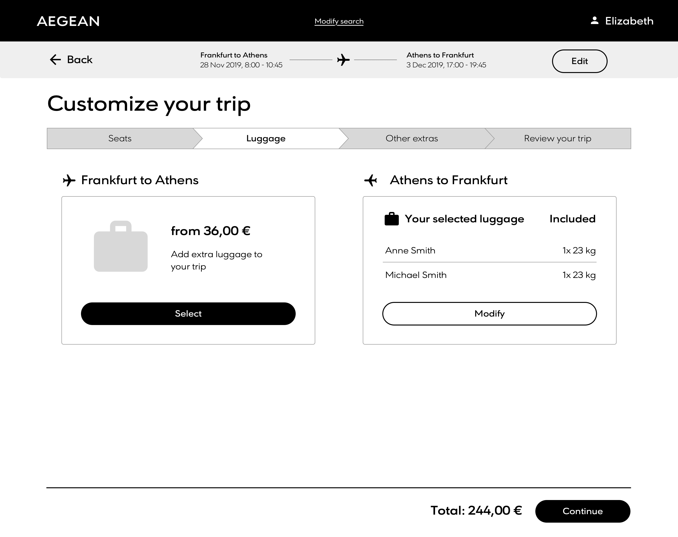
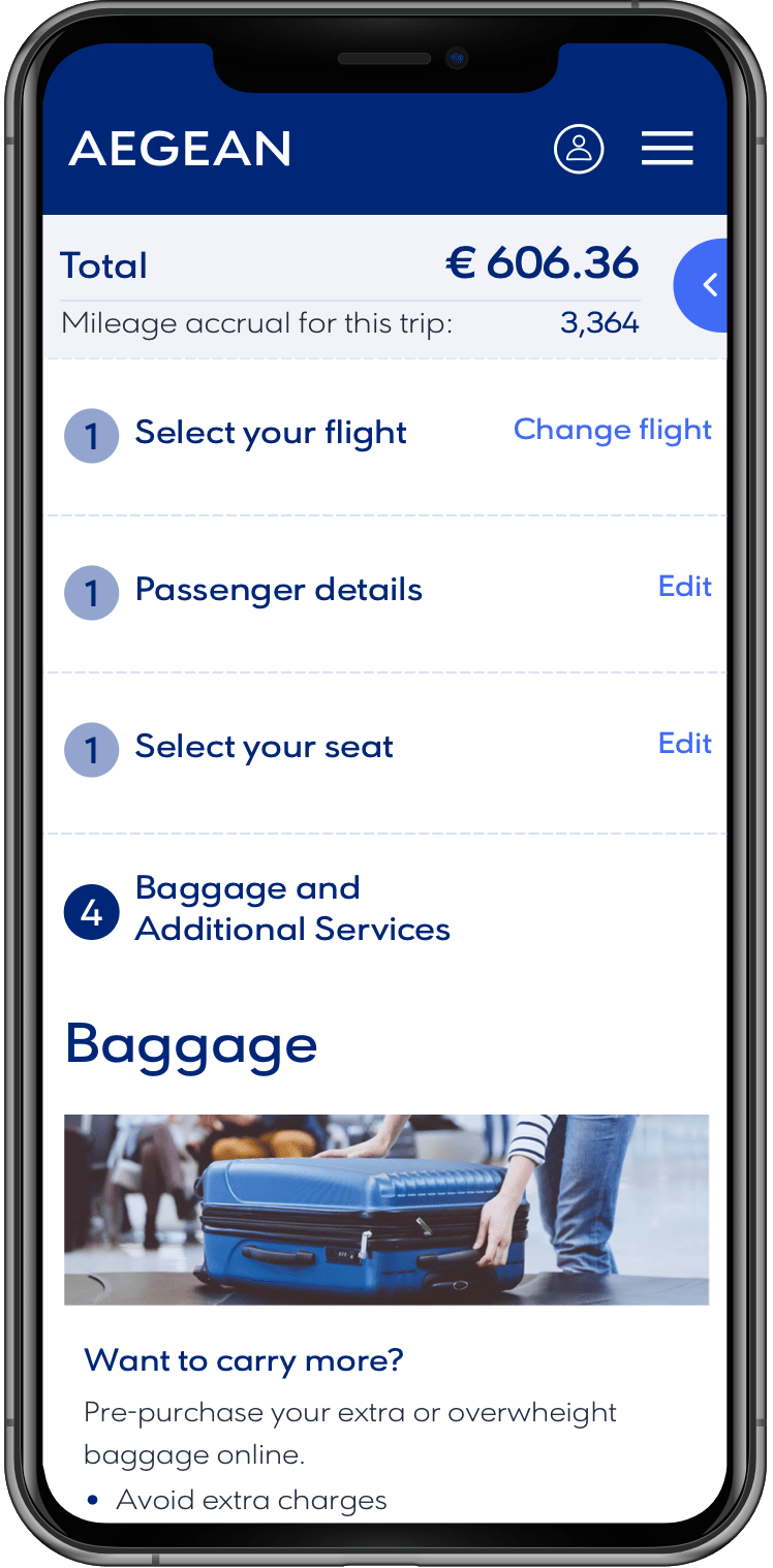
Bag selection
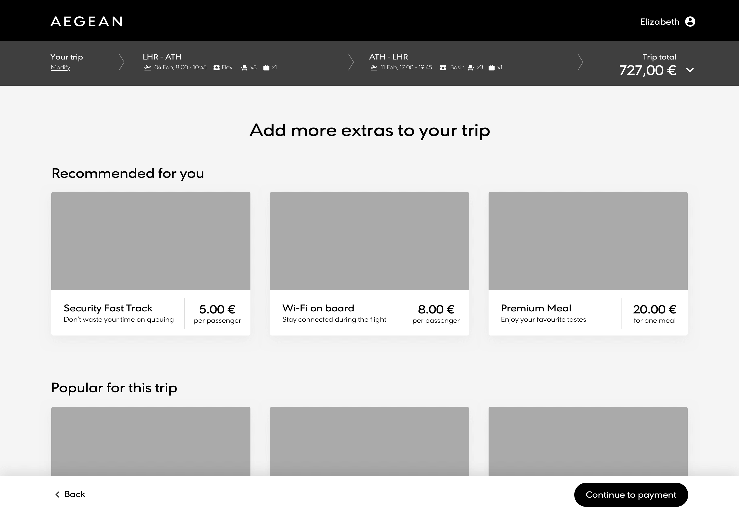
Extras selection
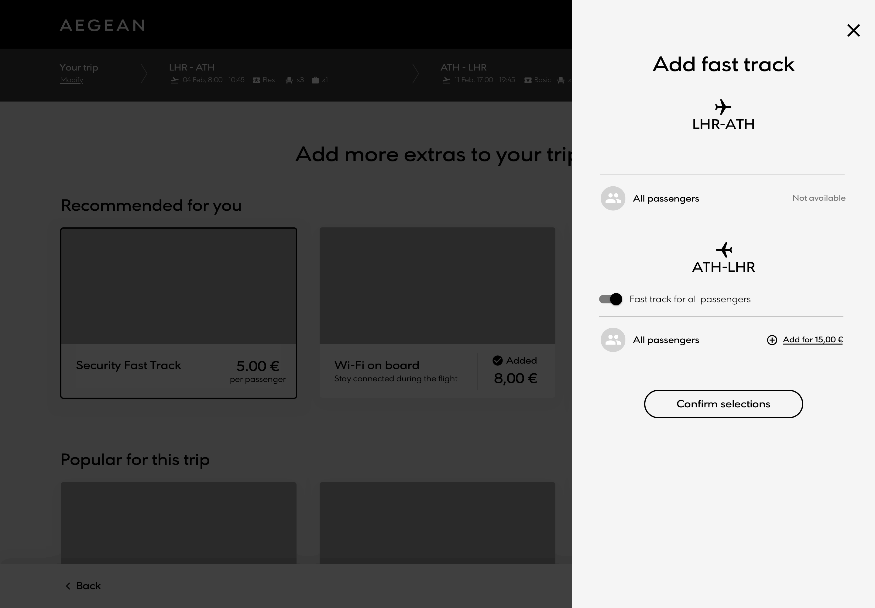
Extras configuration
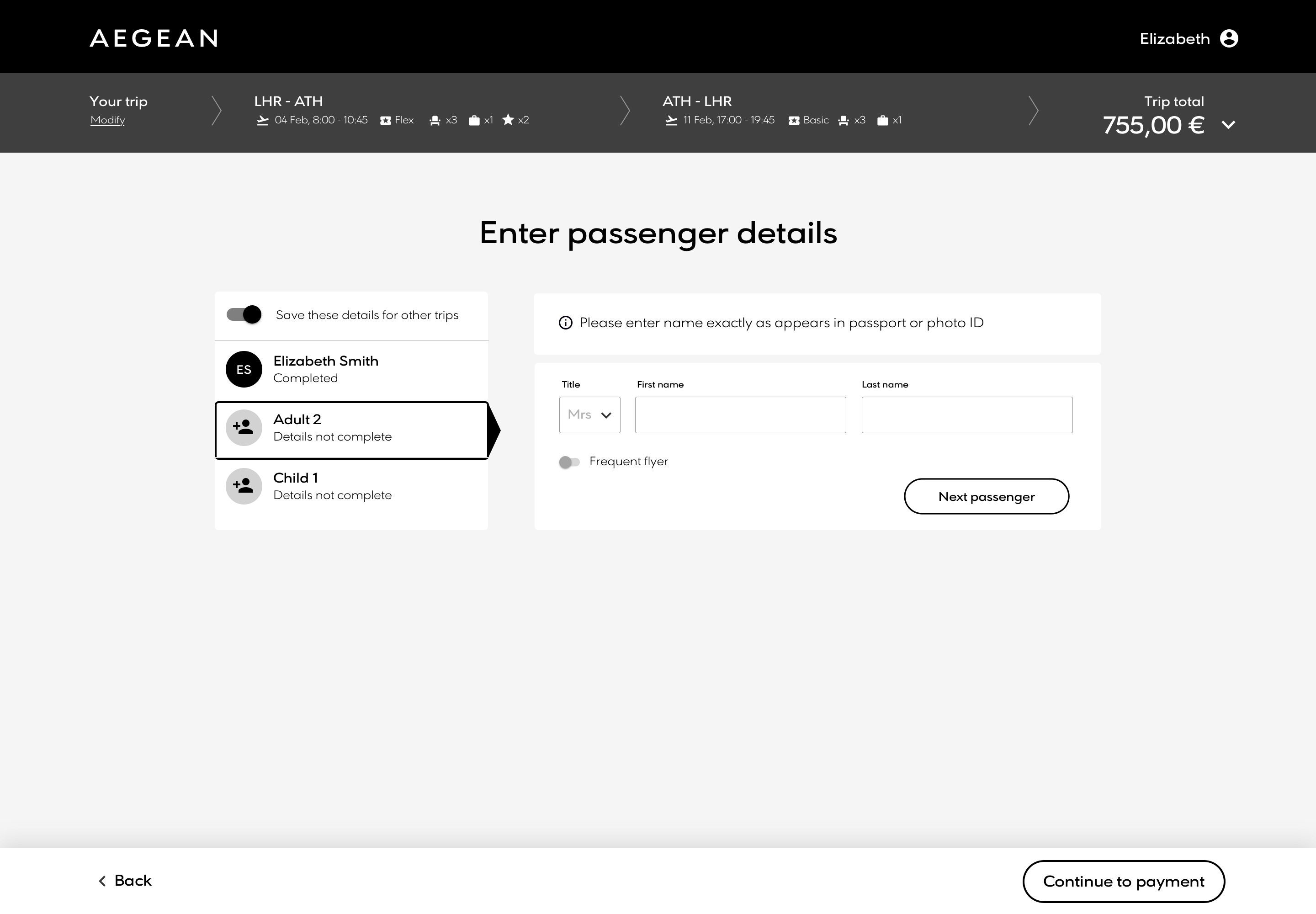
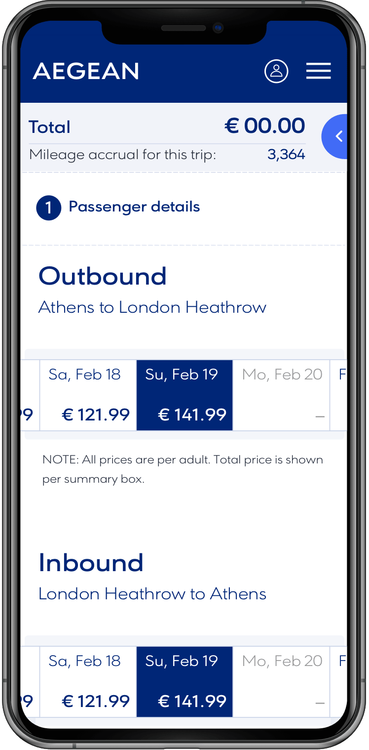
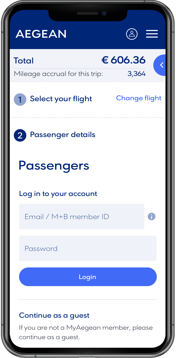
Passenger details
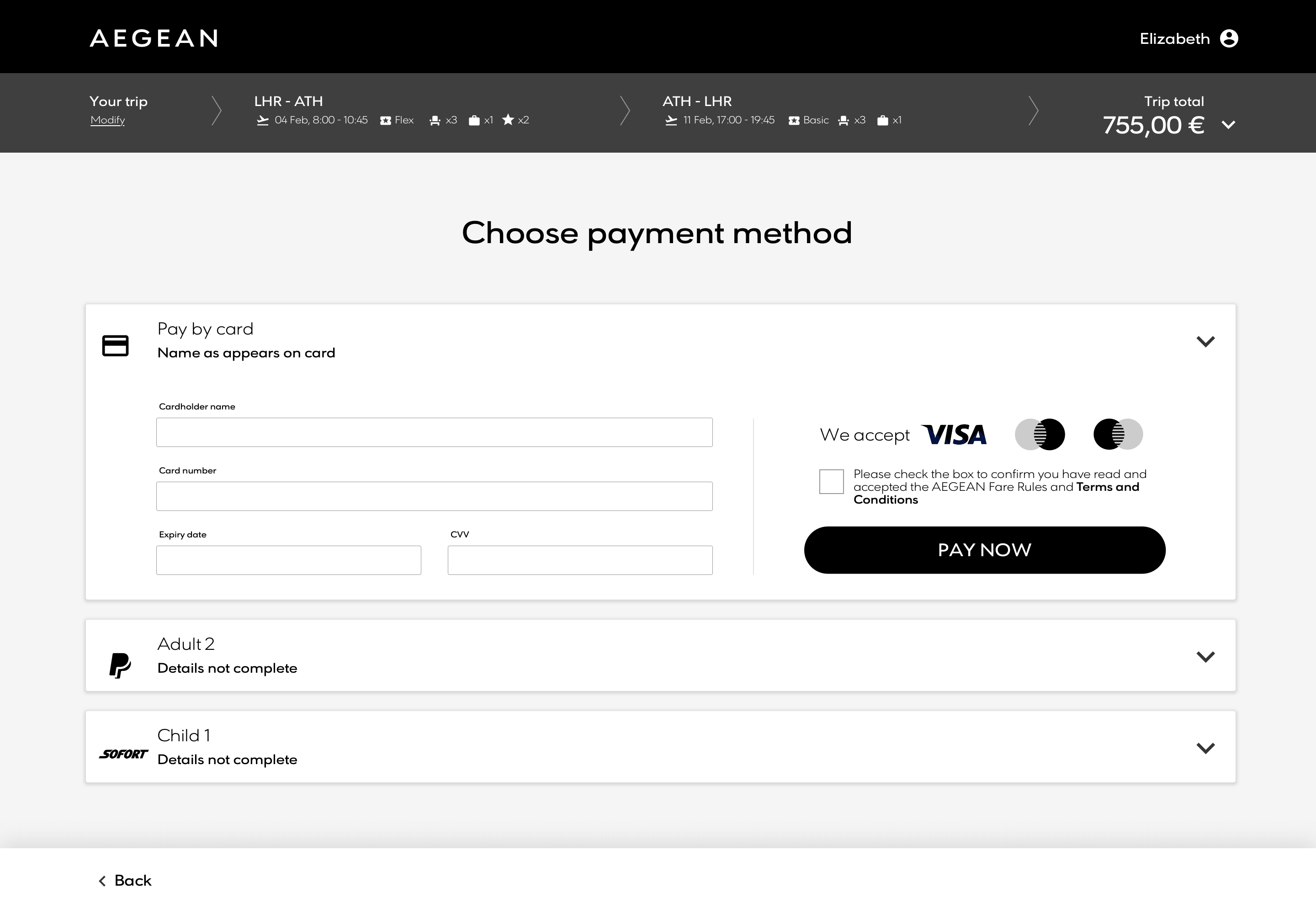
Payment options
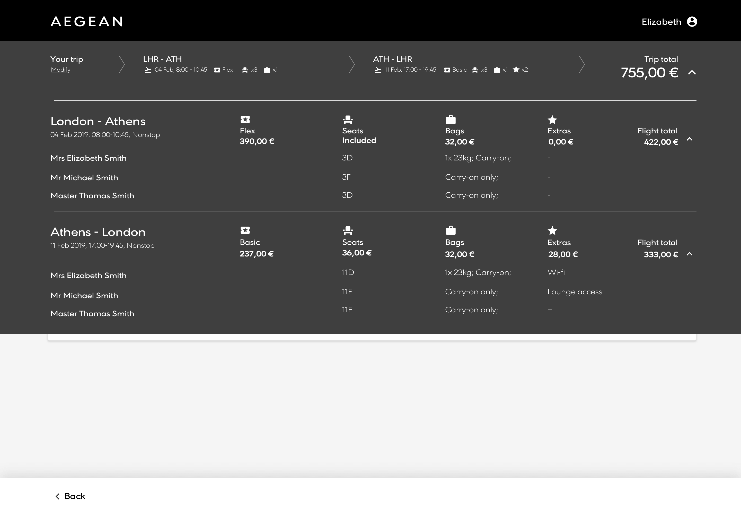
Cart expanded
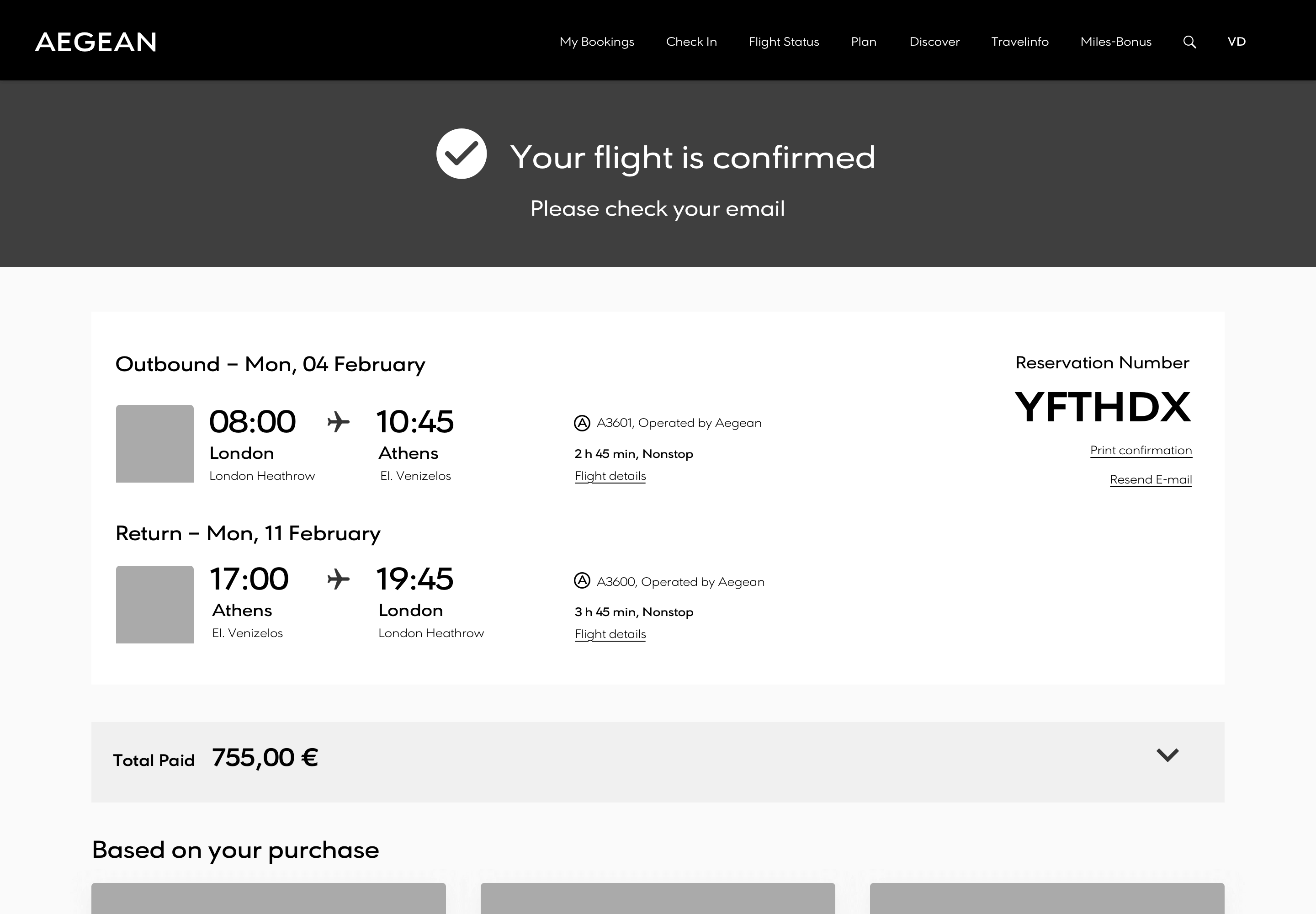
Confirmation
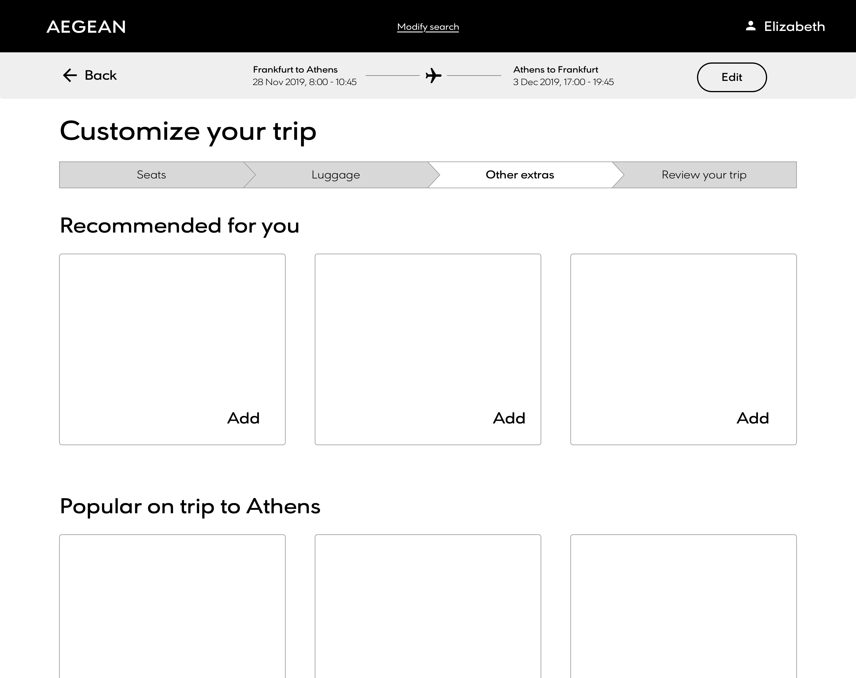
Sprint 3 review: Fleshing out the process
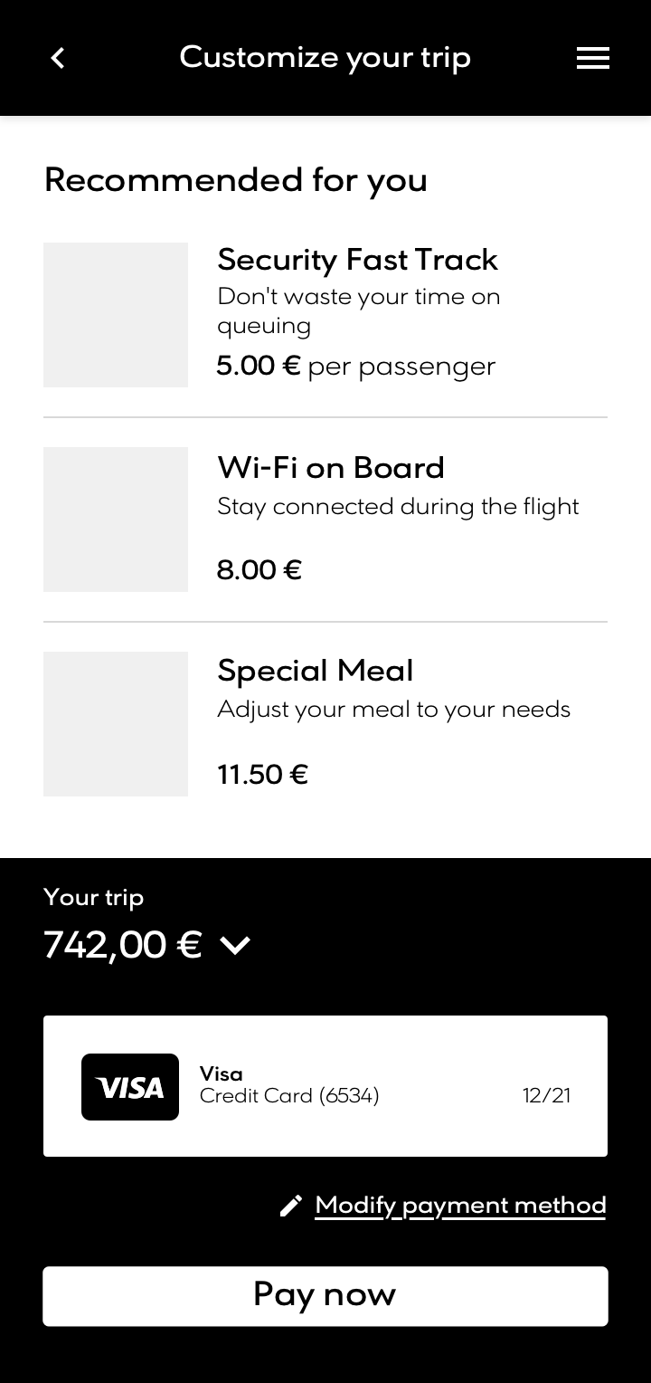
By Sprint 3 we were gathering momentum, with good direction and a strong vision and of where the flow was headed. The main order of screens had been approved by Aegean and we were now looking at adding more ancillaries and including detailed processes intyo the mix. We thought out ways to configure elements for certain areas, addding extras would be done via modals whereas editing flight details was performed from the expanded cart push area.
Add another flight
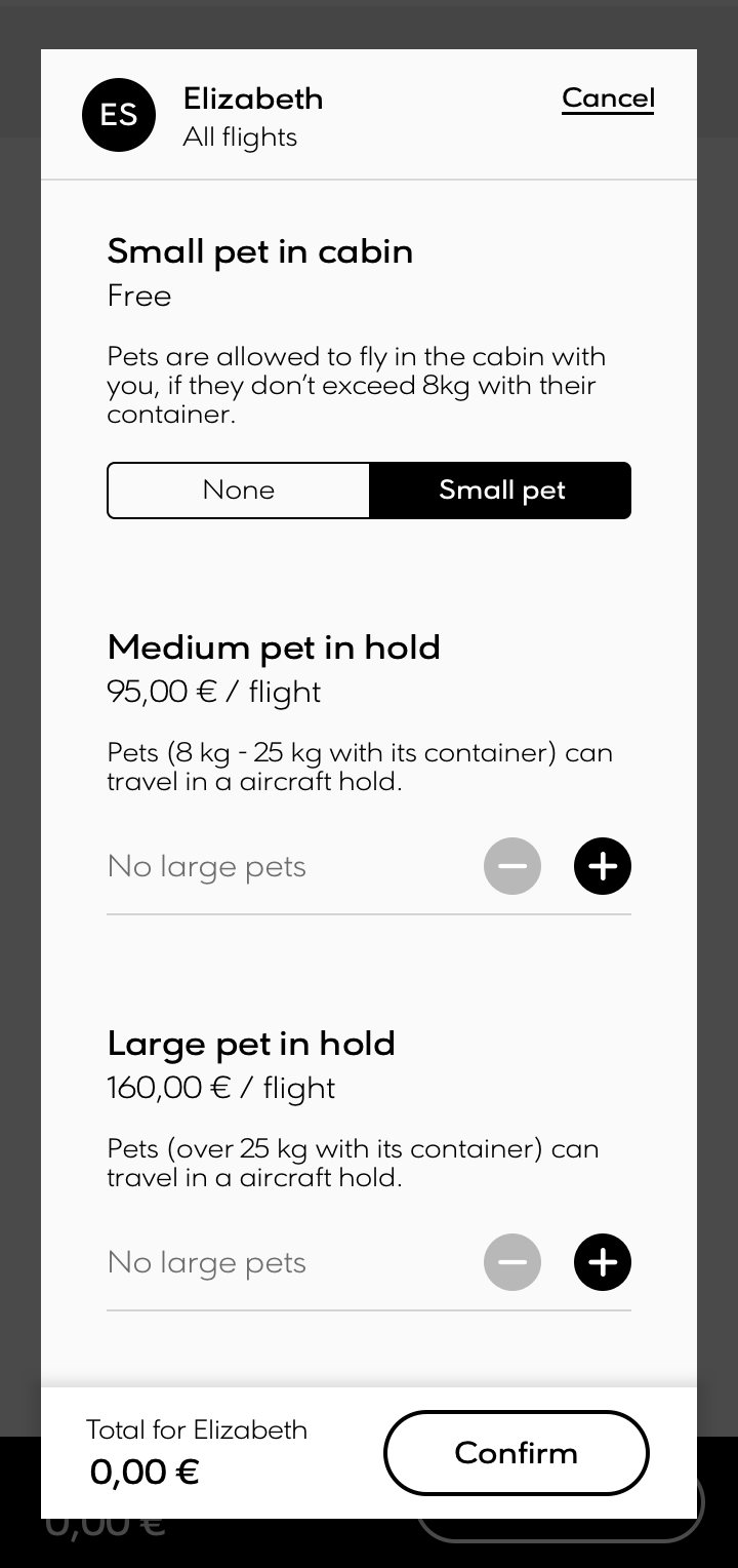
Add pets
One-click payment
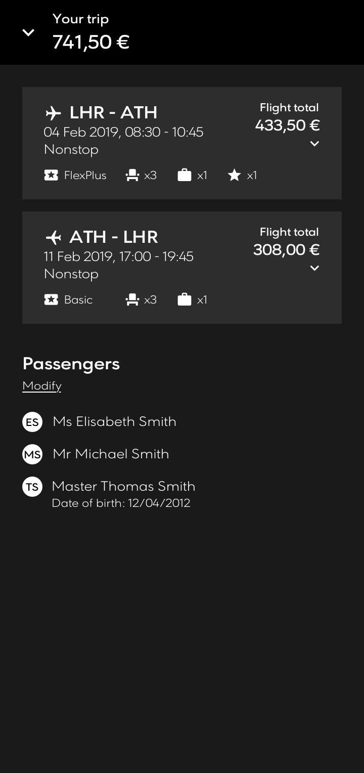
Shopping cart
Sprint 4 review: Detailed payment systems
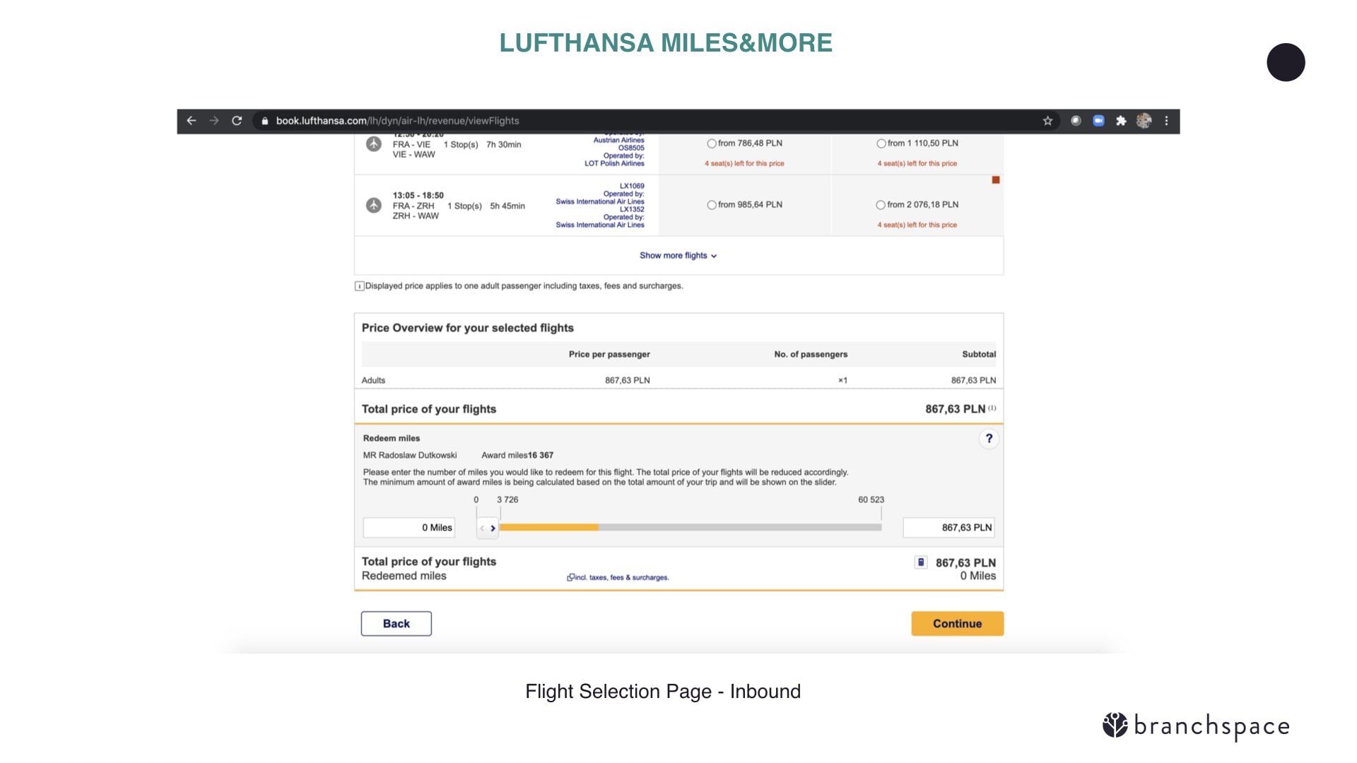
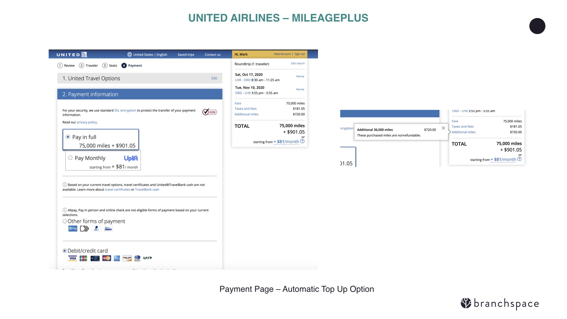
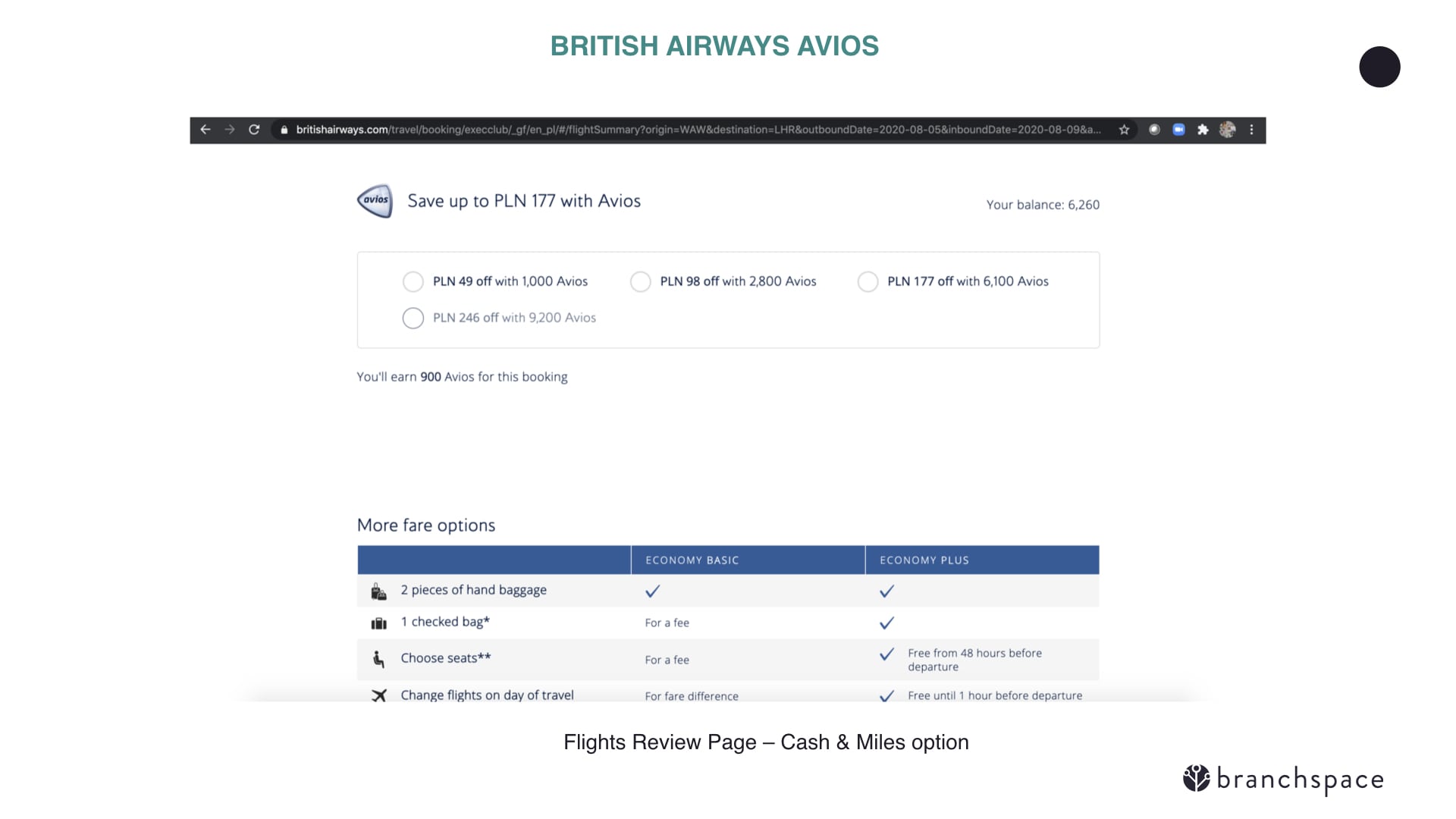
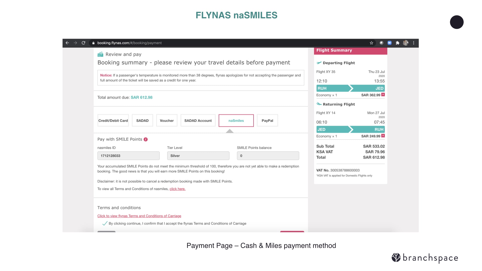
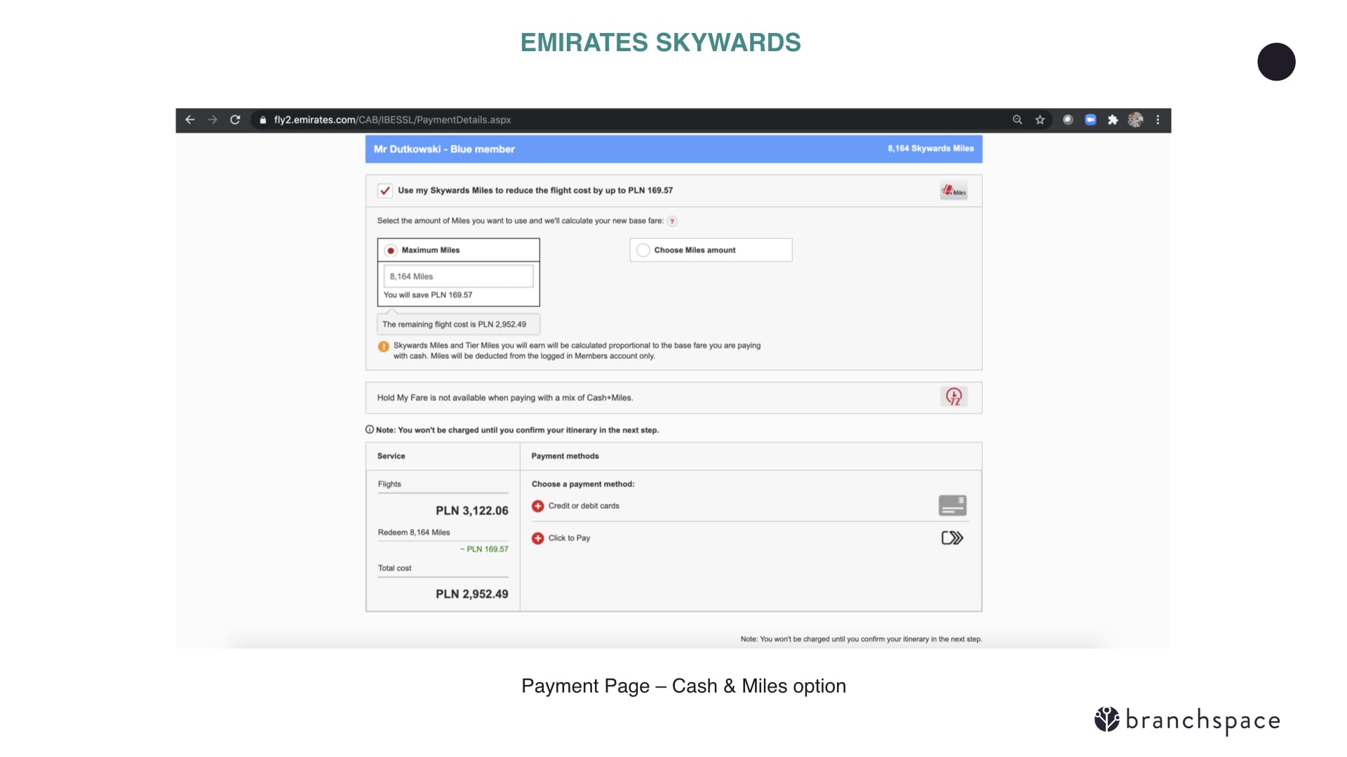
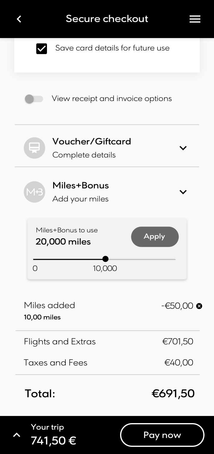
By stage 4 we started to look into more intricate features of the flow, including paying with air miles or using different payment methods to pay for a booking (eg: half with card, half with paypal). There are a number of diferent ways in which other existing carriers allow their flights to be paid by miles, with some determining whether a flight is accessible by miles from the offset - something we actually incorporated into the search filters on the fare selection step. Paying with multiple payment methods was rare in the industry and I incorporporated the idea of including it in the push overlay system previously outlined in former sprints.
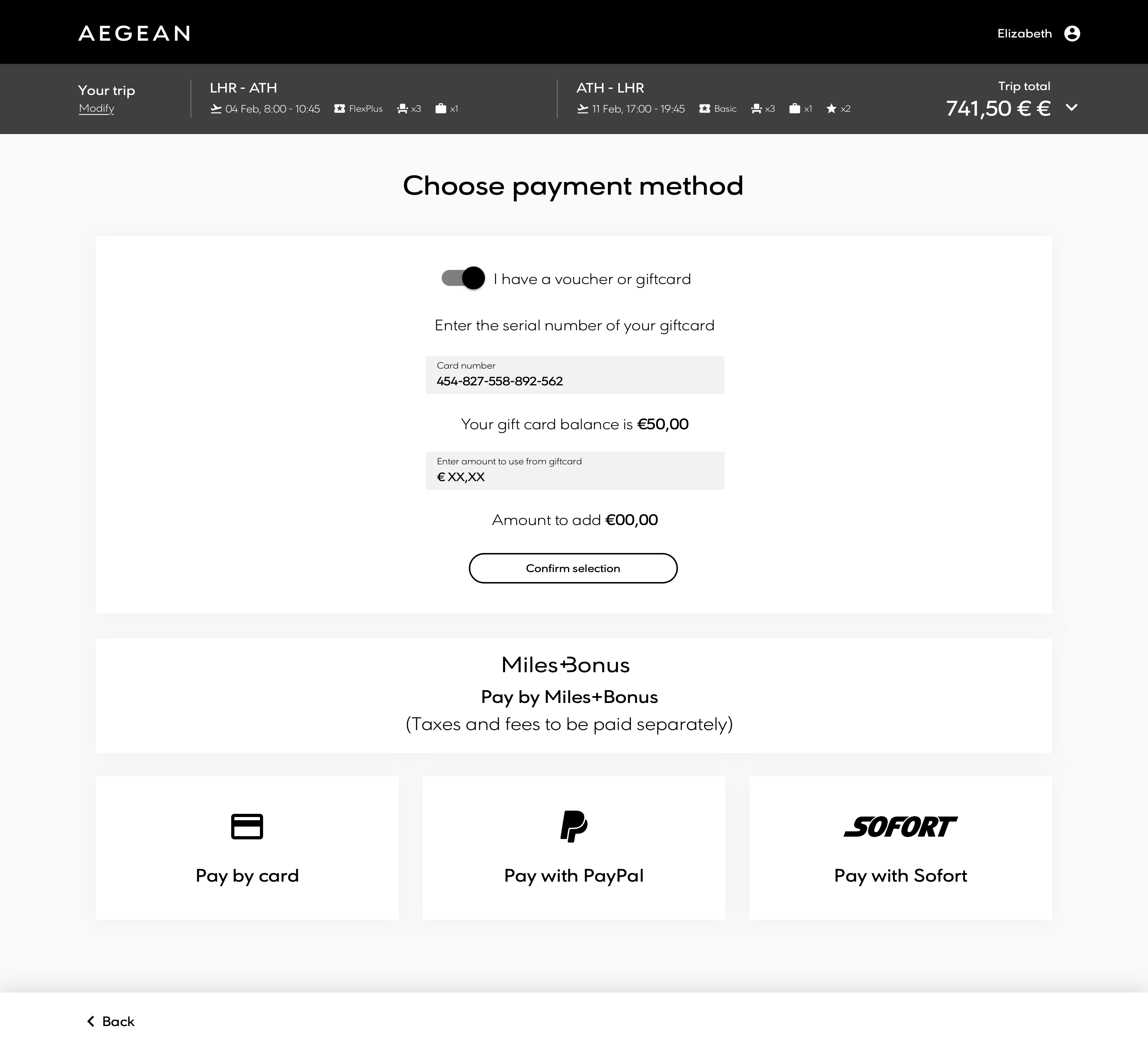
Payment by miles / vouchers
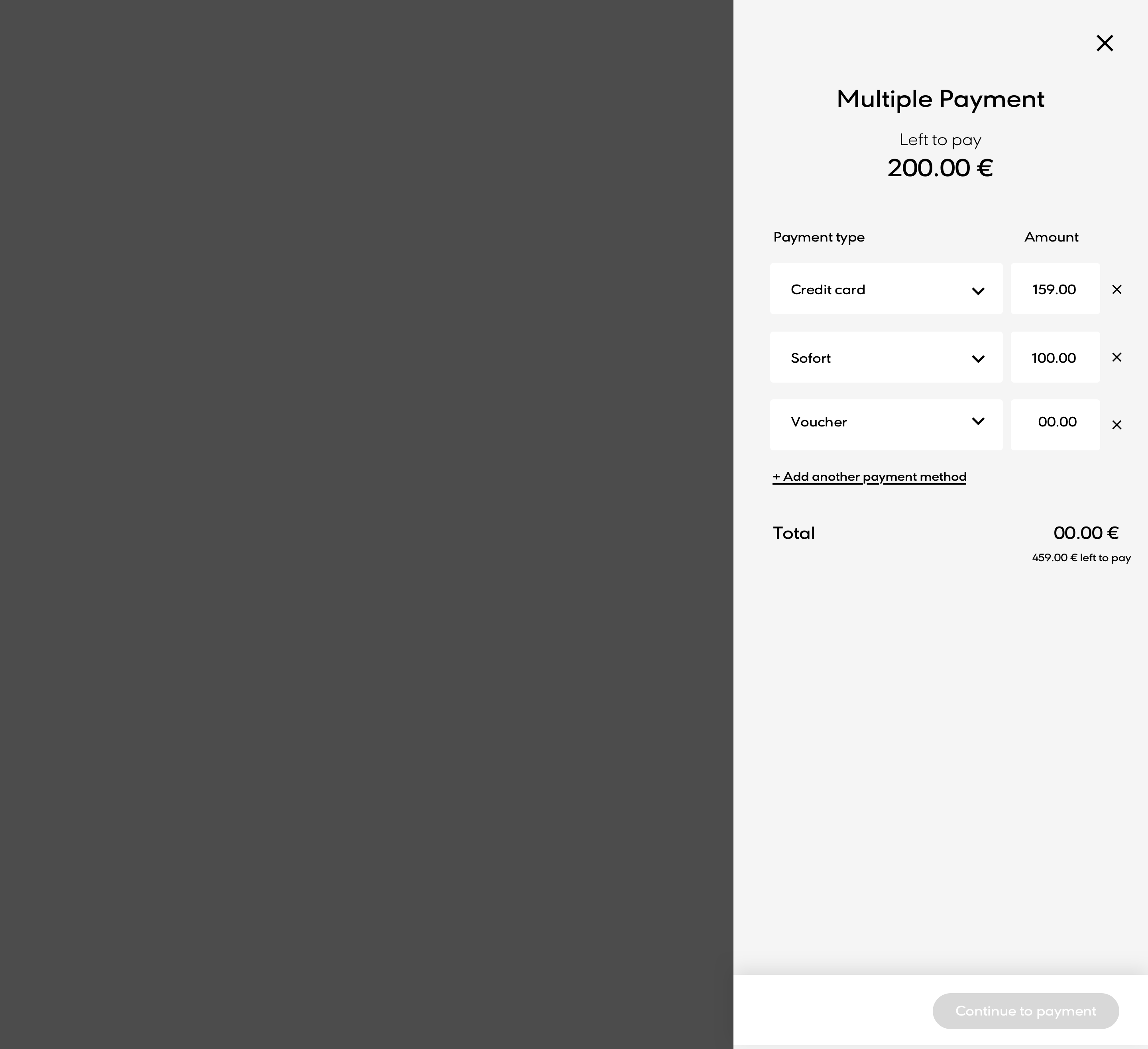
Multiple payment
Sprint 5 review: Fleshing out the process
At this point there was a solid concept and direction where the flow was going. The overall layout had been approved and there was a strong sense of direction of where we were headed. Continuing on for spribt 3, we fleshed out the more particular details and added more detail to the process.
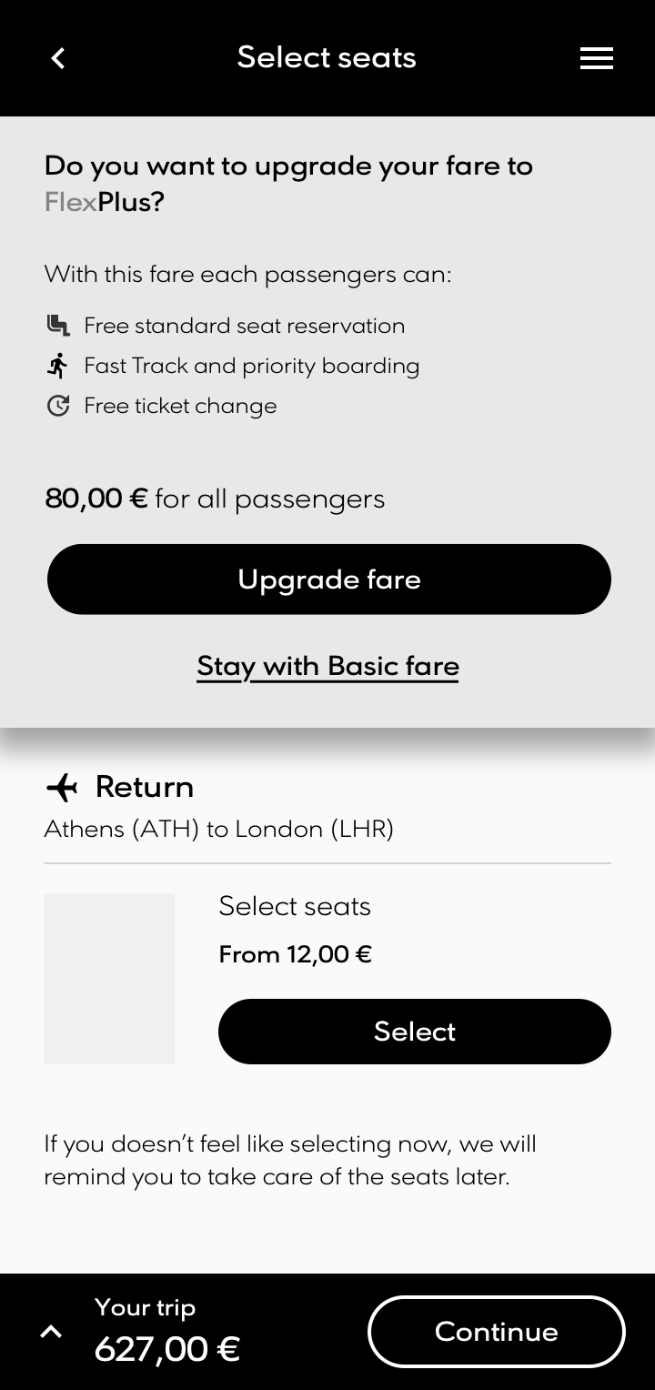
Fare upgrade
Redemption
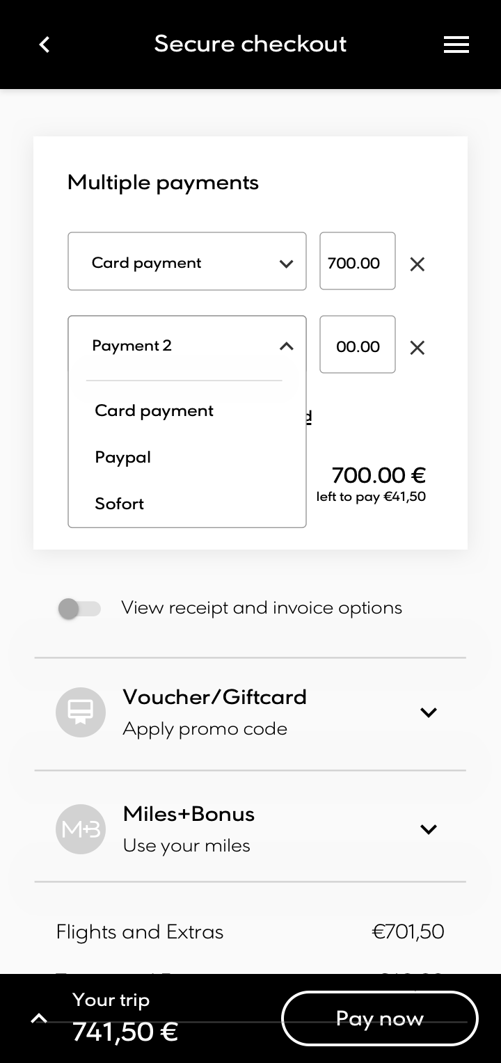
Multiple payment types
Ancillary bundle
Discovery phase workshop and refinement
At this point there was a solid concept and direction where the flow was going. The overall layout had been approved and there was a strong sense of direction of where we were headed. Continuing on for spribt 3, we fleshed out the more particular details and added more detail to the process.
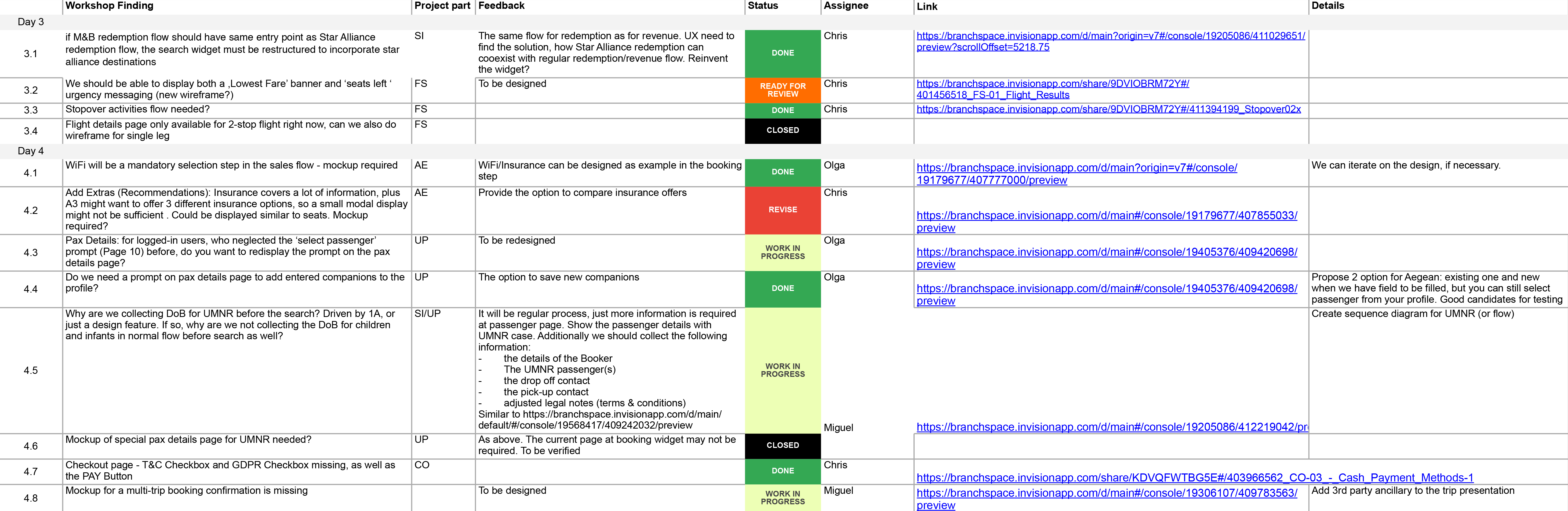
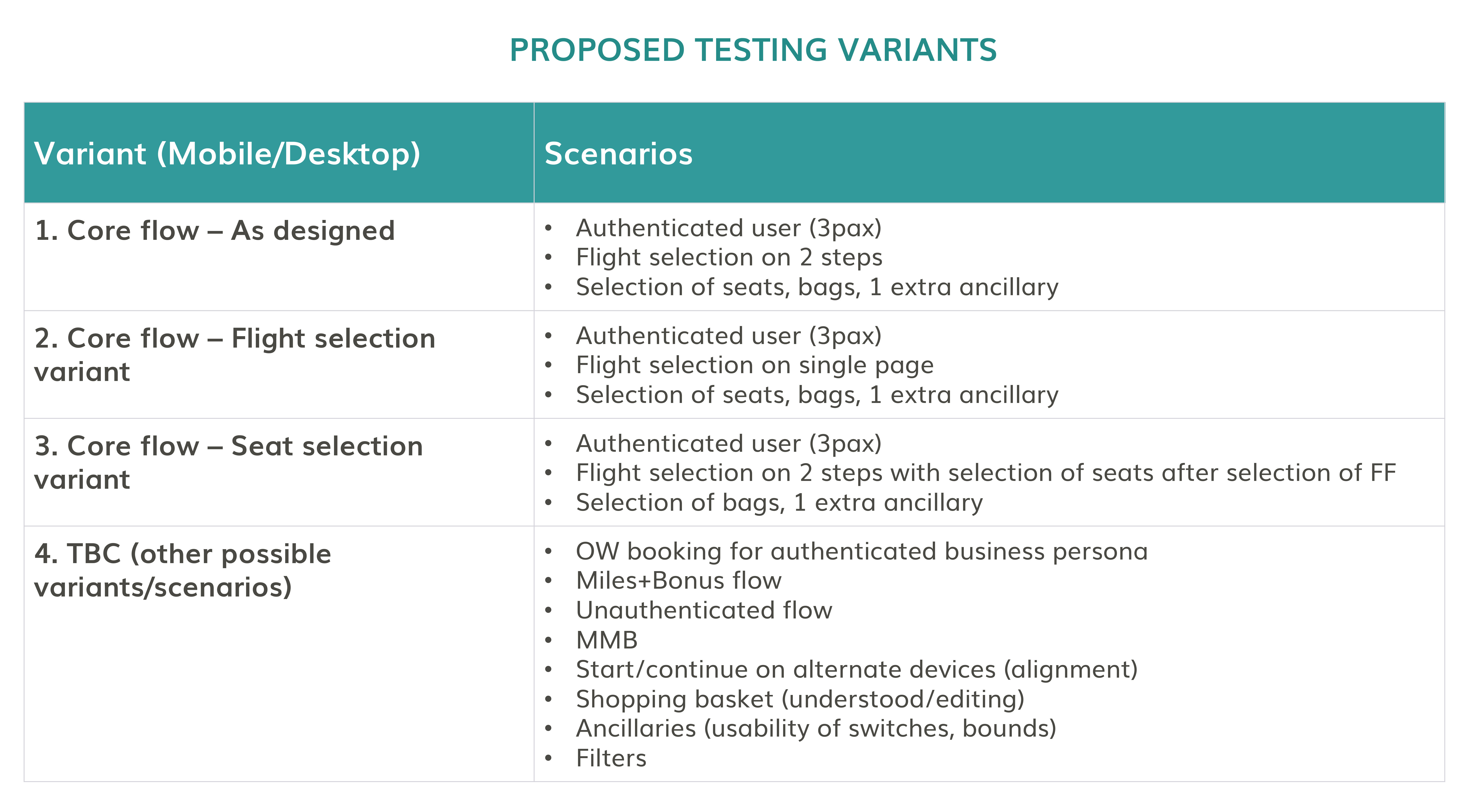
Usability testing
Aegean use a local company to carry out all their tests in Greek in order to get a better understanding of their main demographic and user base. They asked Branchspace to propose a set of scenarios based on the prototypes that we had produced for them. The external test company would then gather feedback through focus groups to get feedback on user experience and feeling.
A total of 4 scripts were devised for the test subjects, all aimed at guaging a feel of how easy it was to book a flight with variations for authenticated and unauthenticated users.
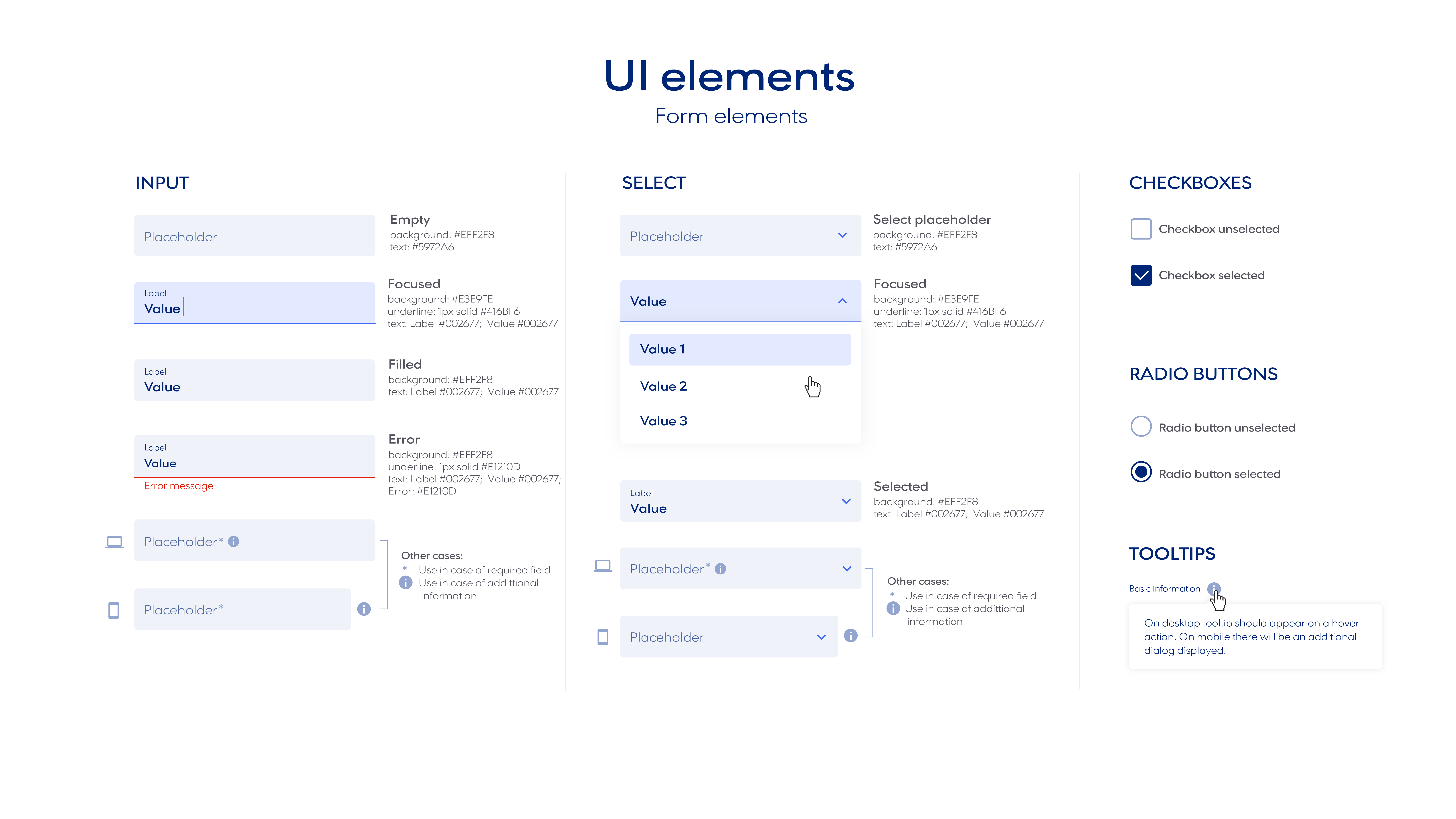
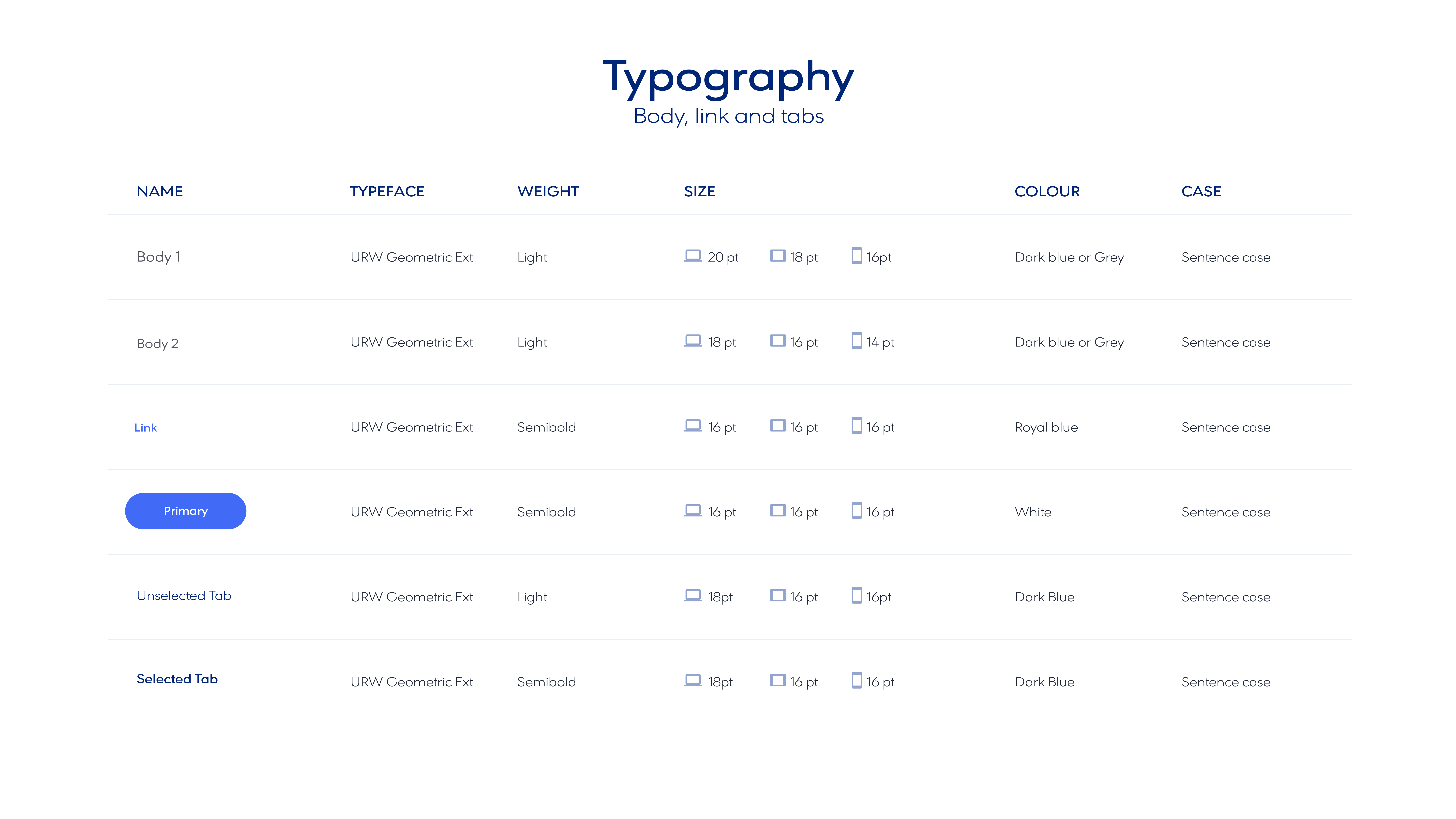
Defining the UI
Working with the newly formed brand guidelines that were prepared by Aegean, we looked to integrate these settings within the design. Aegean wanted a design that reflected the heritage of Greece as well as modern feel that was clean and fluid.
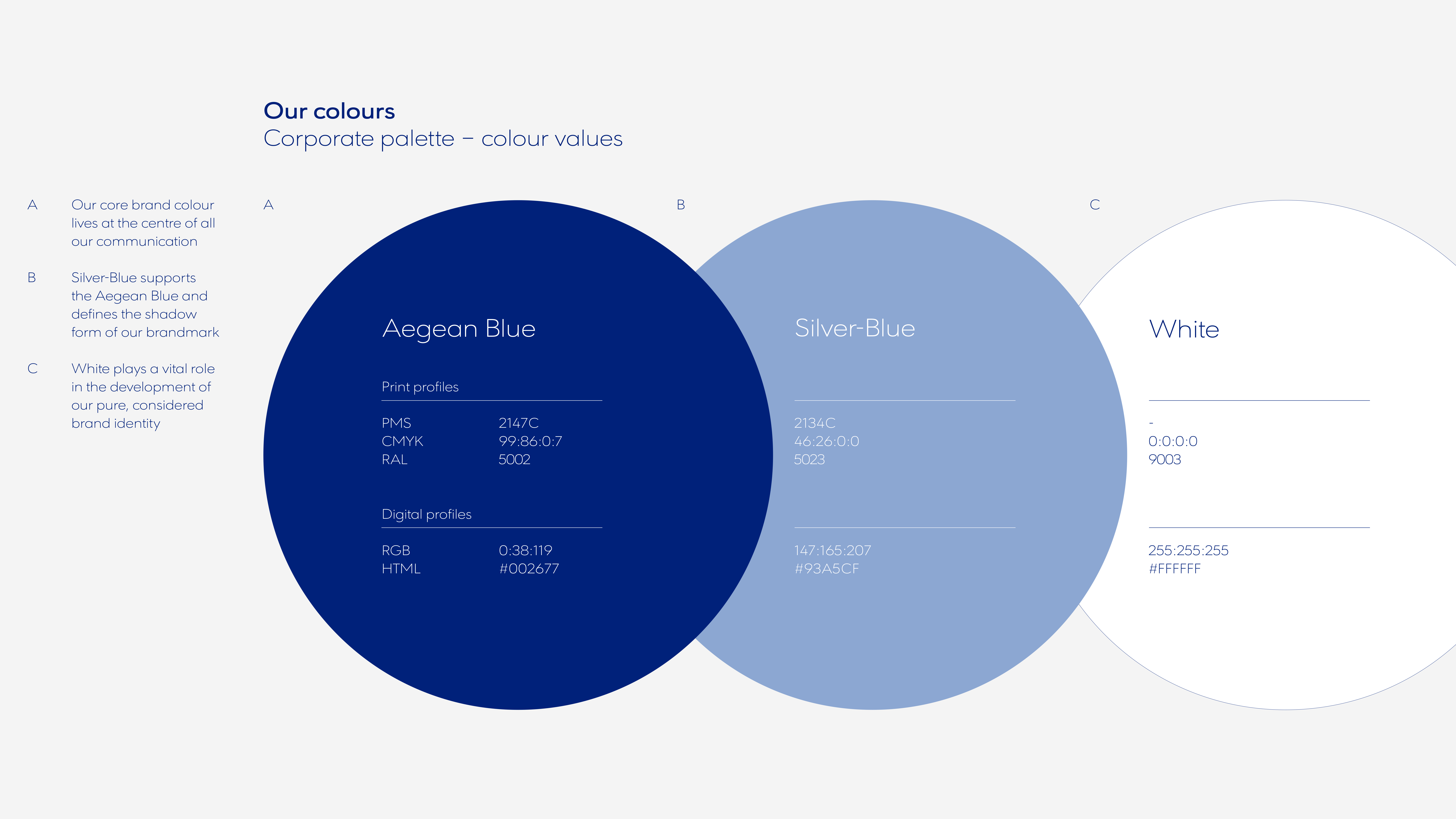
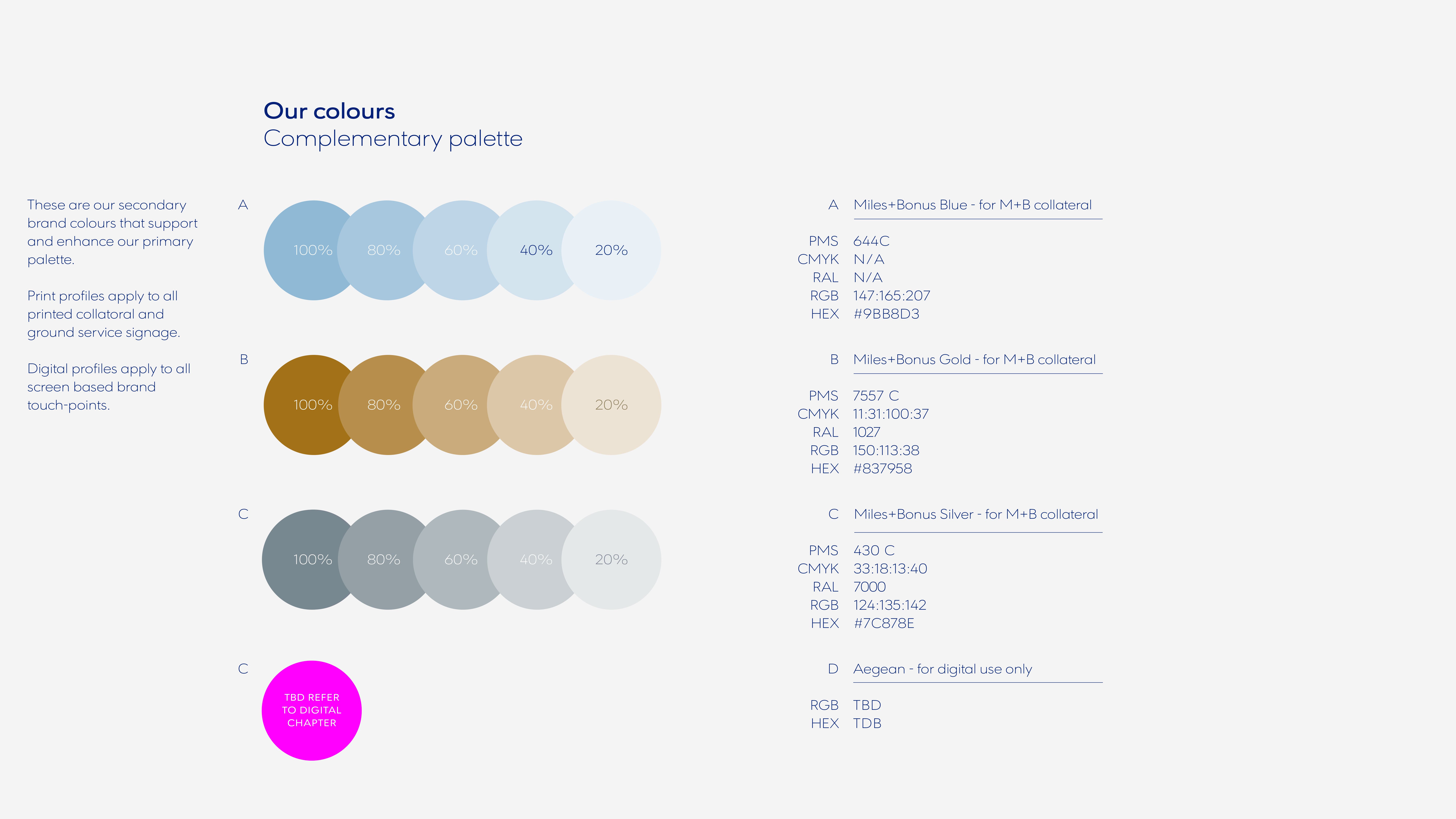
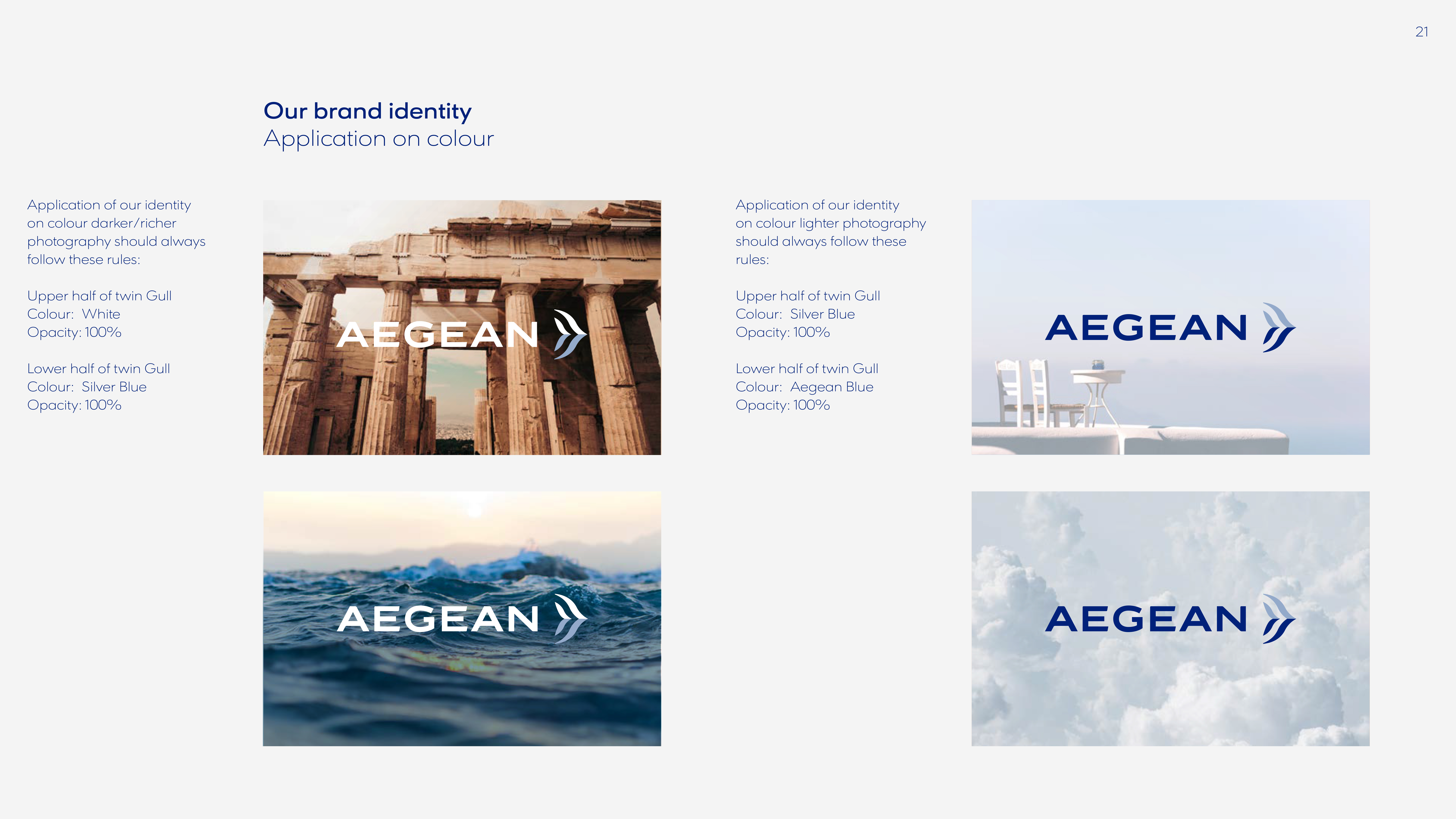
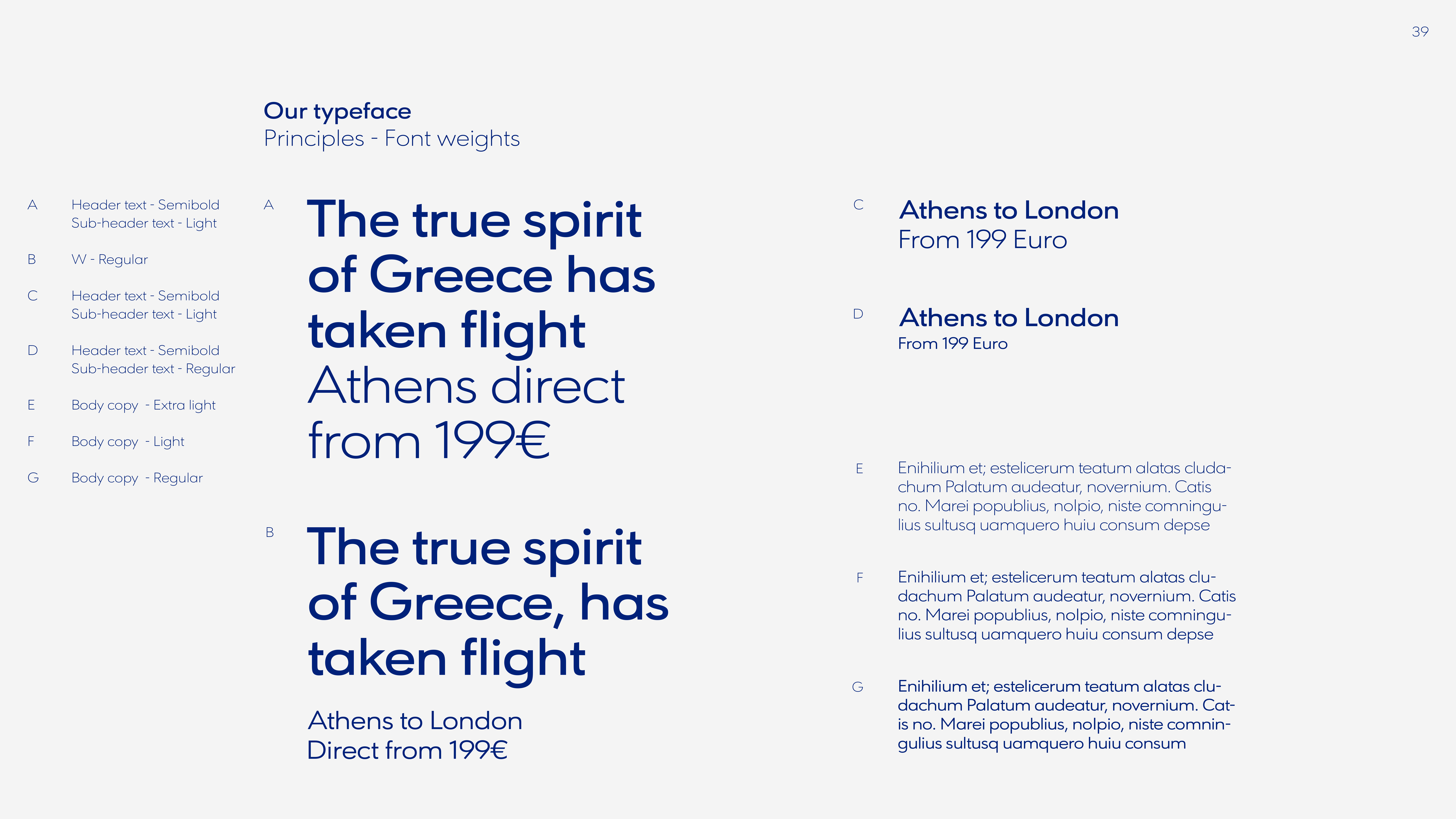
From these brand guidelines, a set of UI specifications, repeatable modules, and templates were designed for the Aegean booking flow redesign.
Final design
Aegean use a local company to carry out all their tests in Greek in order to get a better understanding of their main demographic and user base. They asked Branchspace to propose a set of scenarios based on the prototypes that we had produced for them. The external test company would then gather feedback through focus groups to get feedback on user experience and feeling.
A total of 4 scripts were devised for the test subjects, all aimed at guaging a feel of how easy it was to book a flight with variations for authenticated and unauthenticated users.
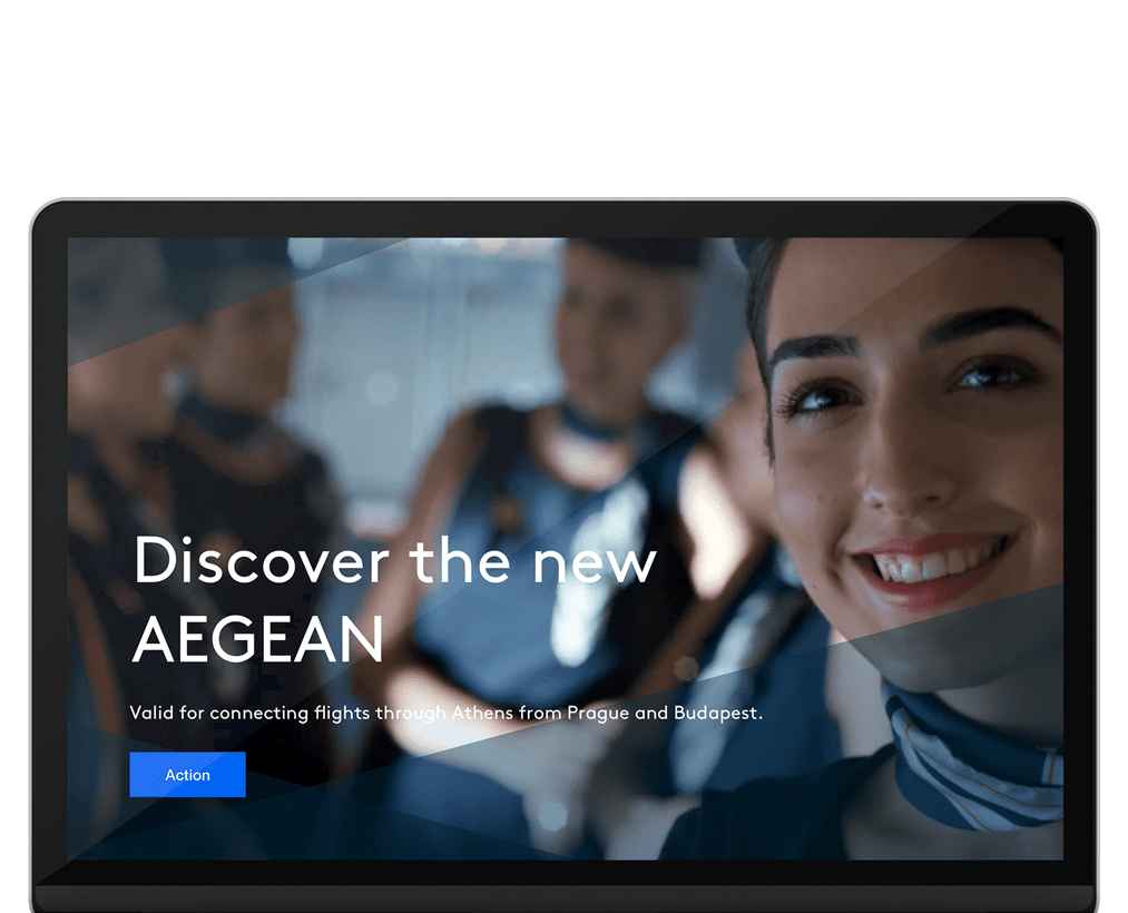
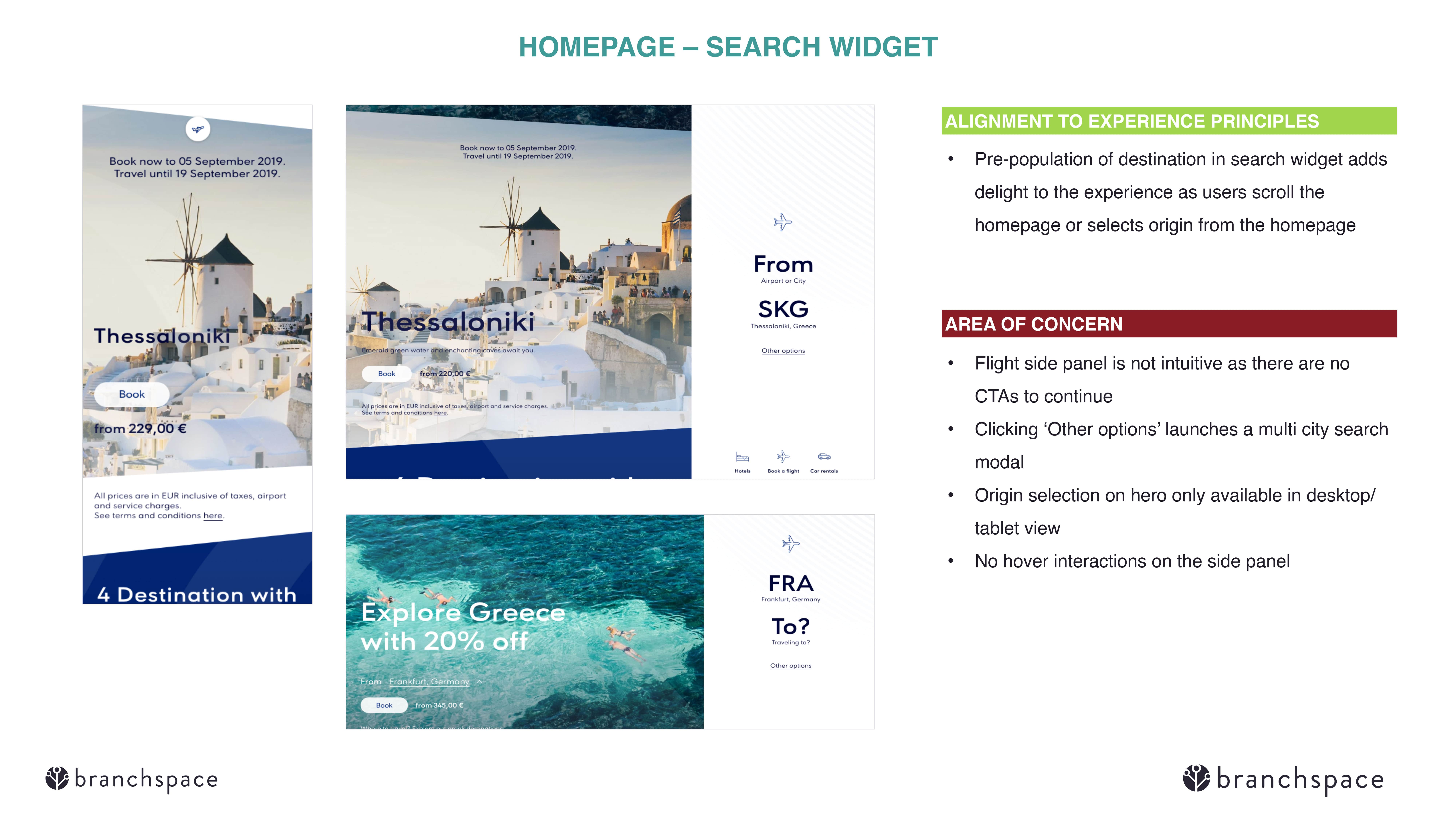
For the search and inspiration pages, rich imagery was used to appeal to the user and invoke the holiday spirit.


Conclusion
Working with a highly experienced team of consultants made the project run seamlessly with any technical issues that arose being dealt with swiftly as possible. I had the pleasure of working with Branchspaces' director of UX who had worked on a number of similar projects within the airline industry in the past. With this being my first time working with a client in the commercial flight industry, it offered peace of mind to be able to call upon him for any points or issues that would come about relating to fare tarrifs or legal necesseties in the field for example.
As senior UX director I was responsible for mentoring other staff members on the team, with some being new to the company and others that had been with Branchspace for a while. The more experienced staff on the project were based in Poland and were proficient in their roles. I was able to delegate tasks to them and trust that they would carry them out swiftly and efficiently. The newer in-house team, although of course not as versed in air travel, and fairly junior in their careers took direction well and contributed some great ideas to the project
Working with a large international company such as Aegean taught me that precision was an absolute must. Working with a number of discerning and passionate stakeholders and executives required a degree of patience, when at times it felt that we were 'designing by comittee' and having to produce results to fit a variation of ideas of which direction the project should go. Adding to the fact that they had already relinquished control of the project from a different company added a degree of pressure, however working as a tight-knit team with strong organisational skills enabled us to hold outr own and produce first-class results that they were happy with in the end.
In conclusion, I feel very fortunate to have worked with such a professional and knowledgable team on a fast-paced and interesting project and it is little wonder Branchspace recently made Financial Times' list of fastest growing companies in Europe 2020. Working there enabled me to experience the workings of an industry that is very appealing to me given my passion of travel and allowed me to learn new skills and hone existing ones in a fresh and dynamic setting.
Aegeans new booking system is due to go live in 2021